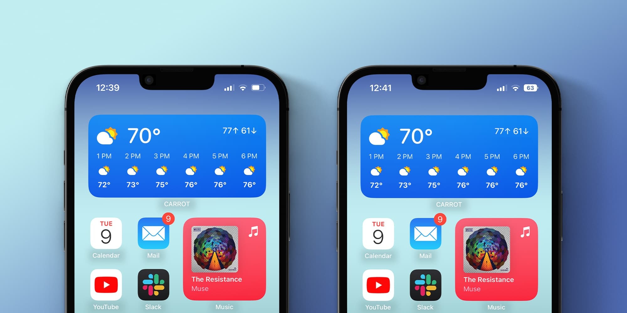
One of the new features introduced with iOS 16 was a new battery indicator with the percentage right on the status bar, which was a first for iPhone X and later. However, after multiple complaints, Apple seems to have listened to users and has once again changed how this new indicator works. Now we want to know which is your preferred solution.
Battery indicator on iPhone
Previously, the battery icon didn’t match the battery percentage as it drained. This means that no matter what the battery percentage is, the icon will always look the same – except when the battery is below 20%. Some users claimed that this tricked them into thinking the battery was full at a quick glance when it wasn’t.
Apple reconsidered this aspect and introduced a redesigned version of the battery indicator with iOS 16.1 beta 2. The new indicator has a dynamic icon that changes according to the battery level. But that wasn’t the only change Apple made to the battery indicator during the betas.
This new design also comes with a bolder font than before. When your iPhone is charging, the lightning bolt icon no longer appears once you hit 100% charge.
Previously, even if you chose not to use the new battery indicator with the percentage, it was automatically enabled if Low Power Mode was on. This behavior changed before the official release of iOS 16 to the public. With iOS 16.1 beta, Apple has also enabled battery percentage for models like iPhone XR and iPhone 12 mini, which previously lacked such an option.
Some users argue that the new dynamic icon makes it even harder to read the percentage, while others seem to prefer the new design introduced with iOS 16.1 beta 2.
Which one do you prefer?
Now we would like to know your thoughts on this. Do you like the original implementation of the battery indicator with a fixed icon or the new one with a dynamic icon that changes according to the percentage? Let us know in the poll and also in the comments section below.

Add 9to5Mac to your Google News feed.
google-news
Author: Filipe Espósito
Source: 9TO5Google


