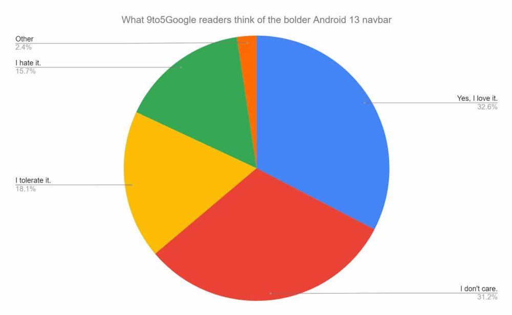
Last week we asked you about Android 13’s potential change to a more prominent gesture navbar — here’s what you had to say.
If you didn’t know or haven’t tried the recent preview builds on your own device, then you may have missed that the Android 13 Beta 3 has altered the gesture navigation bar. This is the first change to this UI since gestural navigation was first added back in Android 10. There is more than a passing resemblance to the thick navbar that you’ll find on iOS devices that use gestures.
This is just a cosmetic change, as gestures work exactly the same as they always have with the new navbar in Android 13. While there is still time for Google to make changes, it’s likely that this is what will greet Pixel owners that update to Android 13 when it finally arrives in a stable form.
What is most surprising is that we expected our readers to dislike the change. It actually falls predominantly into two camps: those who love it and those who simply don’t care. 32% of our readers love the change, citing the “larger bar” as it’s more visible and it makes it more obvious for features like one-handed mode. That said, the larger size doesn’t change the activation area.

31% of you said you don’t care, with some, like reader Spaha saying they continue to use three-button navigation rather than gestures. Some like reader Jitterry even claim that they “couldn’t care less” about the bigger, bolder Android 13 gesture navbar even going so far as to state they had “never noticed when it’s there or not.” That seems pretty surprising given the change is quite substantial — at least visually.
18% of our readers said they simply tolerate the change. Luckily, because there is no effect on the usability or functionality, it is easy to just let these changes pass by. However, reader destinyhud makes a great point about the introduction of a black border in certain applications because the gesture navbar is larger in Android 13. It would be great to have a toggle to adjust this in Pixel system settings for sure.
A fairly small 15% of our readers said they outright hate the change here. Reader Mrd1 said they would actually like to see a return of the two-button navbar as it fused all the best bits of gestures with the functionality of on-screen buttons baked in. That’s kind of hard to argue with, and it would be great to see Google restore the feature or at least allow some level of customization.
More on Android 13:
- Samsung’s skin for Android 13, One UI 5.0, reportedly brings better animations
- Android 13 Beta 3: In-display fingerprint setup gets updated enrollment UI
- Android 13 Beta 3 hands-on: top new features and functions [Video]
Author: Damien Wilde
Source: 9TO5Google


