
iOS 16 was released back in September of 2022. It brought plenty of visual changes to the iPhone and also changed how we interact with it, especially the lock screen. This update was all about personalization and customization. It brought features like lock screen customizations, widgets, the ability to edit & undo messages, and much more. So what could Apple possibly have in store for iOS 17? Parker Ortolani is back at it again with some new concepts and renders of what the future of iOS could look like, and it seems like refinement is the name of the game.
iOS 17 – further customizations
Parker posted his vision of what the future of iOS could look like, and it seems like it’s more of a refinement year than an evolutionary year. If customization was the theme in iOS 16, then further customization and frictionless interactivity is the theme for iOS 17.
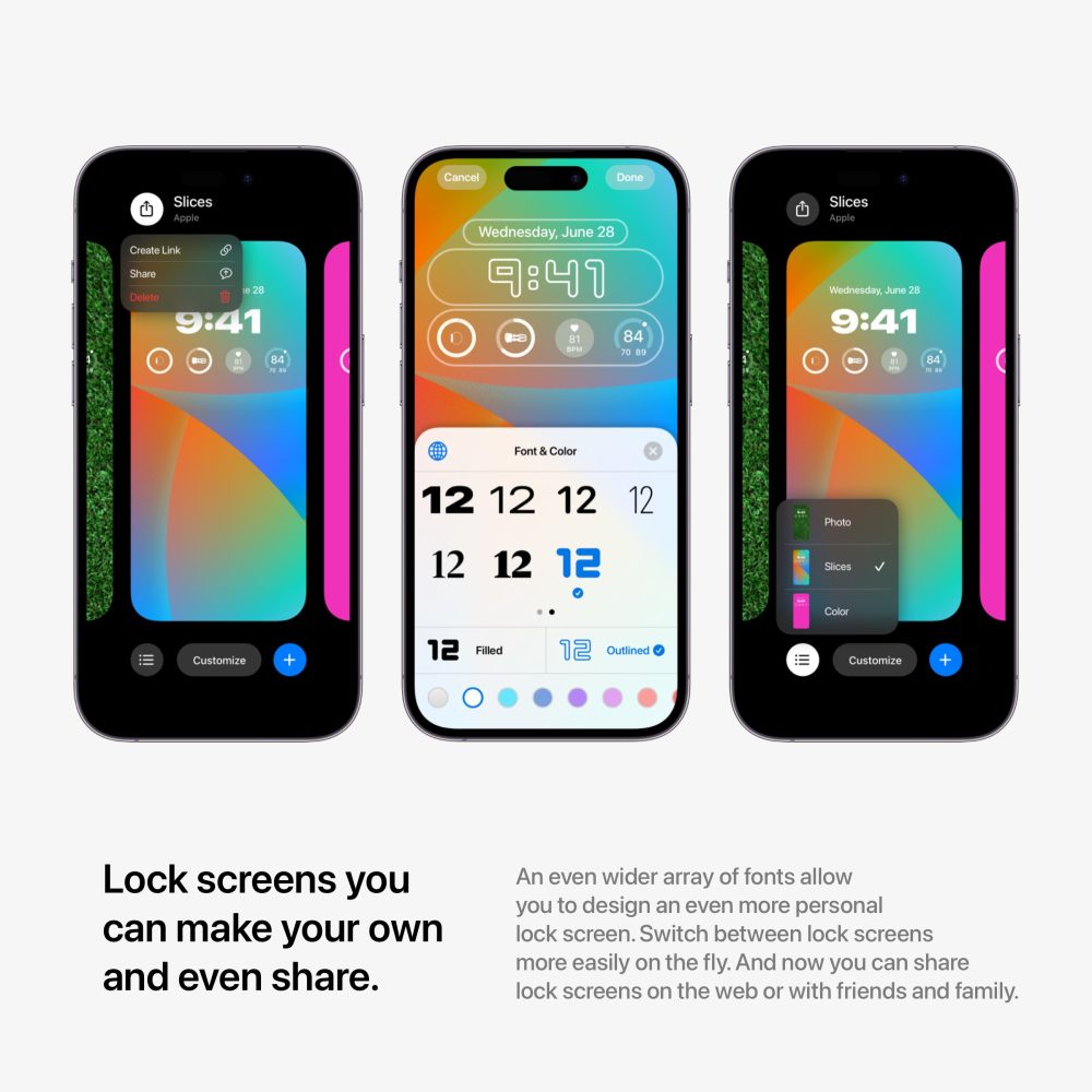
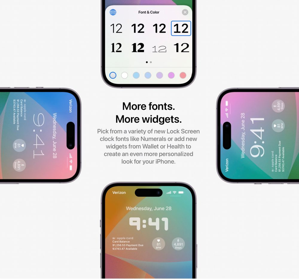
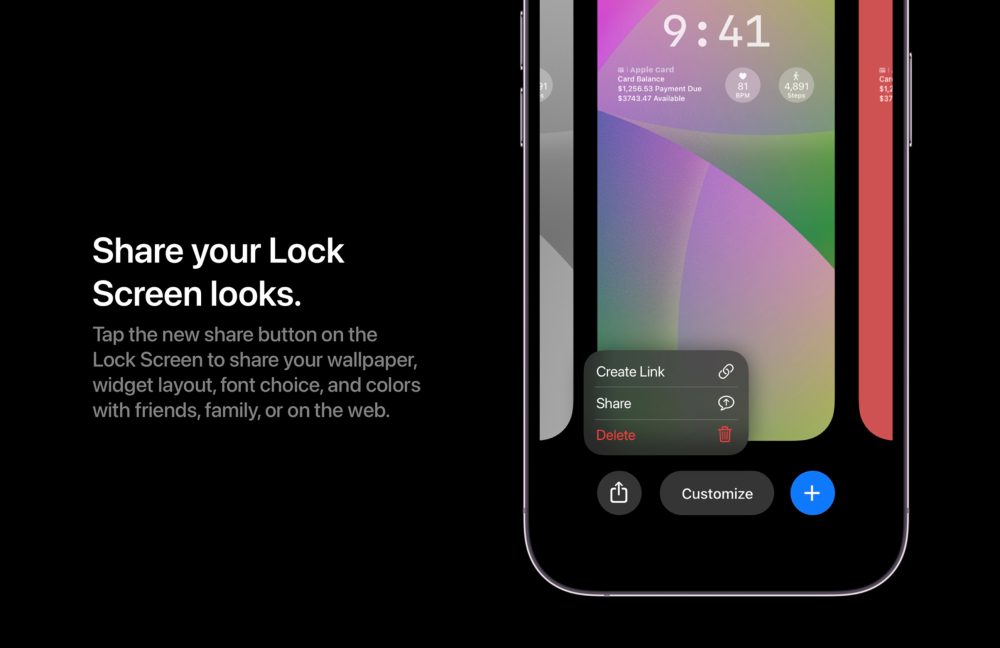
iOS 17 will most likely bring even more customization to your Lock Screen setups. Last year we got the ability to change the font on the time, add a few widgets, and even set different lock screens for different focus modes. iOS 17 should bring this to the next level with more fonts and widgets. Having the ability to possibly download other fonts and then be able to use them for your Lock Screen clock would be a great addition. Then, finally, also have the ability to fully share your Lock Screen with others. This could create a small marketplace where iPhone users could actually digitally sell their unique Lock Screen setups, similar to when the custom icon feature took over. I would love this feature to take place. I take inspiration from other people’s Lock Screens, so being able to share them would be ideal.
It seems as though Parker believes that iOS 17 will bring a new UI to notification banners and how it interacts with the Dynamic Island. I personally think the new look is great, but it seems like others are not a fan. To me, it makes sense to make notifications the same shape as the Dynamic Island – pill-shaped and more bubbly. The other aspect of notifications that could be updated is actually using opacity to help with notification organization. The older that notification is the more opaque it gets, indicating that it’s no longer the first notification. I can also see this being adopted for types of notifications, where the higher importance the bolder the notification looks.

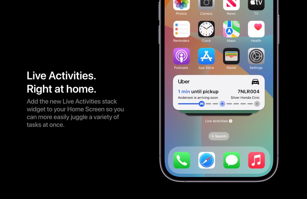
iOS 16 brought the new Live Activities feature to our iPhones. This allows us to have an active widget that shows us real-time information and data based on the app that is using it. You could see how far your Uber is in real-time, or see the score of the basketball game. Live Activities are only displayed on the Lock Screen. iOS 17 could allow us to have a section of the Home screen that has a carousel of Live Activities. Very similar to how we can create a smart stack of Home screen widgets, just flick through your Live Activities to the most relevant one at the moment.
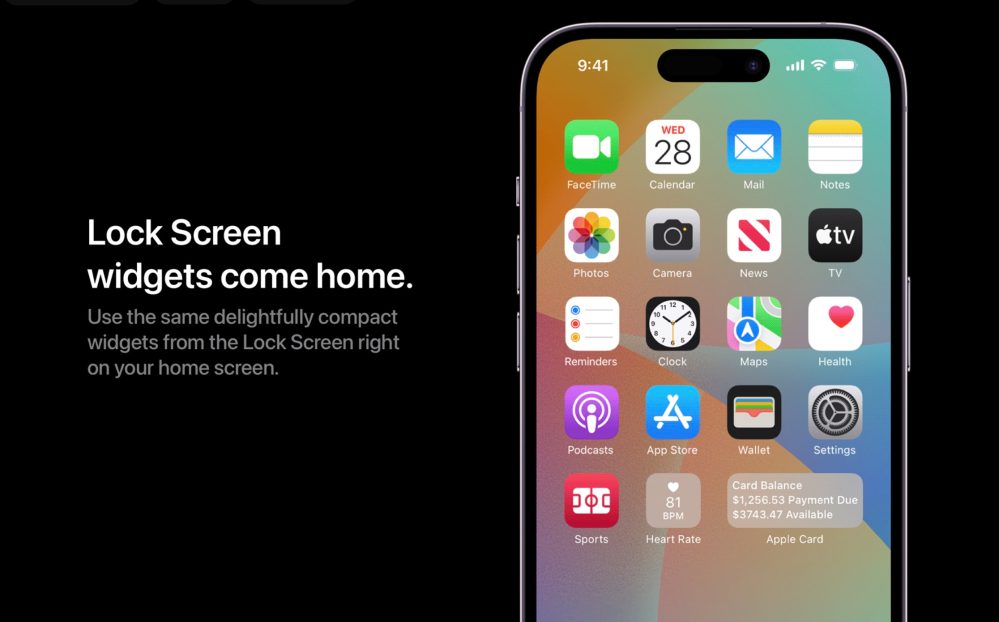
Another idea highlighted by Parker is that Apple could bring Lock Screen widgets to the Home screen. You might notice that the Home screen and Lock Screen widgets are different in how they look and where they can be used. Being able to add Lock Screen widgets to the Home screen is something Apple could easily implement.
Siri has always been known as the second (or even third) fiddle when it comes to smart assistants. Google has always been the king there, Alexa has an abundance of users it’s constantly learning from, and now Bing has begun to rise with the addition of ChatGPT; improving Siri should be of high importance to Apple, which can be done in multiple ways.
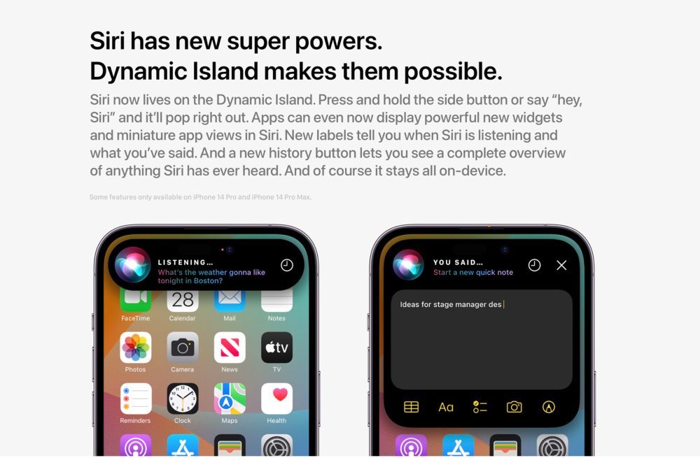
Parker suggests making Dynamic Island the area where Siri lives. Every time Siri is summoned, it will come from Dynamic Island. Adding small visual cues like a “listening” or a “you said” label to let the user know what Siri is actively doing would be a welcome addition. Being able to launch mini versions of an app like a quick note directly from Siri will also improve the user experience.
Wrap-up
Parker does a great job of highlighting some realistic updates and features that could come to iOS 17. The keyword there is realistic. We’ve learned that Apple is putting a lot of its R&D power into a supposed VR/AR headset in 2023; this means that there will be less innovation when it comes to iOS, iPadOS, and MacOS. That is why I also believe iOS 17 is going to be mostly about refining all the features they released with iOS 16.
There have also been reports that iOS 16 has been a huge battery drain and some persistent bugs and other annoyances that users were not dealing with when it came to iOS 15. iOS 15 was amazingly stable and had great optimization for battery life. That is the type of improvement we should expect with iOS 17 – refining the feature-heavy update of iOS 16.
What do you think of this concept? Is it realistic? Do you think Apple will bring more to the table? What is something you personally want to see from iOS 17? What do you think of the new notification shape? Overall I think these are welcome additions, but I am hoping Apple gives us that “One More Thing” feature for iOS 17. Let’s discuss in the comments!
Author: Fernando Silva
Source: 9TO5Google


