

American photographers more or less invented color as a serious art form. William Eggleston’s Memphis, Joel Meyerowitz’s Cape Cod, Stephen Shore’s road trips across a candy-colored 1970s USA.
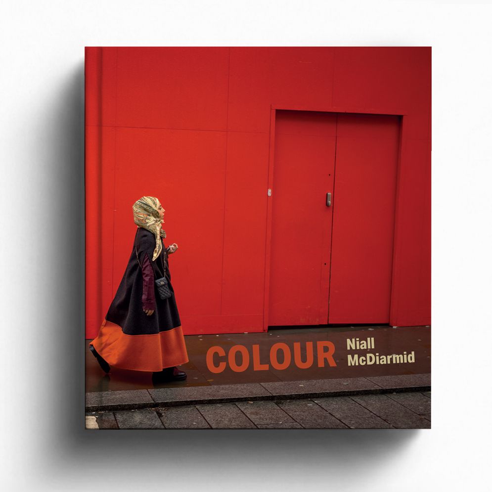
Scottish photographer Niall McDiarmid is working in that same tradition, just on the other side of the Atlantic, and his new book, Colour, published by RRB Photobooks, makes the case that the hunt for great color hasn’t got any easier since Eggleston’s day. If anything, in his view, it’s become harder.
Over 15 years of shooting mostly in London, McDiarmid has watched the palette of everyday British life fade toward taupe, gray and beige. In opposition to that trend, he’s built an entire book around tracking down the places where it hasn’t.
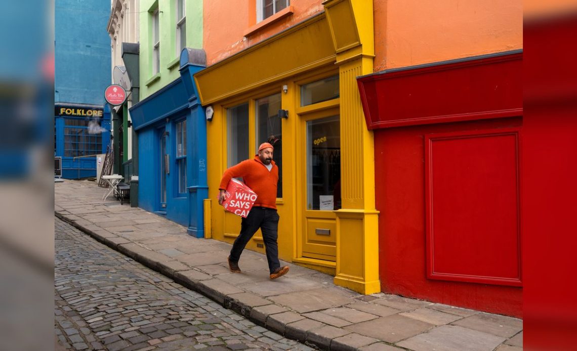
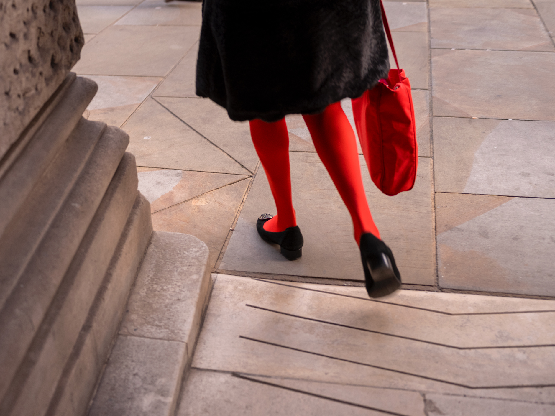
The result is pictures that feel almost defiant. A woman in a headscarf and an orange-hemmed coat walks past a Ferrari-red shopfront in Mayfair. A man in a burnt-orange sweater strides past a row of boiled-sweet shopfronts in Folkestone. A pair of red tights disappear up a museum staircase.
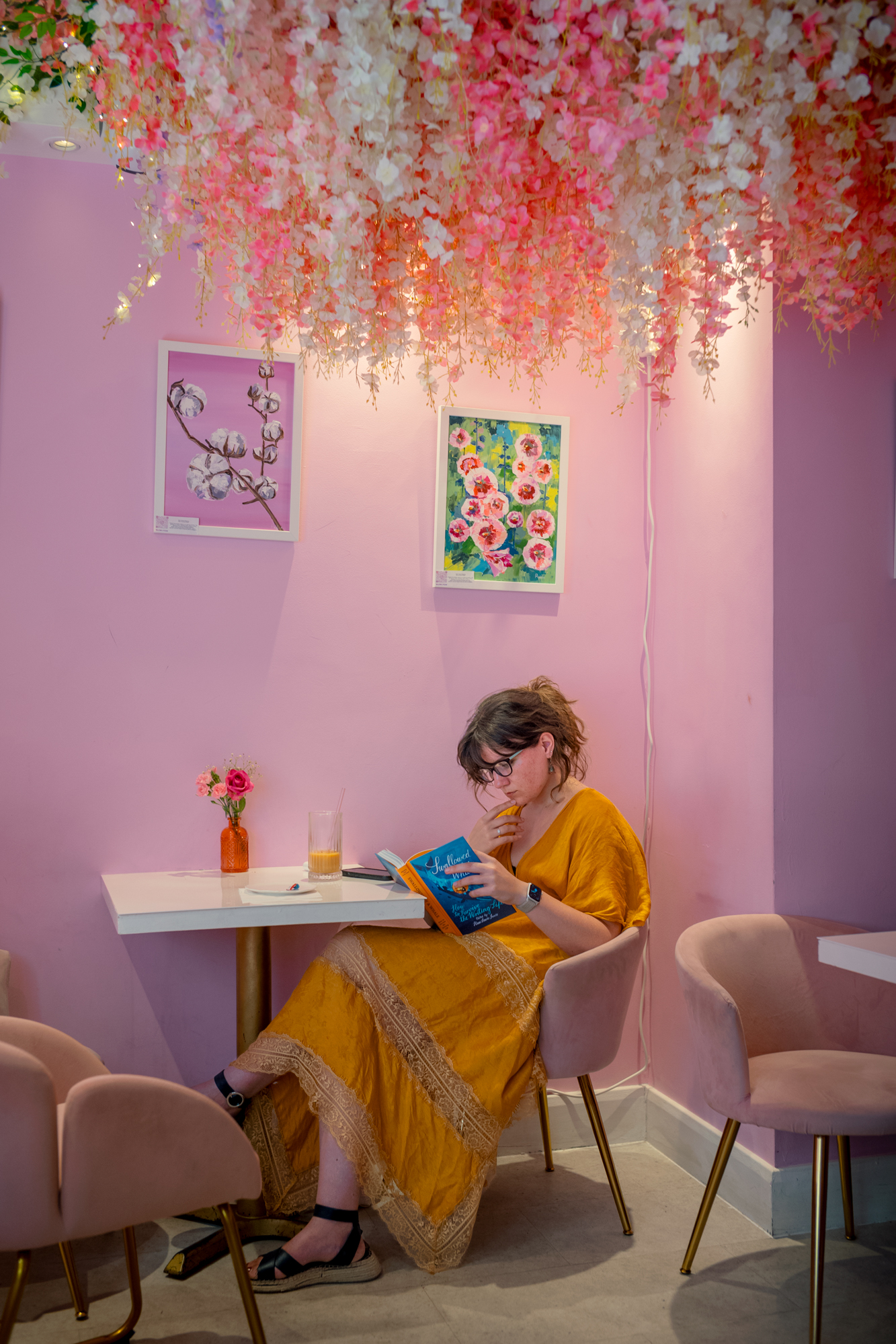
None of this is subtle, and that’s the point. Like the color pioneers before him, McDiarmid isn’t after a tasteful accent in an otherwise neutral frame. He wants the whole picture saturated, corner to corner; the way a lot of photographers are actively taught to avoid.
That makes Colour worth a proper look for anyone who’s absorbed the modern orthodoxy that restraint equals sophistication. McDiarmid’s argument, in his own words in the book’s introduction, is blunt: “Color is dynamism and strength and passion. Color is life.”
It’s a rebuke to 15 years of minimalist interiors, taupe render and monochrome cars that, from his perspective, have drained the visual life and energy from British streets.
Technical lessons
The technical lesson here is a useful one. McDiarmid works almost exclusively in the flat, overcast light of an archetypal British day, the kind of light most photographers spend their lives trying to avoid or “fix” in post.
But flat light has an underrated advantage: it kills harsh shadows and enables color to read as pure, unbroken tone rather than being chopped up by contrast.

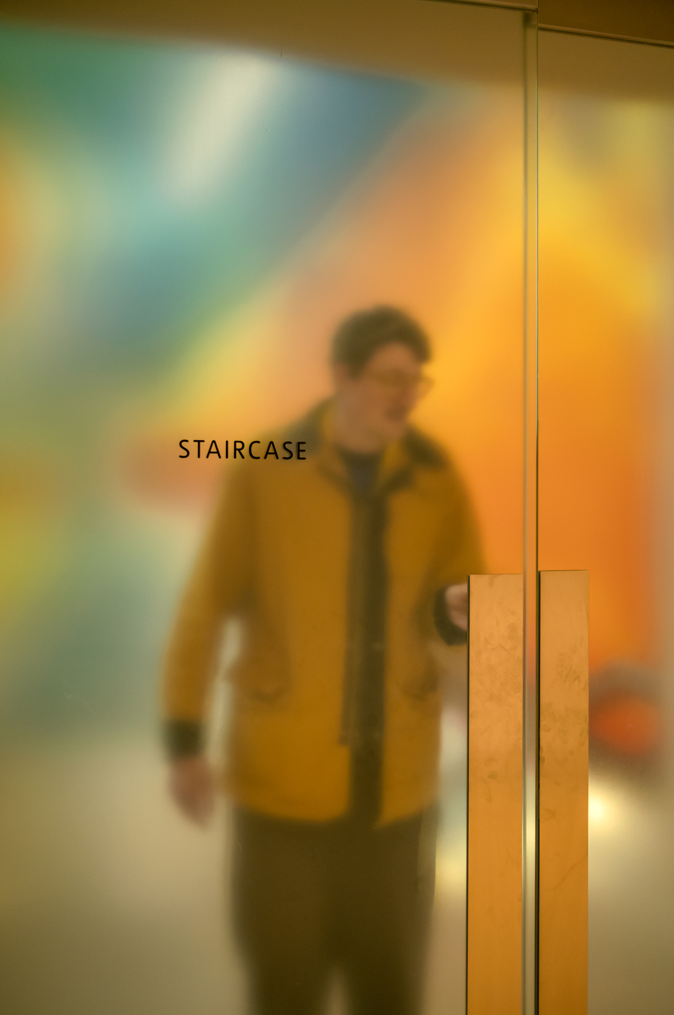
A red shopfront under hard midday sun gets carved into bright highlights and murky shade; the same wall under gray cloud stays one solid, confident block of red. It’s the same reason product photographers use diffused light boxes rather than direct sun, applied out on the street.
The other habit photographers can learn from is his pairing of subject and setting. Time and again in Colour, a person’s clothing echoes or collides with the color of the wall, door or shopfront behind them: an orange sweater against a yellow-and-red terrace, a yellow umbrella against a red Post Office sign.
That’s not luck repeated over 15 years. It’s a discipline of watching a location and waiting for the right person to walk through it. The classic Cartier-Bresson method, retooled for chromatics rather than geometry.
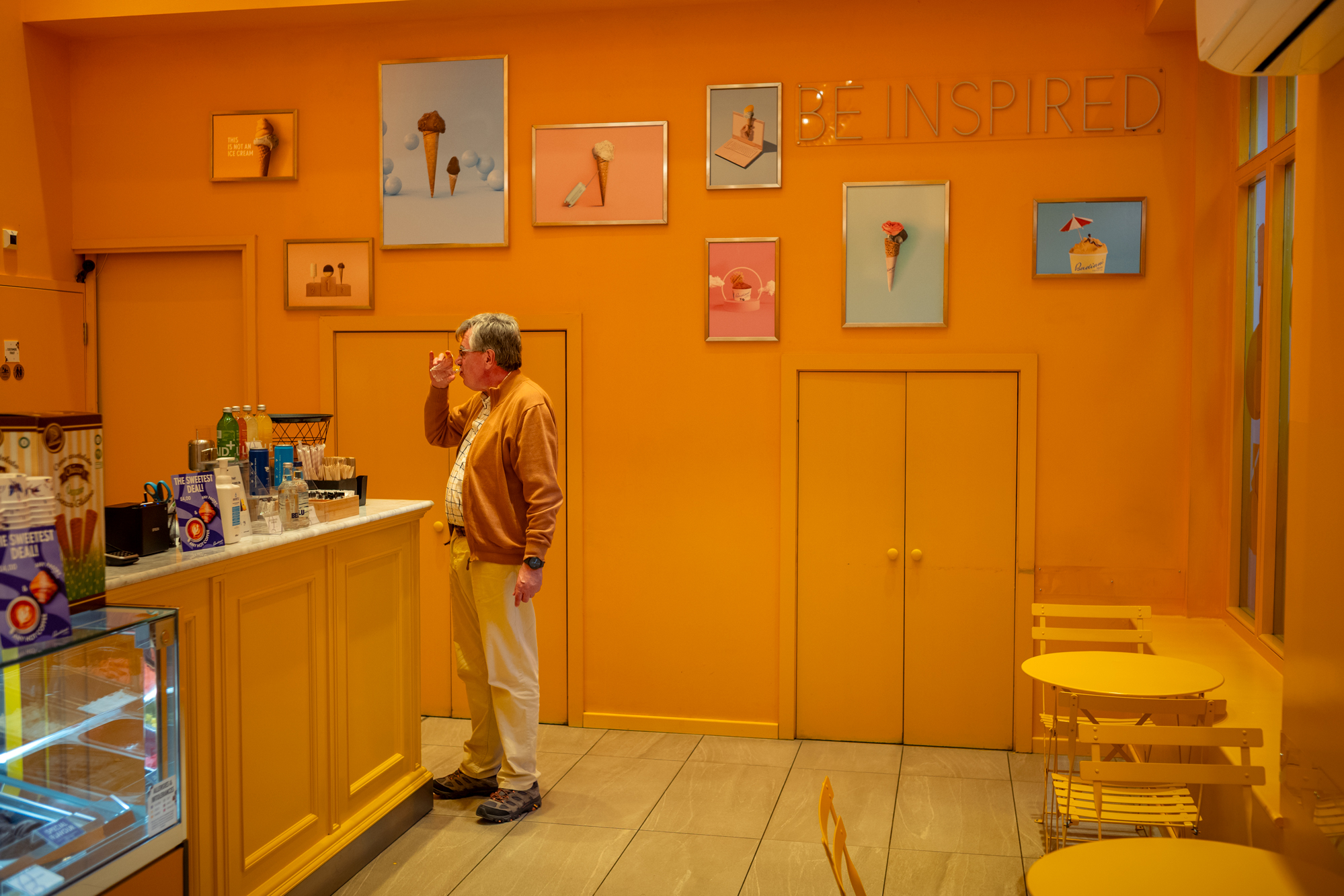
More broadly, there’s also something a little “documentary” going on beneath the visual fireworks. McDiarmid isn’t just chasing pretty walls; he’s cataloging the shrinking number of places where color still gets to exist unapologetically, from Jerk Shack signage in Tooting to a resolutely green-tiled café in Wimbledon.
Read that way, Colour might be seen more as social record than pure aesthetics; a survey of a Britain that’s steadily repainting itself beige. And for street and documentary photographers, there’s a broader lesson there. Keep half an eye on what’s disappearing around you – not just what looks good through the viewfinder.
Colour by Niall McDiarmid is published by RRB Photobooks, priced £28 (approximately $48/£35) with a £95 special hardcover edition including a signed 10×8-inch print.
Author: Tom May
Source: DigitalCameraWorld
Reviewed By: Editorial Team