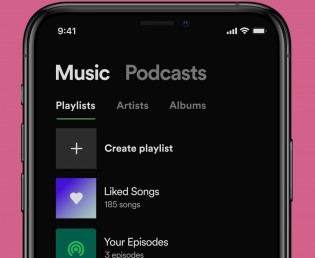
Spotify is great but let’s face it, it hasn’t had a meaningful design change of the library in a long time. Luckily, the new design is all about functionality and ease of navigation. The “Your Library” tab has been totally revamped and offers much faster navigation through your collection of playlists, artists, albums, etc.


Before and after the update
The first thing to notice is the preset filters for playlists, artists, albums, podcasts and shows. Those are quite useful and long overdue. There’s also a new toggle that switches between list and grid view, with the latter being a nice alternative when you are streaming music in your car, for example. The bigger album arts help with the navigation.
Sorting your library by recently played, recently added, alphabetical or by creator’s name is another way to get around. Finally, you have the option to pin your favorite playlists so they will always appear on top regardless of the sorting.
The update is already live for some, if not most, of the users and should reach everyone by the end of this week.
Author: Ro
Source: GSMArena


