
It’s been almost a decade since Google first launched Android Auto, a way of maintaining control over music, maps, and messages while behind the wheel. Over that time, Android Auto has undergone three major versions with the latest, “Coolwalk,” bringing a dashboard that delivers on some welcome upgrades.
Android Auto dashboard redesign – Is ‘Coolwalk’ any good?
In its second major redesign to date, Android Auto keeps things relatively simple in terms of its core functionality.
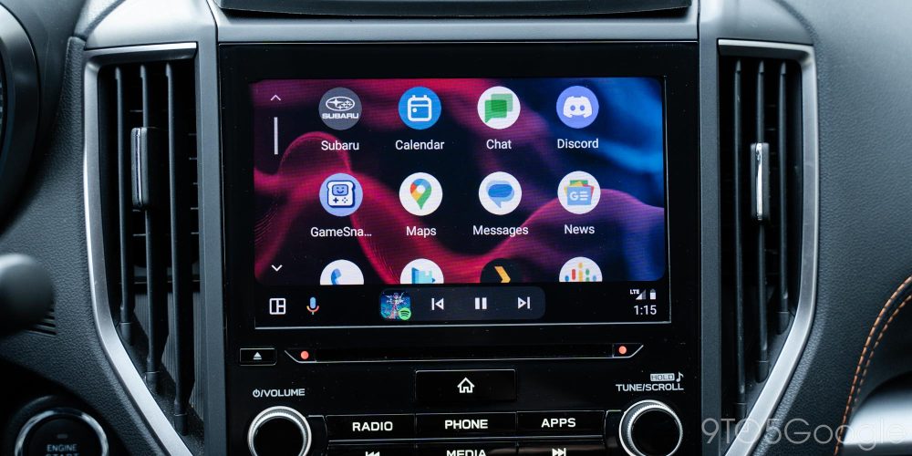
The system still relies on a variety of apps and the Google Assistant to control the system, with an app drawer that mirrors the apps available on your phone (at least those with Android Auto experiences) alongside a few Google Assistant shortcuts and GameSnacks, a handful of basic games designed to be used while parked (or charging, in the case of electric cars). Since 2019’s redesign, the list of Android Auto apps that most folks see in their car has certainly expanded greatly with names such as Microsoft Teams, Signal, WhatsApp, Discord, and others either building on or introducing their Android Auto apps.
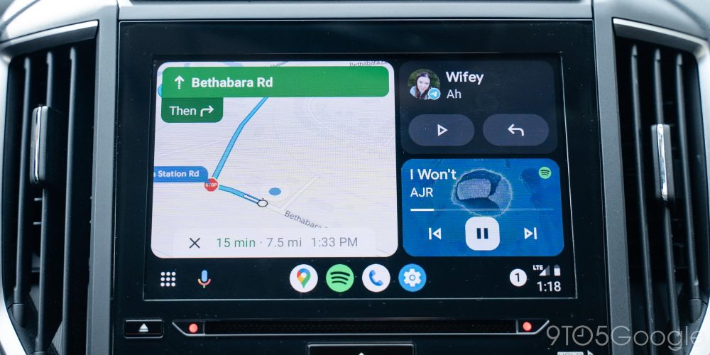
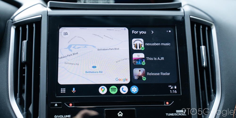
The core of what’s new, rather, lies in the “homescreen” of Android Auto. The new dashboard design – codenamed “Coolwalk” – gives Android Auto a whole new level of information density that previously wasn’t possible unless your car had an ultrawide display.
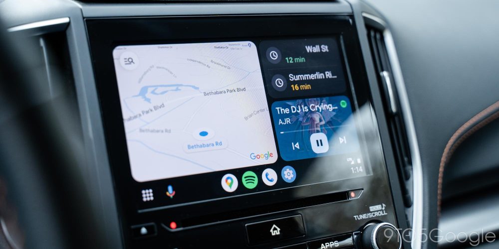
Android Auto’s dashboard shows a mapping app, frequent locations powered by that mapping app, and your media app of choice on first launch. Previously, Android Auto would always launch to your default mapping app.
The good of this is that as soon as you get in the car, you’re greeted with every bit of information you might need at a glance. It’s also great news for anyone with an uncommon display shape or size. While my Subaru Crosstrek has a pretty standard widescreen display, taller displays and super short but wide displays are showing up in more cars, and this new Android Auto look can take much better advantage of that screen space.
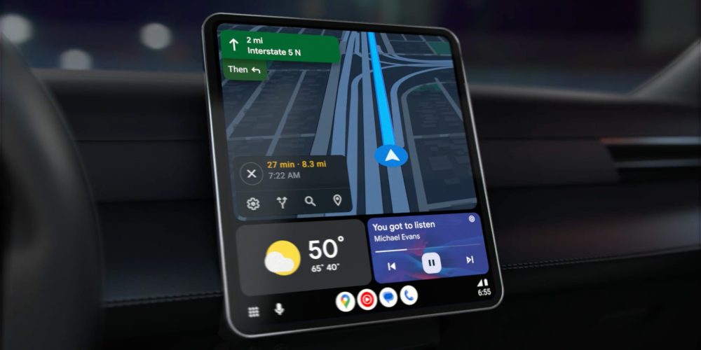
The bad? For the time being, only Google Maps supports the dashboard view, with Waze “coming soon” and other mapping apps presumably set to follow later on. That’s surely going to make this upgrade cause some confusion and headaches for some users.
How does the Android Auto redesign work?
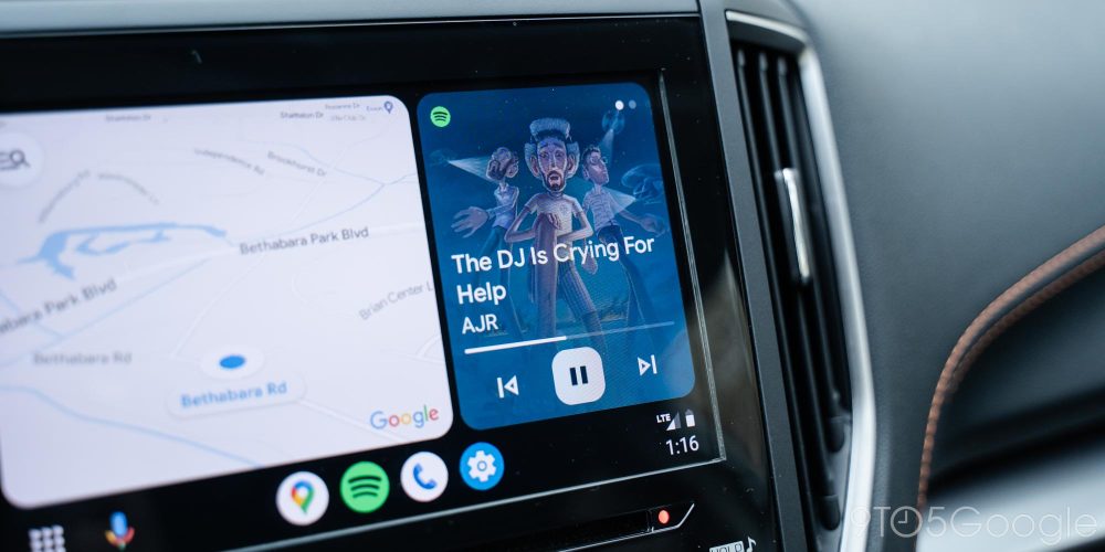
Digging further into how it all works, this dashboard will show your mapping information in a window and, once you set a destination, the list of frequent locations will go away, allowing the music card to expand. That list also goes away after you’ve been driving for a few minutes or so. Tapping on either card will launch it into a fullscreen experience which works roughly the same as in the prior version of Android Auto in most cases. But for general navigation and basic media controls, it’s rare you’ll need to dive into the full apps, at least I haven’t over the past couple of months.
Whenever you do jump into the full app, animations are much smoother in the new Android Auto, even when using it wirelessly. I’ve found that whole experience to be much more fluid and polished off compared to what was available prior. It really boosts the overall experience of using Android Auto.
Related: How to use wireless Android Auto
At the bottom of the screen you’ll find the revamped taskbar, which serves a few functions. Firstly, there’s a multipurpose button that will either act as a shortcut for the app drawer or a button to toggle the dashboard while using supported apps.
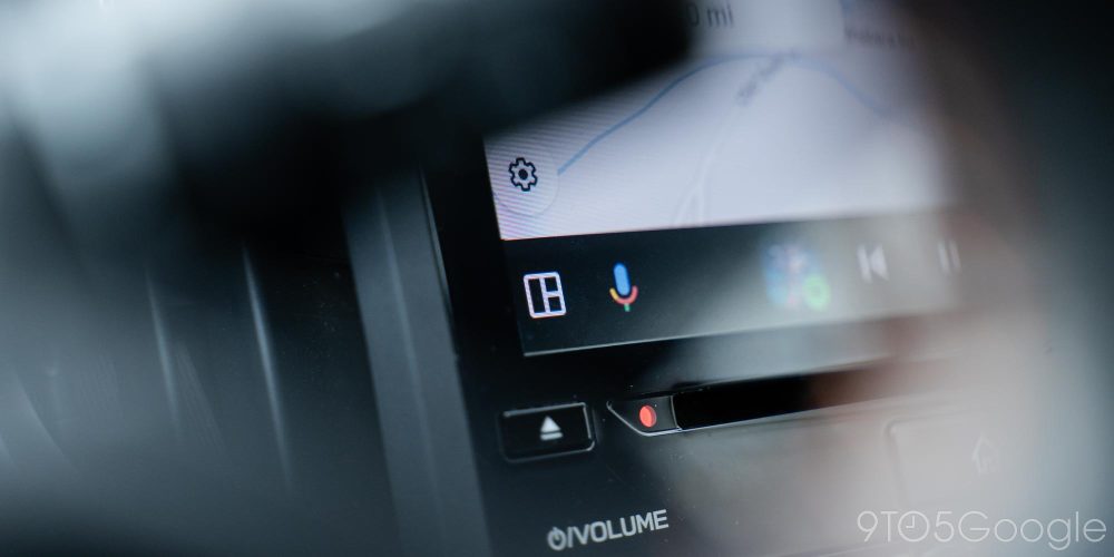
Accessing the app drawer can, at times, be a little confusing, but I found myself getting the hang of what shows when within a single trip. Next to that is a shortcut for the Google Assistant, which is unchanged from the previous Android Auto version, and shows up in the same pop-up window.
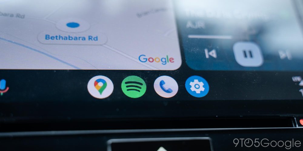
The taskbar then shows a handful of apps that are mostly powered by what you’ve most recently used. For me, that means it usually shows Google Maps, Spotify, the phone app, and the settings menu. This idea works well enough, but it’s something I kind of struggle to find the full utility of. I don’t multitask in my car between more than two apps regularly, so this feels like a bit of a waste of space. I’d much rather have the option to mount the taskbar to the side of the screen and show more relevant data on this bar than have my apps but, clearly, this is useful to some people – Apple’s CarPlay does the same thing, after all.
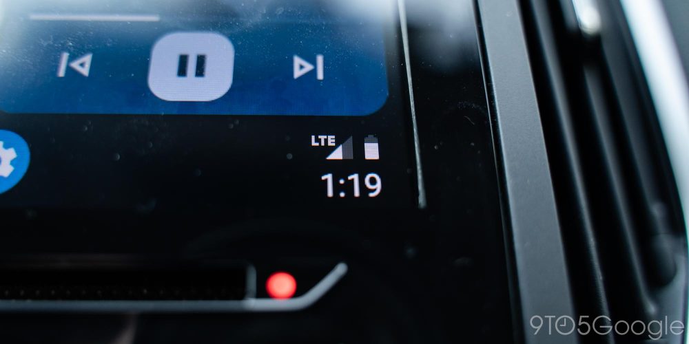
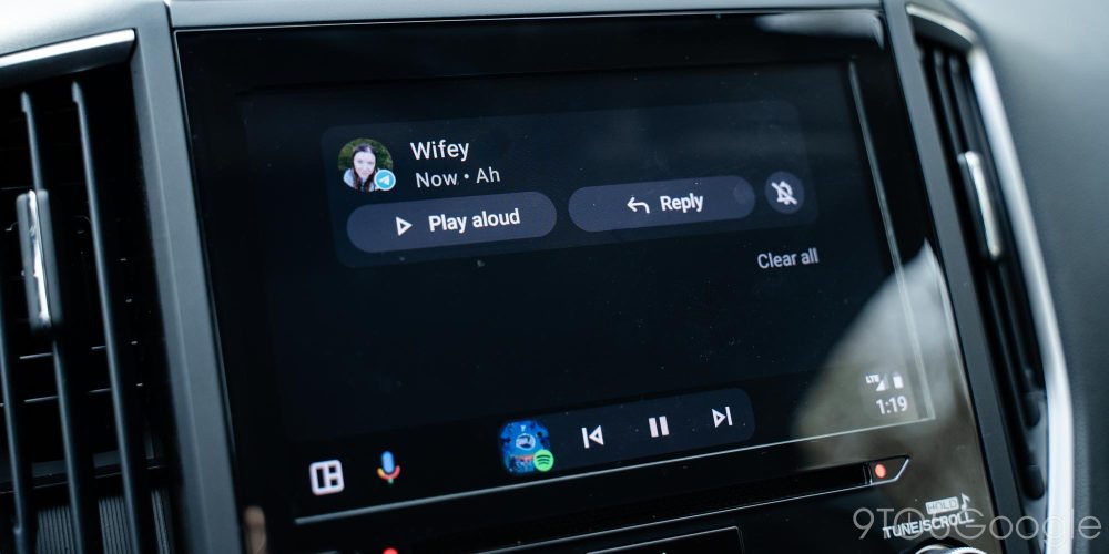
Finally, at the far end, there’s a button to show the time, your battery status, and your connection status. Tapping on that shows any notifications since you’ve started your journey, with the option to show some of that text or just tap it to have the Assistant read it all aloud. Visually this isn’t as intuitive as the bell icon that showed up in the previous Android Auto redesign.
Material You makes a little cameo
In music apps, there’s also a nice visual change. Material You shows up in media apps, pulling colors from album art and using that to theme the media controls. It’s a minor cameo compared to Android’s use of Material You theming, but fun and good-looking nonetheless.
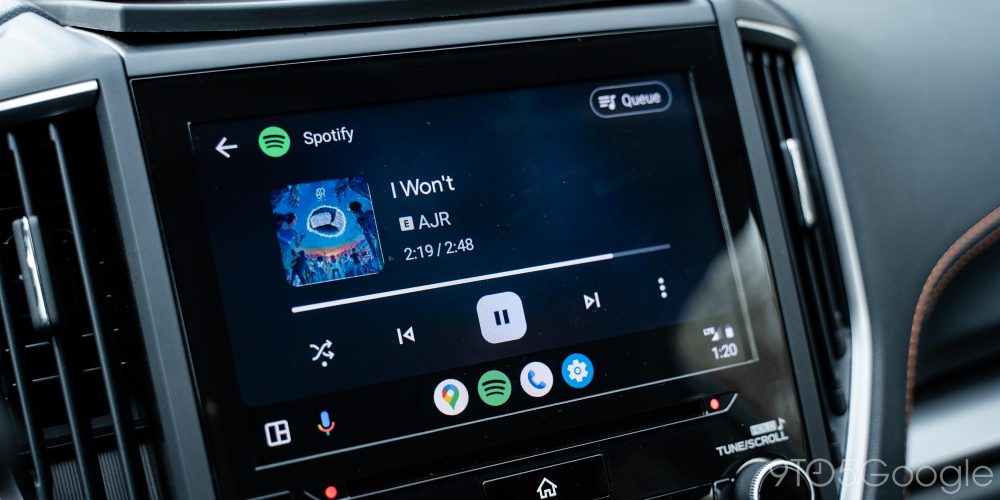
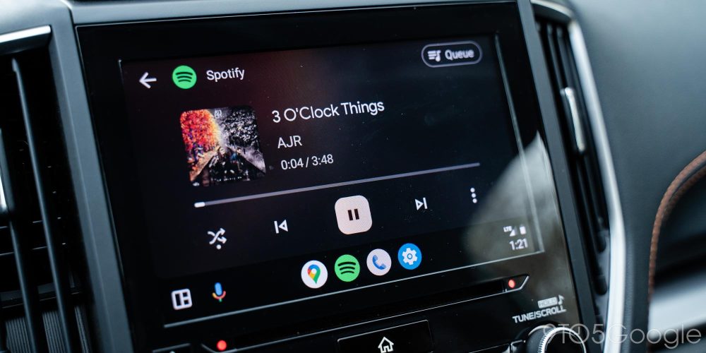
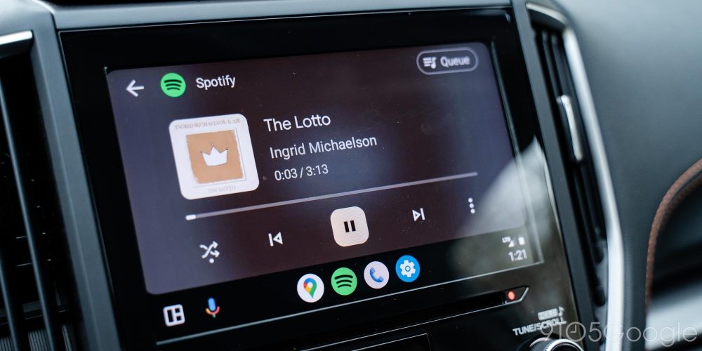
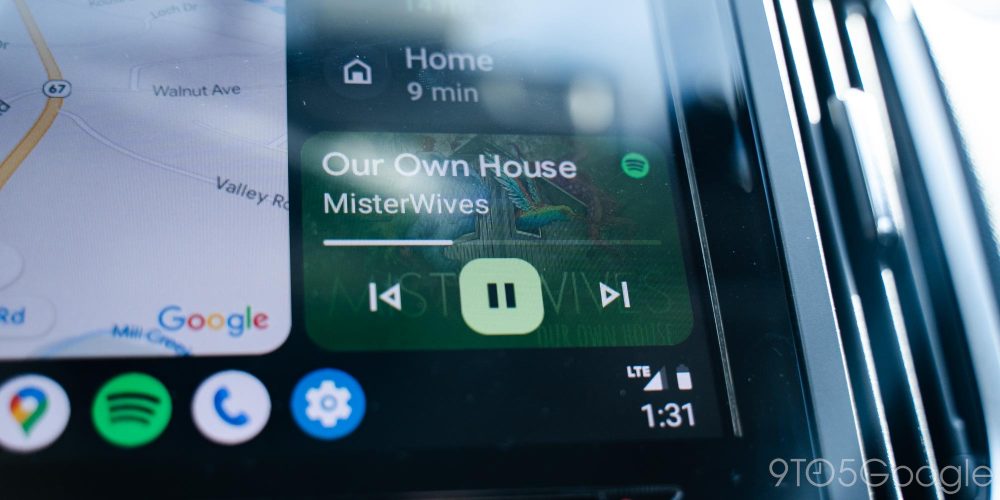
Notably too, media apps also get a second nice trick in this redesign. On the dashboard, swiping the media card will show a selection of relevant playlists, albums, and other media from your default service. It’s a nice way to quickly jump into the media of your choice without going into the full app.
What’s missing?
But as with the last Android Auto redesign, “Coowalk” is missing some features. One of those is the decision on Google’s part to remove the temperature and weather forecast icons from the platform again, despite the user outrage that caused last time around. It’s certainly a weird call, but something the company can probably add back later. Still, I’ve missed it over the past few weeks. It only adds to the frustration that, on larger displays (pictured above), a weather widget is available.
There’s also the de-emphasizing of taskbar widgets. Google opted to bury this one under a setting, but it still doesn’t work quite as well as it did before. In the prior redesign, music controls or mapping directions could be shown on the taskbar while in another app. Admittedly, this isn’t as needed with all of Android Auto’s new dashboard functionality, but losing it still leads to a bit of a learning curve.

Luckily, it’s pretty easy to re-enable these widgets, even if they aren’t quite as consistent as before.
Related: How to switch back to taskbar widgets on the Android Auto redesign
What’s next for Android Auto?
With the dashboard redesign, Google has Android Auto in a state where, personally, I feel it can stay for a while. There are certainly things the company will be able to do in the future to improve on the platform – Apple’s incredibly ambitious instrument cluster takeover comes to mind – but the efforts we’ve seen here solve a lot of the pain points of using Android Auto.
Meanwhile, Google is well on its way with the next version of this experience that people will see in time.
Eventually, new cars will arrive with technology that far outpaces what we have today, and that includes the expansion of Android Automotive, which is quickly taking over at various carmakers. Android Auto was effectively the foundation for that experience to be built on, and with “Coolwalk” in place, they’re ready to live in harmony.
How do I get the Android Auto dashboard redesign?
Android Auto’s dashboard redesign is currently rolling out to all users through a server-side, account-based update. You’ll want to check the Play Store for the latest app updates to ensure you’re eligible. Your smartphone will also need Android 8.0 or higher.
More on Android Auto:
- Motorola MA1 adapter for wireless Android Auto sees first big discount to $70
- Waze is adding support for the Android Auto redesign ‘soon’
- AAWireless adapter for wireless Android Auto stock returns as production moves out of China
Add 9to5Google to your Google News feed.
google-news
Author: Ben Schoon
Source: 9TO5Google


