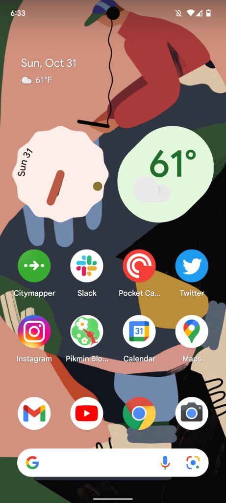
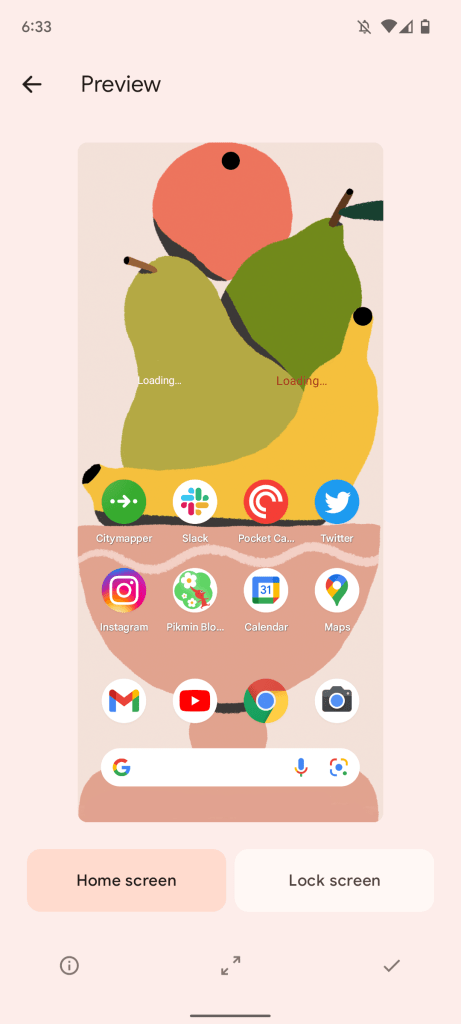
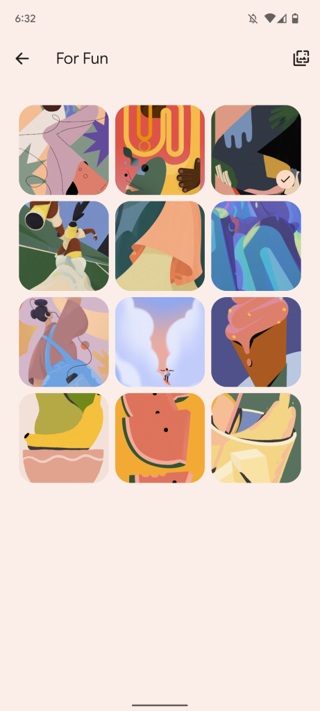
I’ve been using Google’s new flagship Pixel 6 phone for a little over a week now. It’s been quite a wild ride if I do say so myself. Like I said in my first entry, I’ve owned a handful of Pixels and other Android devices over the years. But the Pixel 6 continues to surprise me in delightful ways that other devices that run Google’s operating system haven’t before. In this entry I want to focus specifically on Material You, Google’s new design framework for allowing users to customize nearly every aspect of their Android experience.
Before I dive into Material You, I want to give a bit of background on Google’s design team for those who may not know. Google’s software design team is led by Matias Duarte, an industry vet who has been quietly responsible for some of the most profound user experience metaphors of the 21st century. Matias’ crowning achievement in my opinion, was webOS. Yes, that’s right Matias Duarte led the design of webOS, Palm’s last attempt to save itself from the iPhone.
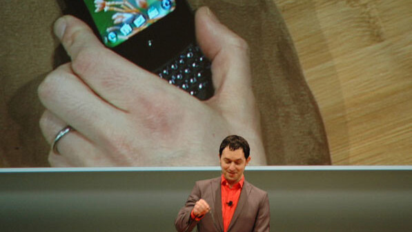
Palm’s webOS introduced several important ideas that are widely seen across the industry now. The first is gestures. If you go back and watch the Palm Pre event from CES 2009, it becomes instantly clear where the modern phone gestures came from. webOS introduced a dedicated gesture area that now sort of lives on in the form of home indicators on iOS and Android. Matias’ webOS also introduced the card based metaphor for multitasking which is now utilized by nearly every single major operating system on the planet. webOS was also an extremely clean looking OS that felt modern and retro at the same time. It was the perfect blend of ideas, applying skeuomorphic ideas to flat surfaces.
After Palm floundered with Apple veteran Jon Rubinstein naively believing in HP, Matias went to Google to run design. His first major company-wide idea was Material Design which was introduced in Android 5.0 Lollipop. Material Design’s core was a digital material that acted like something you’d see in the real world. It was malleable and animated, but it was also easily customizable. The Google design team has iterated on Material Design over the past 7 years several times, but with Android 12 on Pixel 6 Google is making its boldest change to these ideas ever.
Material You is supposed to let users easily theme their entire device while still maintaining the things that make Android, Android. It doesn’t let users remove the main aspects of Google’s design language, but rather lets users implement their own take on it. All one has to do is pick a wallpaper that they love. From there, the Pixel launcher serves up a series of clever color palettes based on said wallpaper. Once you select one your apps, Home Screen, widgets, notifications, and more will all take on that color palette.
For example, I’ve changed my wallpaper several times just to see how Android takes the colors inside it and applies it to the rest of the system. The algorithm that does this is incredible. It does such a good job of taking the best colors from an image and carefully applying it to apps and system components. I’ve currently set a wallpaper with lots of colors in it and Android 12 in exchange has created a very diverse color palette that it’s applied everywhere. My keyboard and notifications have a soft orange aesthetic, while my widgets change depending on where I place them on top of the wallpaper. It’s a super clever feature that makes Android 12 truly customizable in a way an OS hasn’t been before.
So how does this affect Apple? Apple currently offers a color theming option on macOS. It’s very minimal and only shows up in a handful of places, but it could serve as the basis for something more advanced. Currently you can choose a system color that applies itself to menu selections, alert buttons, and cursor highlights. Apple does this because it lets users customize their Mac just enough without truly letting them customize it. Everything still stays the way Apple wants it, but it lets users feel like they’ve added their own personal touch. Material You is just a more advanced implementation of that idea. It’s frankly kind of funny how Apple-y the idea of Material You actually is.
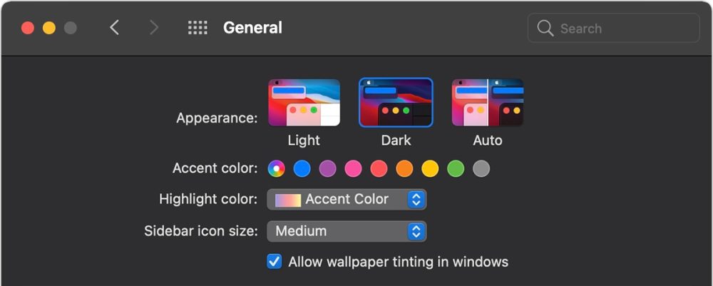
It keeps the system the way Google wanted it, but users can make it feel truly their own. It’s all an illusion at the end of the day but it’s an effective one. I’d love for Apple to explore a color selection option for iOS that applies itself throughout the system. Even if it doesn’t pull colors directly from your wallpaper, Apple could select a series of human interface design approved ones. Then that color could be applied to standard system elements like buttons, switches, notifications, keyboards, and more. It would be the first major piece of iOS device customization ever. When Apple added dark mode in iOS 13, it showed a teeny tiny glimpse of willingness on Apple’s part to let users make their devices their own. These color options could be a part of that same system.
By doing this, Apple keeps the basic foundation of iOS the way they want it. But it allows users to make their devices their own in a way that they haven’t been able to before. It’s giving customers the illusion of control but also satisfying their desire to customize.
If you missed the first entry in our Pixel 6 diary, make sure to check it out here to get up to speed.
Author: Parker Ortolani
Source: 9TO5Google


