
While some people reported a smooth journey, a significant number of people had a terrible experience when attempting to pre-order the iPhone 14. I was one of them. (Terrible in the FWP sense, of course.)
As always, I was fully prepared for sales to go live. I had my chosen model saved in the Apple Store app, and my finger and thumb were ready to do the CMD-R dance on the website …
None of this helped. The Apple Store app glitched repeatedly, either displaying an error message or just failing at the order stage. The website didn’t let me login. The app eventually managed to place my order, albeit losing the case and wallet before finally placing two orders for those, but by that time my shipping date was September 26 – October 3. Ah, well.
I did try my nearest Apple Store (without success), but I at least got some hands-on time with both the iPhone 14 Pro Max I’d ordered, as well as the other models.
The Dynamic Island mostly works as well as it had appeared from videos. The expansion and contraction is both smooth and playful – except for times when it opens up an old-style banner.
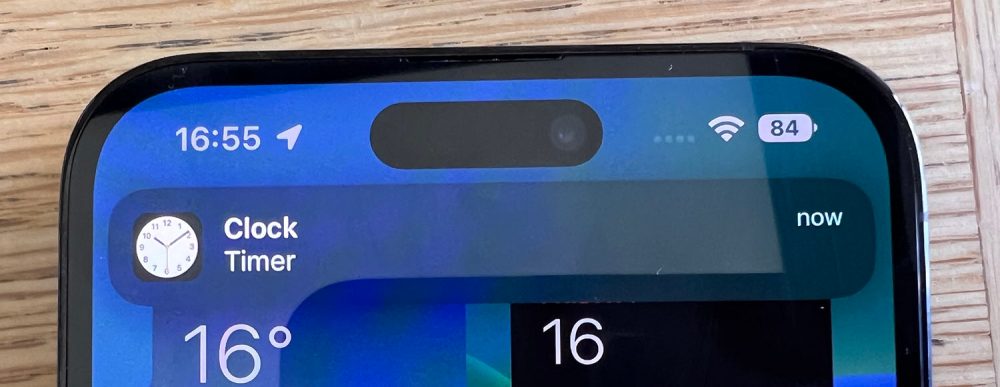
Apple does need to do more work on this aspect so that it’s more deeply integrated into the UI.
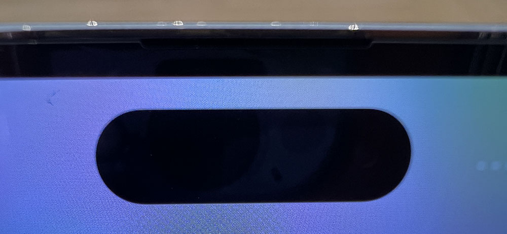
One thing that really impressed me is that the above photo, where you can clearly see the camera in the cutout, is something I had to work hard to show, getting exactly the right position and angle. In most cases, the camera and other cutout tech is completely invisible.
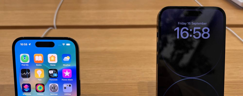
I said earlier that I wasn’t that interested in the Always-On display – based on my experience with the Apple Watch – and that didn’t change when I saw the real thing. Perhaps it will grow on me, but given that the Lock Screen isn’t anywhere I spend any time, I couldn’t see any real benefit.
The case colors are more subtle in person than in photos. I ordered the Space Black, and while I do like it, it’s nowhere near the semi-black it appears to be in some photos.
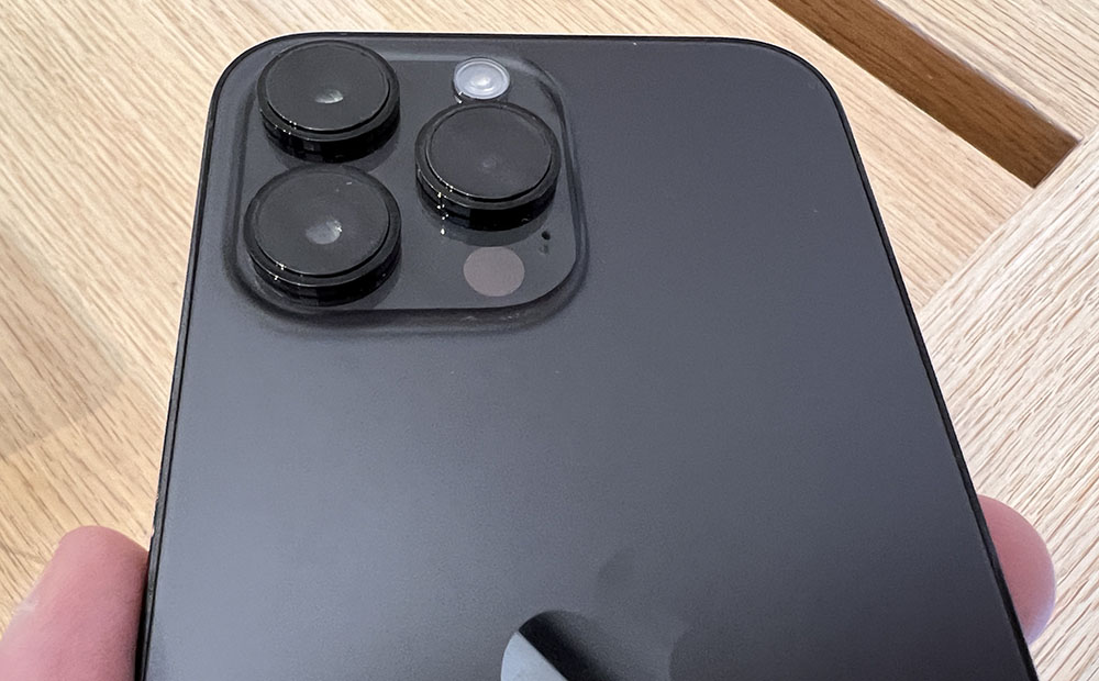
Similarly with other colors – the purple color looks very different at different angles, looking anything from gray to lilac. I do rather like it, though.
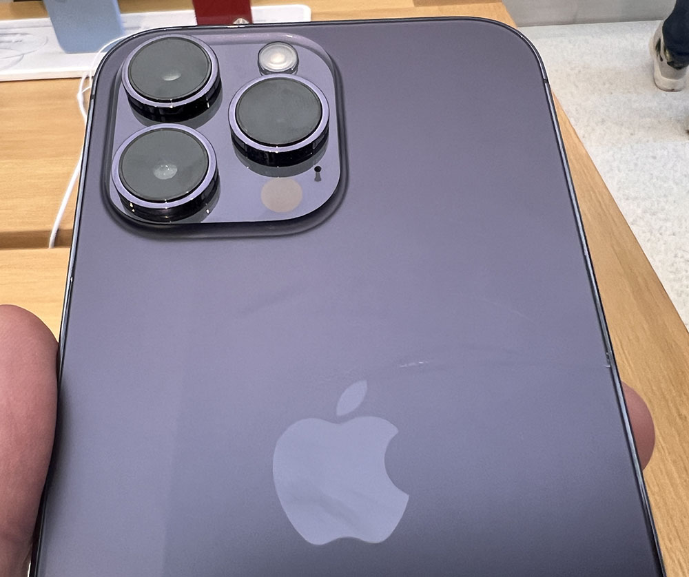
I think my favorite was the beautiful almost cornflower blue of the base iPhone 14. Again, it doesn’t look much the way it does in Apple’s official photos, but is a lovely color.
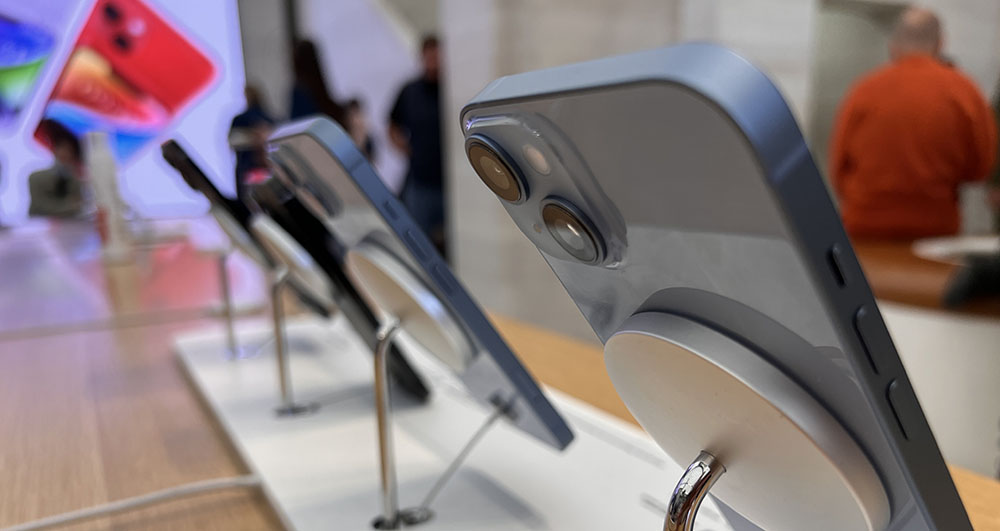
The larger camera cutout of course means you need a new case, and Apple has also moved the button positions just enough that you also can’t use an iPhone 14 case on an iPhone 13. I decided to make a virtue of a necessity, and switch to a midnight color with a matching wallet.
I am of course looking forward to playing with the new camera capabilities – though I did notice when taking photos on Sunday on my iPhone 13 Pro Max that iOS 16 improves on the HDR quite noticeably, and it’s no surprise that some of the improvement is software-driven.
I’d already been impressed by the iPhone 13 video stabilization for static and slow-moving shots, so I’m looking forward to testing the Action mode, and comparing it to action cams.
For now, though, I just have to be patient …
Author: Ben Lovejoy
Source: 9TO5Google


