
The Home app gets lots of attention in iOS 16 with a fully refreshed design. Additions and changes in the overhauled experience include a new UI and iconography, customizable sections, fresh wallpapers, a more seamless experience, and more.
The Home app has been ripe for improvements for a while and this year with iOS 16, Apple is delivering a major update for the HomeKit experience.
iOS 16 is currently available as a developer beta. The free public iOS 16 beta is set to arrive in July. Learn more about installing iOS 16 in our full guide.
iOS 16 Home app: What’s new and how does it work?
Table of contents
Here’s a detailed look at what’s new in the iOS 16 Home app…
The default layout of the iOS 16 Home app now has:
- New top category buttons
- HomeKit cameras are at the top of the app, below are Scenes and Favorites
- Finally, you’ll see your other devices organized by Room
- Most of the HomeKit device icons have been either totally updated or given a slight refresh
- These
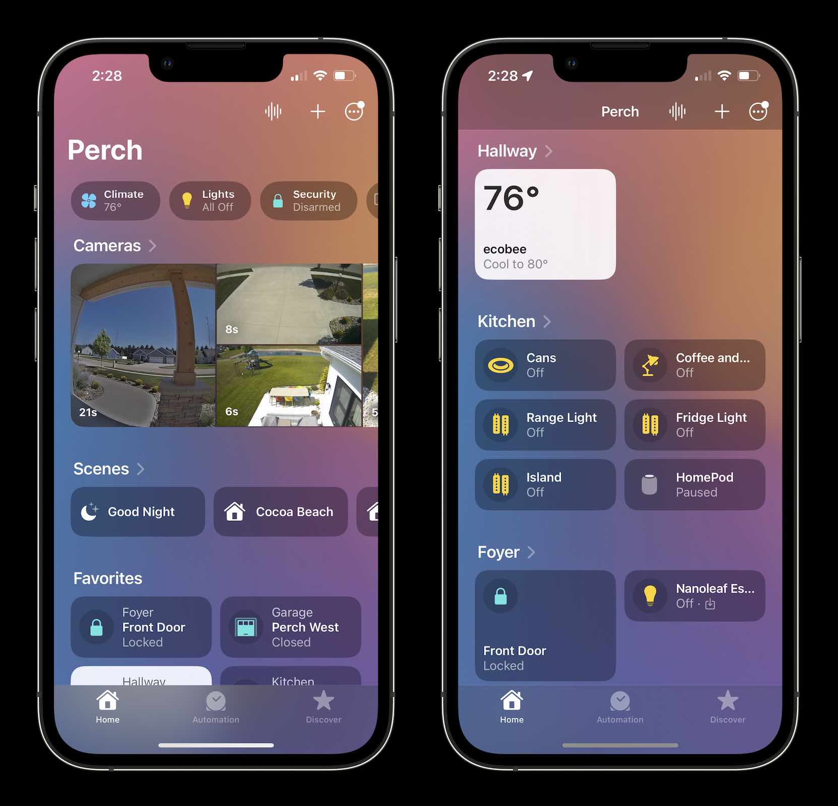
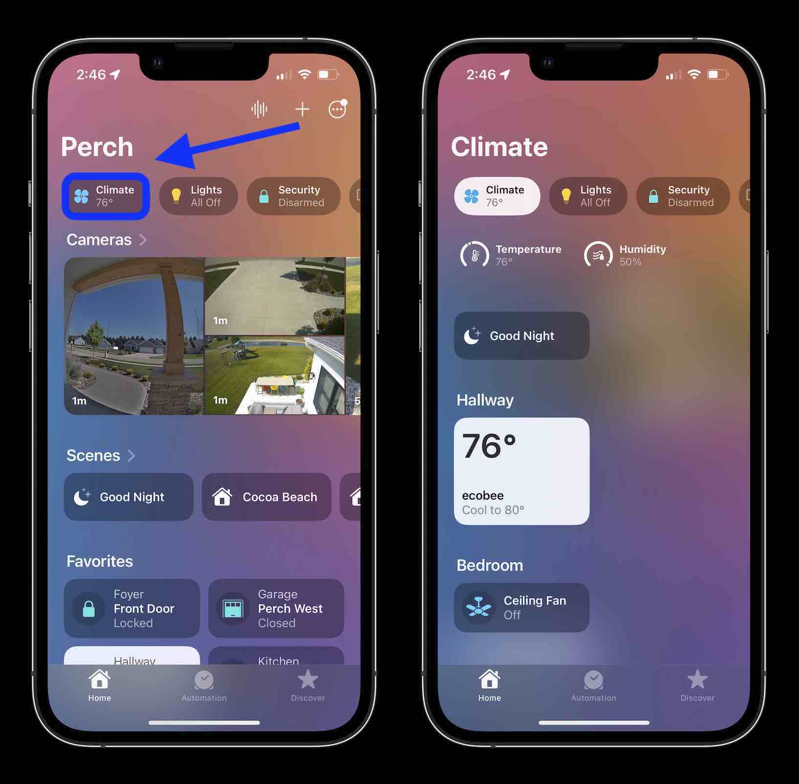
For the new top category buttons, new functionality includes showing all HomeKit devices, Scenes, and data that are related to it.
For example, tapping the Climate top category shows my Ecobee smart thermostat, our HomeKit-enabled ceiling fans (Lutron Caseta), temperature and humidity, as well Scenes that include any of those “Climate” devices.
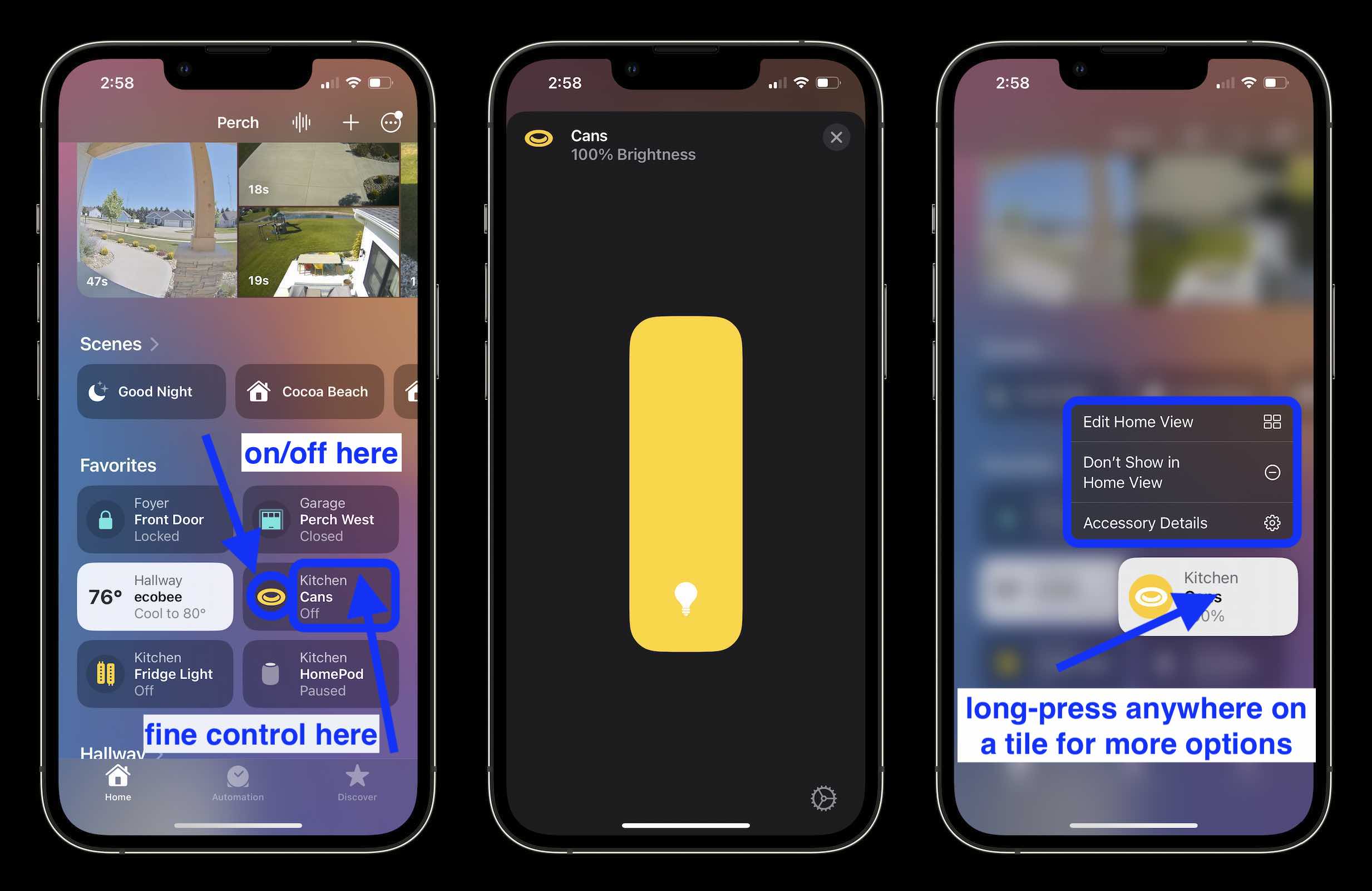
One of the notable updates in the Home app is a big shift in how the buttons work to control HomeKit devices.
In iOS 15 and earlier, you would tap a device tile to turn it on or off and long-press to get the more detailed control UI with things like colors, sliders, etc. for fine-grain control.
Now in the iOS 16 Home app buttons behave like this:
- Tap on the far left (circle icon) to turn devices on and off
- Tap on the middle or right side of a button to see the detailed control UI
- Long-press to see edit/customizability options and device details
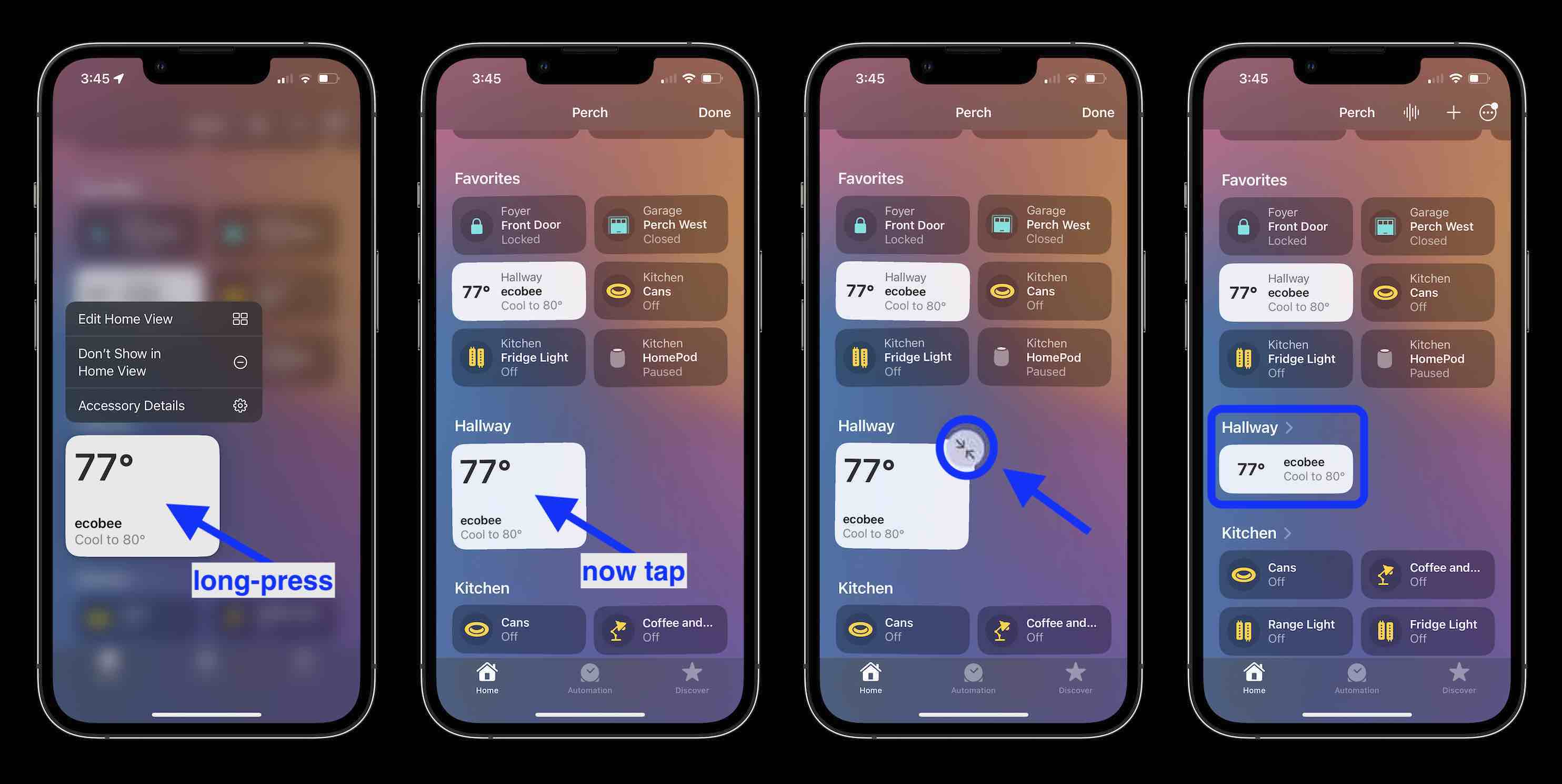
Another new feature is the option to resize device buttons, it’s a bit hidden but here’s how it works:
In iOS 15, the option to access the Home app’s settings was quite buried. Now in the iOS 16 Home app, Apple has moved overall settings and other customization buttons to the top.
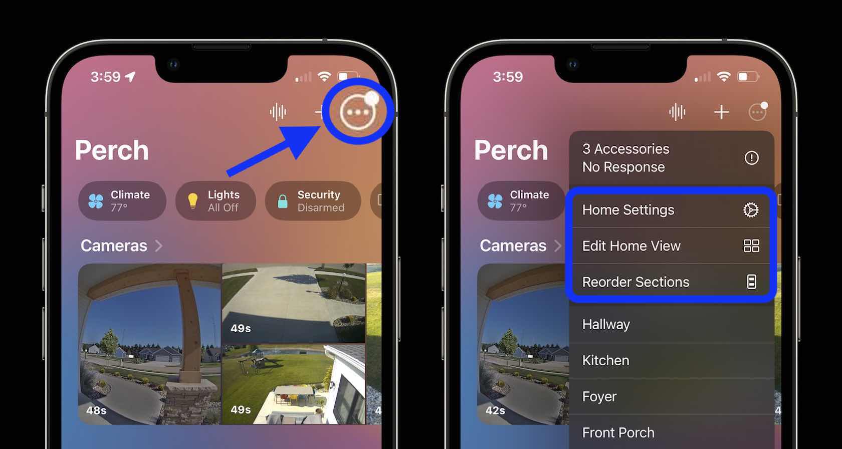
The + icon in the top right corner includes the option to add an Accessory, Scene, Automation, Room, People, or a New Home.
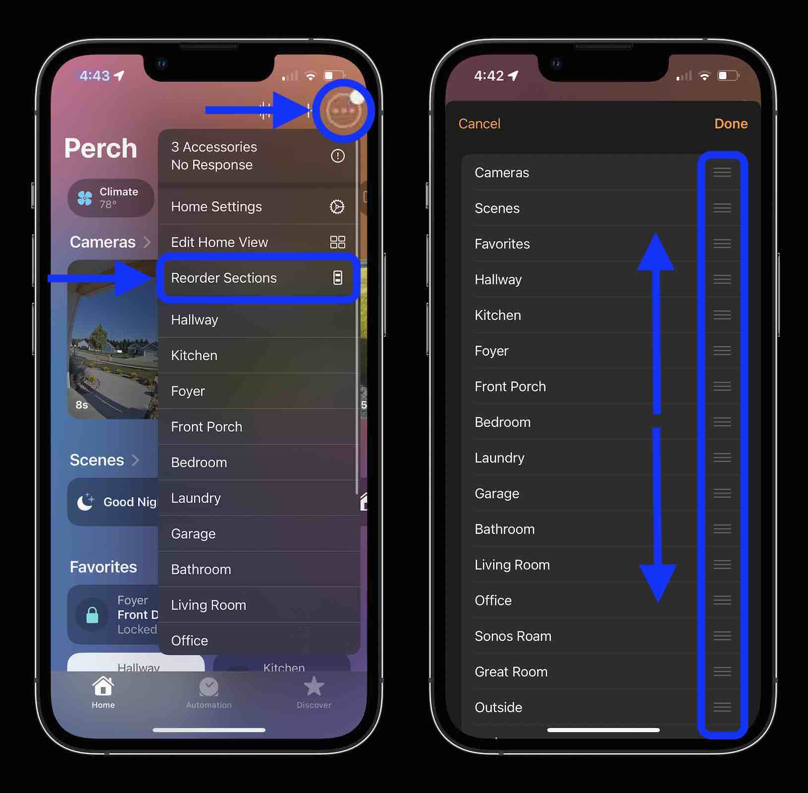
A really nice improvement with the iOS 16 Home app is the ability to reorder sections. As shown in the image above, “Reorder Sections” lets you customize the overall organization. And choosing “Edit Home View” lets you reorder devices in a given category (previously available in iOS 15).
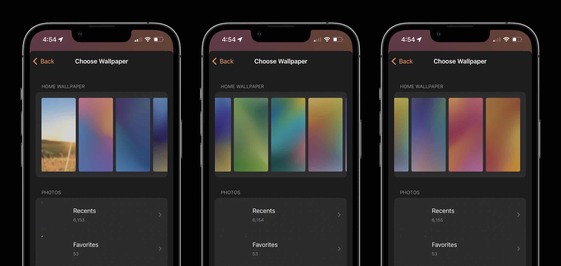
Another nice update is totally new wallpapers. The one shown off in the screenshots above is one of them with 10 total beautiful gradient choices – of course, you can still use a custom photo too. All of the built-in wallpapers appear to be new.
- Tap the three-dot circle in the top left corner of the Home app
- Choose Home Settings
- Swipe to the bottom
- Tap Choose from Existing under Home Wallpaper, then the built-in options are at the top
More details include:
- Automation tab and experience are mostly the same
- Rooms are now found under the three-dot icon in the top right corner
- The Discover tab remains at the bottom of the Home app to get new ideas
- iPads will work as downgraded Home hubs
What are you most excited about with the new iOS 16 Home app? Share your thoughts down in the comments!
- Focus mode in iOS 16: How to link with Lock Screens, create custom Home Pages, use filters
- Batch edit iPhone photos: How the ‘paste edits’ feature works in iOS 16
- iPhone not charging? Here are 6 ways to fix it
- Difference between MacBook Air and Pro: How the redesigned lightweight MacBook stacks up
Author: Michael Potuck
Source: 9TO5Google


