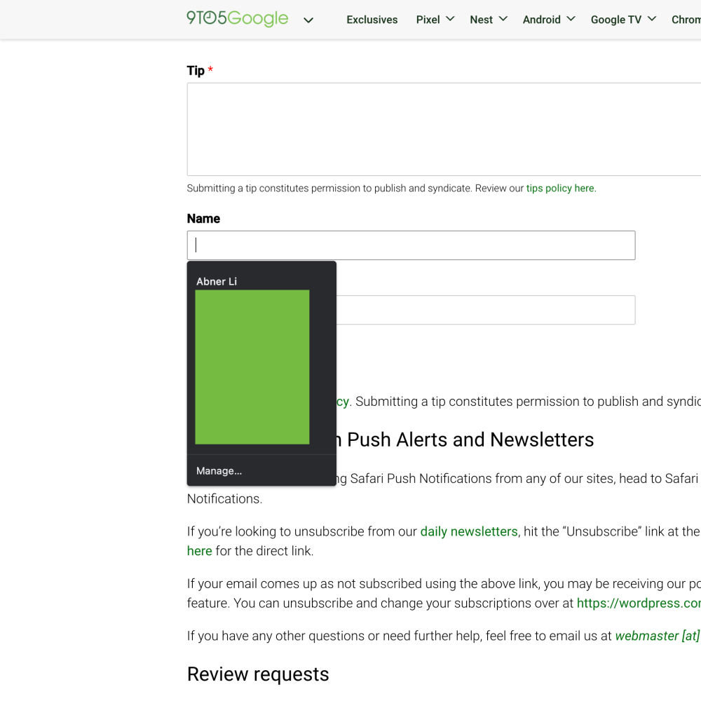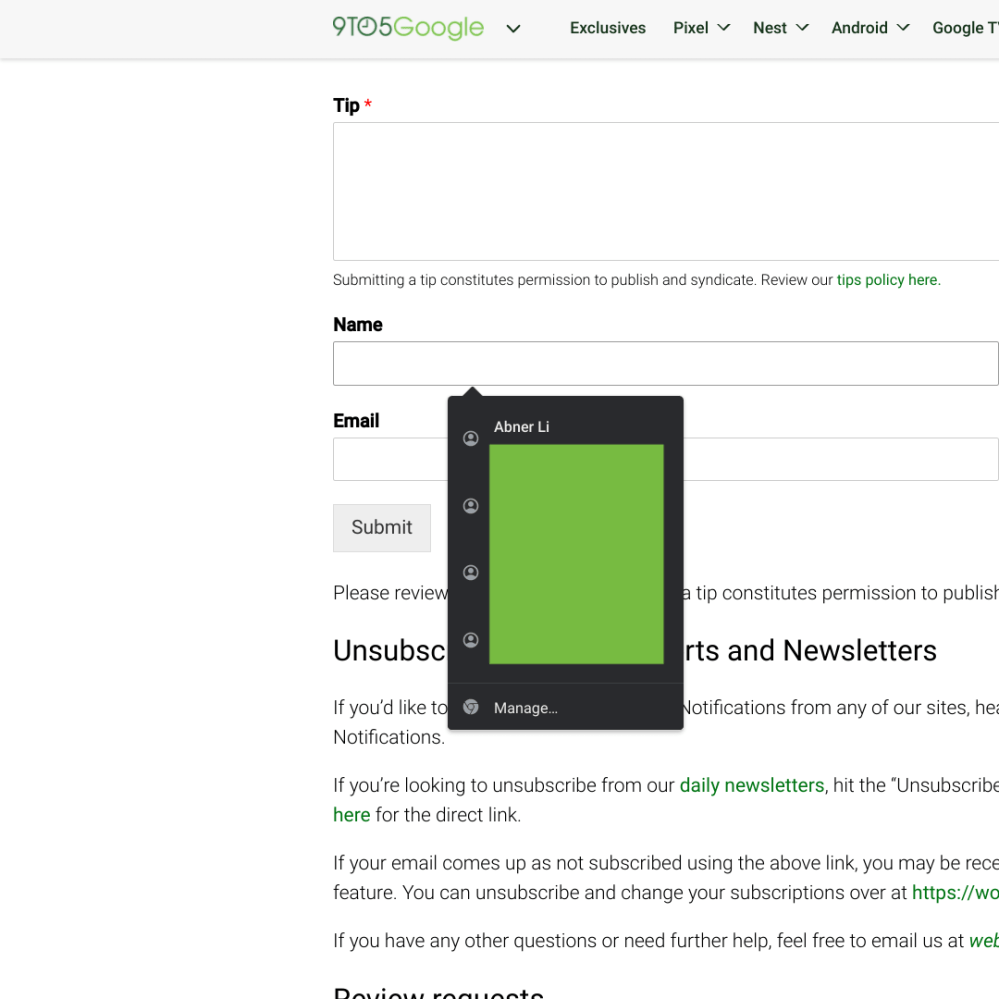
Most Chrome features these days are rolled out via server-side updates instead of browser updates. One such example of that is a small tweak to the autofill popup in desktop Chrome that greatly improves usability when filling out forms.
Previously, Chrome’s autofill popups that appear when you click on a text box were aligned with the left border of said box. Since those fields often have left-aligned descriptions either inside or just above, the autofill popup (of names, addresses, past search queries, etc.) covers up the prompt.
Chrome is now making it so that the popup is “aligned to the center of the initiating field and not to its border.” As a result, you can preview what fields are coming up next. Google says it’s center-aligned, but that’s not the case for wide fields.
As part of this change, the browser has also moved the autofill list ever so slightly lower, and added icons next to each entry that corresponds with the type of information.


Google started rolling out this tweaked autofill popup UI with Chrome 97 in January. As of today, we’re seeing it more widely available on Chrome 100 (CrOS) and 101 (browser). If it’s not yet live for you, enable the following flag:
chrome://flags/#autofill-center-aligned-suggestions
It should otherwise appear the next time you restart the browser, with version 101 hitting stable for desktop and mobile on Tuesday.
More on Chrome:
- Googler showcases the many web apps made possible by Chrome’s ‘Capabilities Project’
- Zoom app for Chromebooks gains better virtual background support, more
- Evernote for Android updated with Chromebook-optimized UI
- Chrome Web Store adding Established Publisher and Featured extension badges
Author: Abner Li
Source: 9TO5Google


