Google Keep has not seen a major update in quite some time — outside of a new icon, though it is already a mature Workspace application. Google is working on a small feature that will let you customize the background of Keep notes.
The capability was quietly announced today but is not yet rolled out — it could take up to 15 days. Once available, opening a note will show a “palette icon” to select a background of “designer-created images.” It sounds like this will be available for text notes, while the ability to add an image to a drawing and doodle on top of it is already available.
You can now customize your Google Keep notes on Android and iOS by choosing a background from a set of designer-created images — simply open a note, select the palette icon, and select a background. | Available to all Google Workspace customers and users with personal Google Accounts.
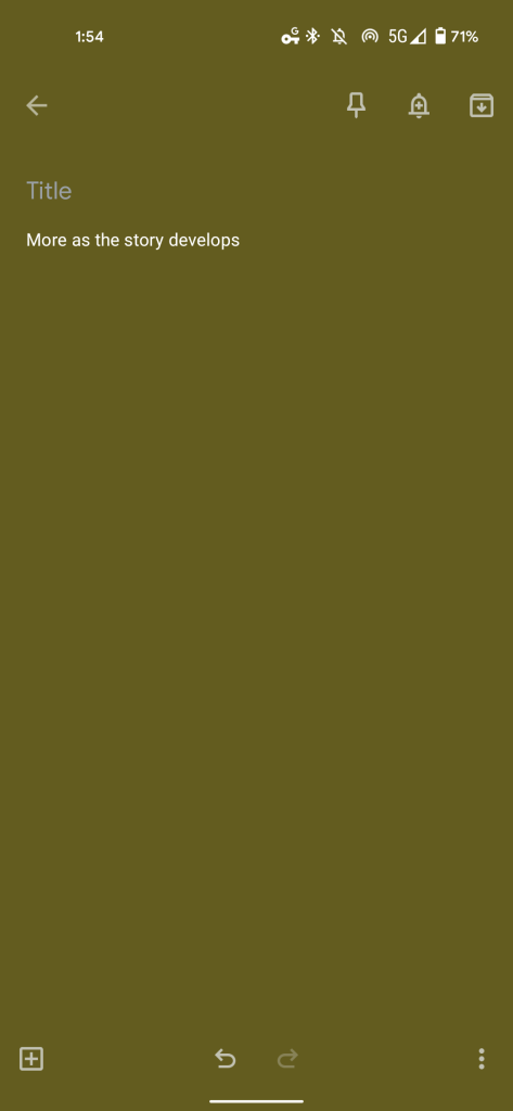
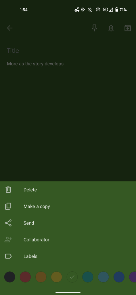
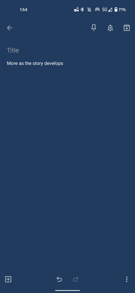
That aforementioned button does not exist today. You can only open the overflow menu in the bottom-right corner to get a carousel of 11 colors or the default no background option. This themes the entire screen and the note preview on the main feed.
A slight redesign of the notes UI might be coming to accommodate this addition. The upcoming capability itself is interesting in an era where “the iPhone app Notes has become the medium of choice for celebrity mea culpas,” as encapsulated by a New York Times Styles section piece from 2016. Meanwhile, a quick copy and paste to the Notes app is a common move for journalists getting statements and sharing to Twitter as screenshots. With this new feature, Google could be looking to make Keep a more attractive option for such behavior.
Once live, Google Keep backgrounds will be available for both Workspace customers and free users on Android and iOS. The web is not mentioned, and it’s unclear if the custom image will sync over.
Author: Abner Li
Source: 9TO5Google


