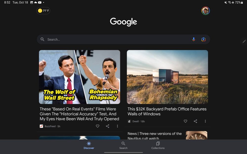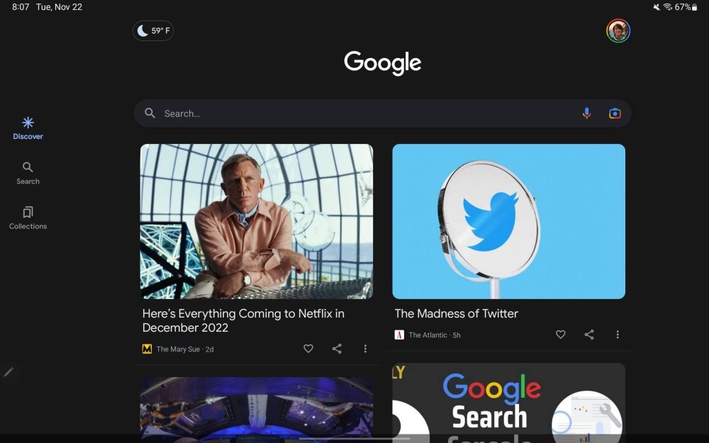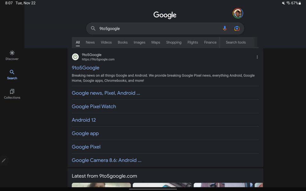
Google’s large screen optimization push continues with the Search app adopting a navigation rail on tablets, though it’s clearly early days.
The latest Google app beta — version 13.46 — switches to a navigation rail. Without the bottom bar, you get to see slightly more of the Discover feed, as well as Search results.
However, this is not a Material You (MD3) element as the icons for Discover, Search, and Collections don’t use a pill-shaped indicator, which is also the case for Google TV today. Your current tab is just highlighted blue instead of gray. The three elements are positioned roughly where you’d place your thumb instead of being exactly at the top, bottom, or even center-aligned.


Meanwhile, there’s quite a bit of padding between the navigation and where content starts. This could use some adjustment in future versions. For comparison, the Google app on the iPad uses a bottom bar.
It’s a good start, but further UI tweaks and optimizations are needed. We previously enabled an M3 redesign of the Google app that should also apply to the tablet layout.
Google Podcasts already features a two-column layout (though a Material You bottom bar is used), while Lens supports landscape orientation. More recently, Google Weather was similarly updated after previously only working in portrait.

More on Google app:
- Pixel Tablet readies new designs for Google Assistant and Discover [Gallery]
- Google app makes it easier to customize the Search widget on Android
- Google will show nearby places airing World Cup matches, add live mini-game, and more
- Google updates mobile Search results with larger favicons and site names
Author: Abner Li
Source: 9TO5Google


