The Google Admin console is how administrators manage Google services for people in their organization, and a redesign is rolling out over the coming weeks to help modernize it.
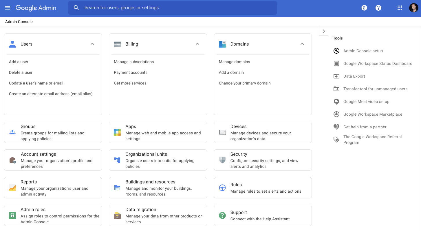
The top bar still leverages a blue accent color rather than switching to a completely white design like most other Google Material Themes. It helps distinguish this important site, while functionality there is unchanged. The last major identity change was in November when Google updated the Admin app icon as part of the broader Workspace branding refresh. It changed from a green gear and gray wrench logo to a blue hexagon.
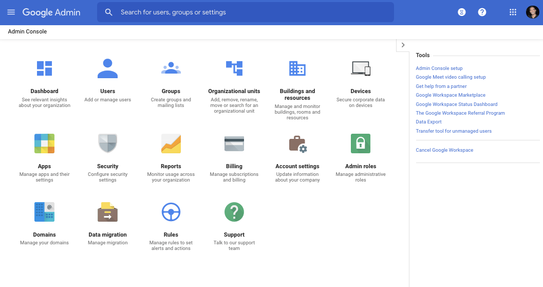
Meanwhile, instead of a grid of large icons, Google is now emphasizing the text descriptions of what each section does. This makes the view more dense, but it’s more functionally useful. Meanwhile, there are expandable/collapsible cards for Users, Billing, and Domains with “quick links to common items in those areas.”
Lastly, Google has “reordered items to make it easier to find the most used sections and complete common tasks,” while each item in the Tools sidebar is now accompanied by a handy icon and better spaced.
-

Previous -

New
We hope this design will make it quicker to navigate around the Admin console, easier to find items you need to manage, and simpler to understand how Google Workspace is deployed within your organization.
The Google Admin console redesign will begin rolling out today and be fully available over the coming weeks for all Google Workspace administrators.
More about Google Workspace:
- Google Chat web redesign is also coming to Workspace accounts
- Meet adds Global Dialing subscription for Workspace customers
- Assistant for enterprise Workspace users on Android is exiting beta
- Google Workspace gets new ‘Frontline’ tier and tools to help manage your time
Author: Abner Li
Source: 9TO5Google


