Apple is upgrading HomeKit this fall with new features like Secure Video and expanded automation, but it’s not all good news for Apple’s smart home framework. The Home app where users manage the smart home experience makes one design choice that is likely meant to make it more approachable. In practice, the change degrades the experience for a whole category of HomeKit products.
Difficulty managing the Home app at a glance when more than a few accessories are added has been a common complaint about the app’s design from the start. In iOS 13, Apple appears to be addressing this feedback with a change to how individual products with multiple accessories are presented.
In iOS 12, each accessory is presented as its own tile even if it’s part of a single product. This can result in a single HomeKit product populating the Home app with a half dozen tiles.
Apple’s Home app treats products with multiple accessories different in iOS 13. One product is one tile even if it includes two or more accessories. Fewer tiles means more usable at a glance, right?
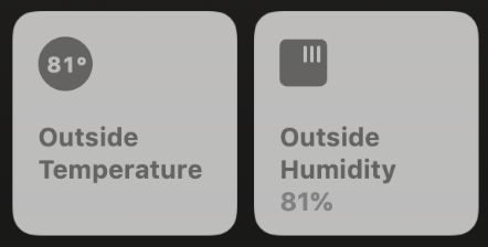
Not so fast. Here’s where it becomes a step back for products like this. The awesome Eve Degree sensor is a single HomeKit product that measures both temperature and humidity. Summer can be brutal on the Mississippi Gulf Coast where I live, so I really like knowing exactly how hot and how humid it is at my front door.
That information is glanceable in iOS 12 where each measurement is presented as its own sensor accessory:
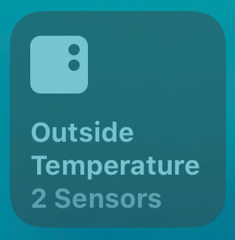
This is how iOS 13 presents the same accessory:
You can still expand the tile to show more information — in this case any information — but the tile for this accessory includes no updatable information.
Here’s another example using the indoor Eve Room product. This is iOS 12:
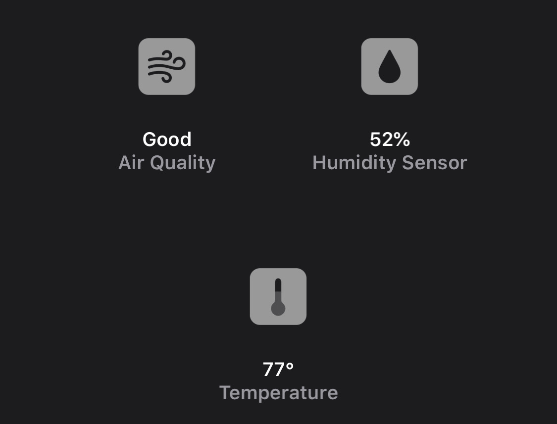
And this is the new approach starting with iOS 13:
Again, any useful information has been grouped into a single tile with no sensor data. Glanceable data is gone, requiring an interaction to actually see what those sensors are presenting:
While the change is disappointing for sensors, it’s downright confusing for other types of HomeKit products that include more than one accessory.
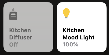
For example, the useful VOCOlinc Flowerbud diffuser and mood lamp is a single product with two very different HomeKit accessories. iOS 12 lets you easily view the status and control each accessory with individual tiles:
Here’s that same product squeezed into a single tile in iOS 13:
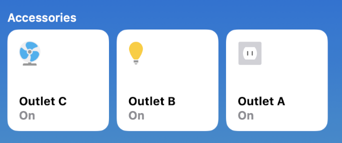
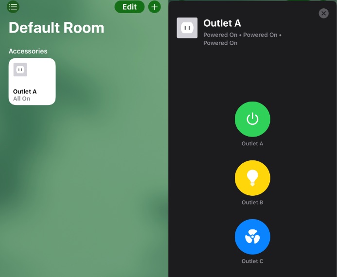
I realize the examples are becoming exhausting, but that just illustrates the disappointing experience in iOS 13’s Home app. This change even affects HomeKit power strips like VOCOlinc PM2E which can include plugs, lights, and fans as assigned by the user in the Home app.
iOS 12:
And iOS 13:
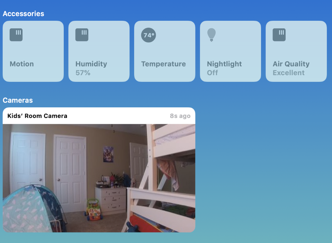
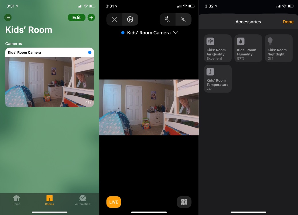
The worst example is saved for last: HomeKit camera sensors. The Arlo Baby Cam is primarily used as a video camera with sound input and output. A firmware update to the camera later added support for five additional accessories using the product’s built-in sensors.
Five more sensors is an awesome improvement to an already great HomeKit product — at least in iOS 12:
If you want to read the same sensor data in iOS 13, simply tap on the camera tile, view the live video feed, find the button for other accessories in that room, then bam, you’ve managed to do something that was zero steps in iOS 12.
Glanceable information isn’t the only benefit lost. Discoverability is a casualty too.
This design choice isn’t just a glitchy software bug found in a beta version of Apple’s software. It’s an intentional design change that required developing for this update. It hasn’t improved as the rest of the operating system has started to stabilize; it’s only grown worse.
Why did Apple make this change? The idea is logical. One product should have one tile that can be expanded to show every included accessory. It reduces the tile count and clears up which accessories belong to which products in your home.
The current answer being tested in each iOS 13 beta so far doesn’t appear to be the correct solution however. Glanceable information is removed and very different types of accessories are squeezed together.
Apple’s Home app already has a solution to the too-many-tiles problem. Users have control over which tiles appear on the Favorites section of the Home app. You can show as many or as few as you choose.
Accessories are only unpacked when you view a specific room, and even then you only see which accessories are located in that room. iOS 13 even improves this by moving bridges that offer no data or control to a different part of the Home app.
The Home app also has a mechanism for grouping accessories — if you choose — which is useful for turning multiple bulbs into a single lamp. iOS 13 could learn from that approach with a toggle to unpack accessories grouped under a single tile. The default can be bad as long as there’s a logical way out.
Subscribe to 9to5Mac on YouTube for more Apple news:
Author:
Source: 9TO5Google
Tags:


