Despite being available for most of the beta period, Google pulled unified Pixel Launcher search with the Android 13 stable launch, but it’s now starting to come back with QPR1 Beta 1.
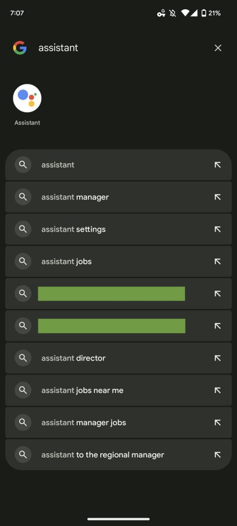
The search field at the top of your app grid is again identical to the one at the bottom of the Pixel Launcher. You can quickly launch Google Lens and perform Assistant voice queries from either, while there’s now one visually similar experience for searching device and web content.
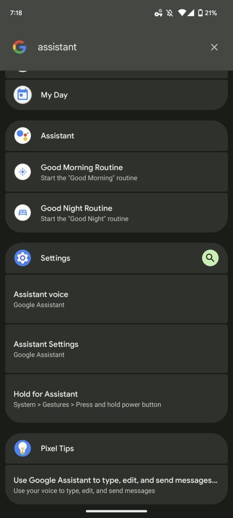
However, the actual results you get back differ depending on where a lookup is initiated from. Searching from the top of the app grid consistently limits web results to four lines, while you get a “From this device” section that shows app shortcuts, as well as results from the Settings app and Pixel Tips. That section does not appear when you search from the homescreen, which just surfaces up to five app results in a row and web content.
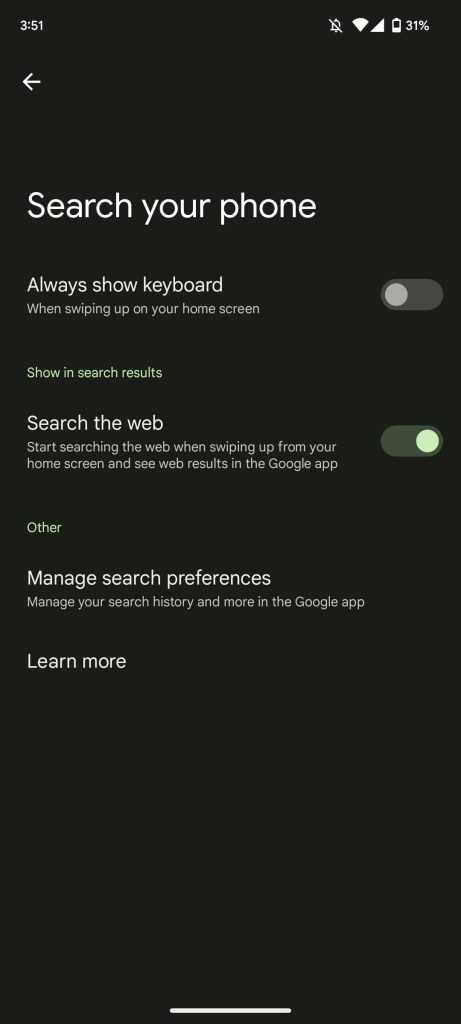
Meanwhile, Pixel Launcher Home settings > Search your phone only shows “Search the web” with “People” (contacts and conversations) missing. This could be an A/B test.


As such, this is basically the previous approach that’s currently live on Android 13 stable but with a more modern UI that matches device search. A visual revamp was badly needed, and this is better than the legacy look, but it remains baffling that Google changed things at the last second.
The company told us last month that it was aware of the issue and would resolve it in an “upcoming release.” That’s increasingly looking like Android 13 QPR1, which is set to enter stable in December for Pixel phones. Hopefully, Google will bring back more of the beta interface sooner than later.
More on Pixel:
- Google may be working on a second, ‘Pro’ Pixel tablet for next year
- Android 13 QPR1 details how face unlock should work on the Pixel 6 Pro
- Pixel Recorder 3.7: Android 13 media player, UI tweaks, and simplified sharing
- Upcoming Pixel tablet and dock appear in new Android 13 animations
Author: Abner Li
Source: 9TO5Google


