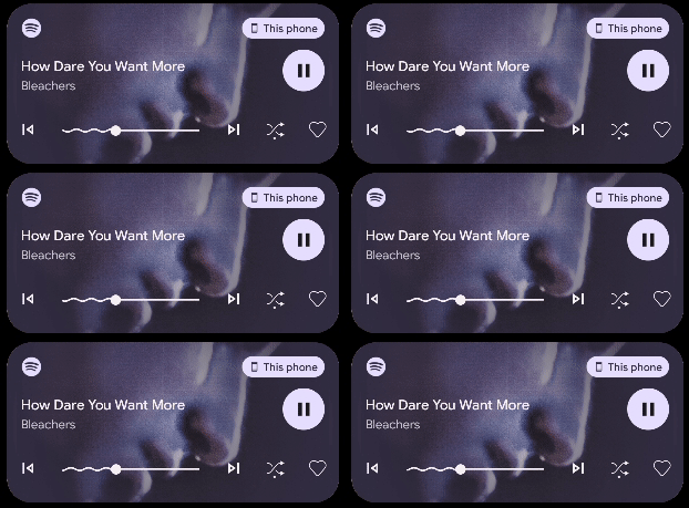
Google radically redesigned Android’s visual language with Android 12, and it seems the company is set to refine that look in Android 13. As a part of the first beta to Android 13, Google has updated the media player notification with a new squiggle look for the track scrubber.
As highlighted by Google itself, the media player notification in Android 13 now has unique track scrubber line. Instead of a simple line, Android 13’s progress bar now changes to a squiggle look for any media that has already been played. While Google highlighted the change in a promo image, it is live in Beta 1 as pictured below.
This look was foreshadowed when Google first unveiled Material You. The squiggle we now see in Android 13 is clearly seen, for instance, in Material You’s announcement video from this time last year. You can see it around the 0:07 mark.
Notably, too, this change also comes following Google revamping Android’s media player notification in Android 13’s last developer preview. That update brought back prominent album art to the notification as well as revamped controls.

We’re still digging through the first Android 13 Beta release, so stay tuned for everything that’s new and hit us up on Twitter or in the comments below if you’ve spotted something we have not.
More on Android 13:
- Here’s everything new in Android 13 Beta 1 [Gallery]
- How to install the Android 13 Beta on Google Pixel
- Google rolling out Android 13 Beta 1 for Pixel phones
Author: Ben Schoon
Source: 9TO5Google


