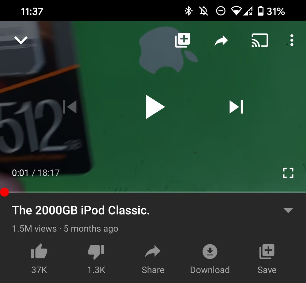
As the world’s biggest video-sharing platform, YouTube goes through almost constant transformation with tweaks, adjustments, and overhauls on an almost yearly basis. The latest looks to be iOS-style line icons within all YouTube menus, sub-menus, sections, and even in the player window.
The new icons have already been available on iOS for a few months at this stage, with sharper, precise lines being used for the various YouTube menu icons. It feels very reminiscent of pre-Marshmallow era Android — and we’re not sure if it’s particularly attractive compared to the designs already being used.
According to the guys at Android Police, reports suggest that many people running the YouTube 15.41.32 beta build on Android are now beginning to see the new line icons in place of the ‘filled-in’ versions there already.
It’s quite the UI change if you haven’t seen them before — although iOS users will have been finding them quite the contrast when using the various toggles and sections. Having used both iOS and Android quite extensively, I’ve found them to be quite jarring when swapping between either mobile OS.
You can see the full changes between the iOS-style refresh and current icons — which even includes the “Cast” icon updated — below:
We’re not entirely sure what the theory is behind the YouTube icons changing, but parity between both platforms is kind of important. On top of that, we’re not convinced they are more visible or even add anything to YouTube by being lines rather than filled-in icons.
If you have started seeing the new line icons on YouTube for Android, be sure to let us know down in the comments section below. And, what do you think? Are you a fan of the new design — or do you hate them? Sound off below.
- Toxic YouTube comments might improve, thanks to new pop-up reminders
- YouTube experiments and beta features now only available to Premium subscribers
- YouTube TV is now ‘YT TV’ on Android homescreens as icon tweaked on Google TV
Author: Damien Wilde
Source: 9TO5Google


