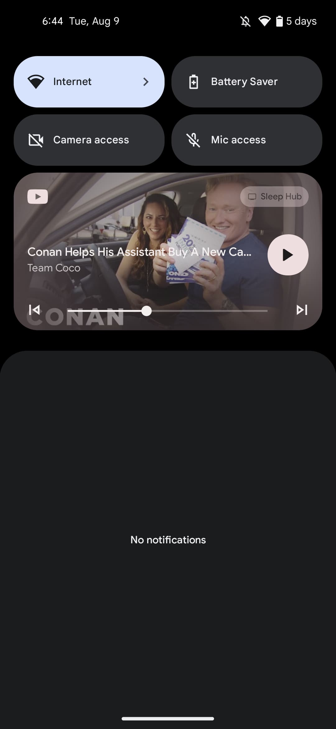
Three Google apps already support Android 13’s redesigned media controls, and the fourth should be YouTube over the coming weeks.
Version 17.32.32 of YouTube for Android is currently in beta and targets API 33. Most people will notice the updated player when Casting videos, while it’s also important for YouTube Premium subscribers that use background (audio-only) play.
Compared to YouTube Music, Google Podcasts, and even Chrome, the change is more minimal for the main YouTube app. There’s of course the rounded square pause/circular play button, while the progress bar spans nearly the entire width of your screen.
The other available button is “next” (though “back” appears when in a playlist) to the right of the scrubber, while YouTube has removed the “x” for closing a notification or quickly ending a Cast session. That particular loss is somewhat unfortunate as swiping just removes the notification rather than ending what’s playing. Lastly, given the more prominent play/pause button position, you see slightly less of the video title.
YouTube 17.32.32 with this modernized controls UI is currently in beta, but should arrive in the stable channel (currently 17.30.x) over the coming weeks for all Android 13 users. Major streaming apps like Spotify (or smaller ones like Pocket Casts) have yet to be updated, but there’s still time before the consumer launch on Pixel phones.


More on YouTube:
- YouTube rolls out experimental ‘pinch to zoom’ feature for Premium users
- YouTube now lets creators turn their existing videos into Shorts
- YouTube partners with Shopify to add in-video check out
- Google Meet will soon let you play Spotify, YouTube, UNO, more on Android
Author: Abner Li
Source: 9TO5Google


