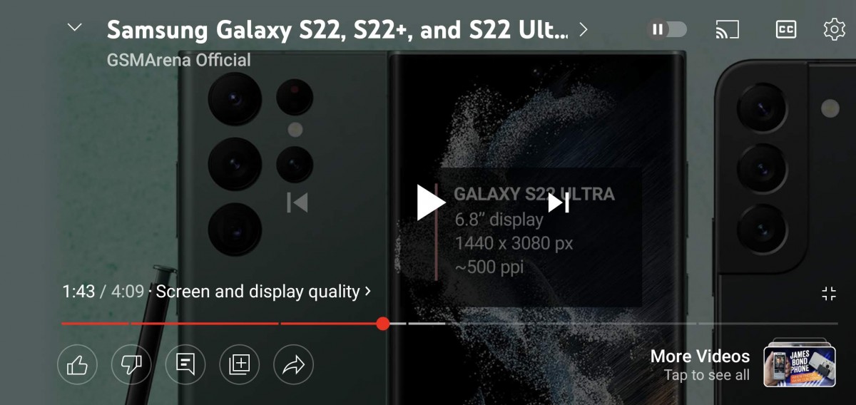
The YouTube app on Android and iOS appears to have received a new video player UI containing all key elements in full-screen mode. The update seems to be a server-side one and adds a row of icons in the bottom left corner. These include like and dislike buttons as well as a quick toggle to the comments, save to playlist and share buttons on the left side while the right one has a more videos tab that brings up recommended content. Music videos also get the listening controls tab in the middle.

We tested the new UI on an Android 12 device running version 17.03.35 of the YouTube app. Interestingly enough you can still dislike videos but you don’t get to see the counter. The new controls allow for a lot more flexibility while watching full-screen content removing the need to minimize the video for interacting with key functions.
Author: Michail
Source: GSMArena


