YouTube for Android TV is rolling out new tweaks to the player UI that have more than a hint of Material You.
There haven’t been too many changes to the actual player UI on YouTube for Android TV for a little while. Last year we saw a few tweaks including an updated playlist UI for viewing videos in a series. Another test saw video descriptions and channel access shortcuts highlighted from within the player view.
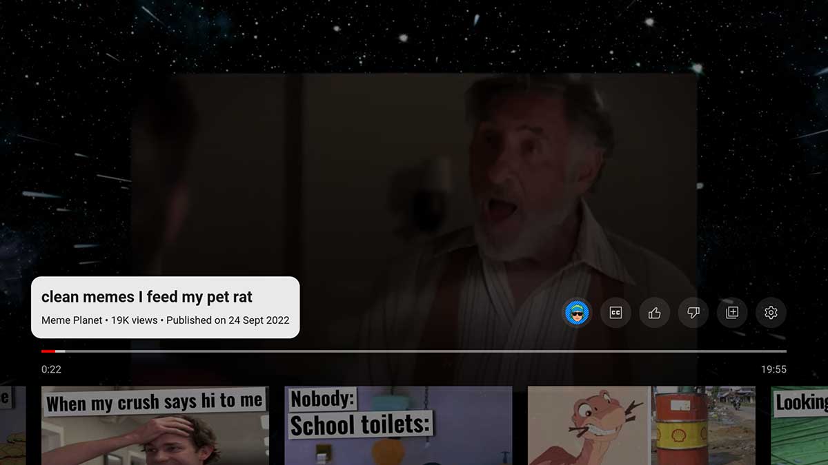
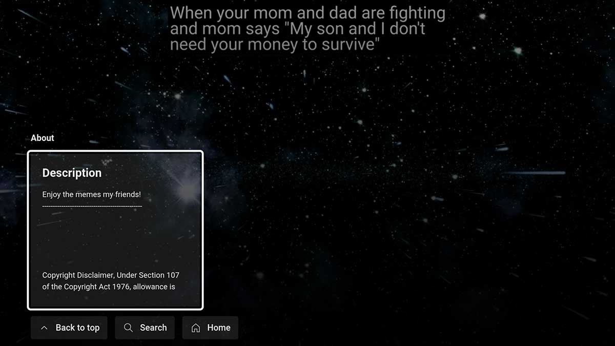
If you’re using YouTube for Android TV or Google TV today, you may spot a new player UI that has a hint of Material You with a rounded pill-shaped video title and description box that can be expanded to give you the full details of a playing video.
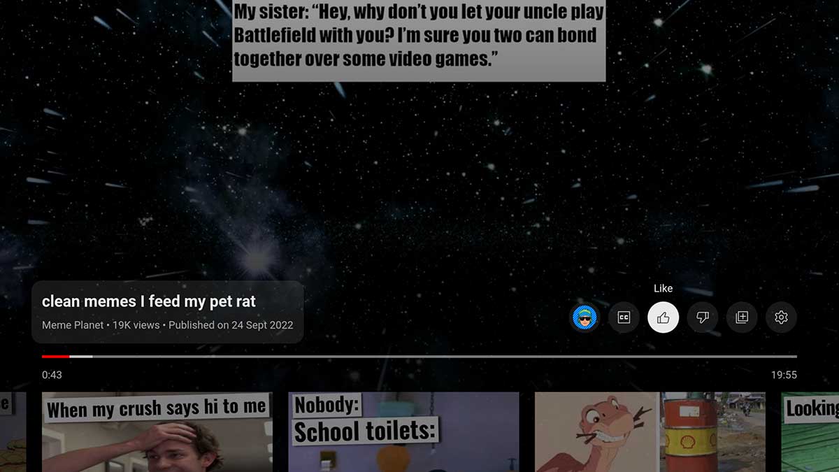
When playing videos, this larger Material You info “pill” looks to have replaced the upper-left title text. Sat just above the playback progress bar, it shows the view count, large video title, small channel name, and upload date. Annoyingly this does obscure more of any YouTube video you’re viewing as content is dimmed. This isn’t the only change, as the channel details and further video controls are now moved off to the left side of the YouTube player UI on Android TV and Google TV-powered devices.


If you tap or use a remote to scrub through the player timeline, related content is still shown underneath. It is hard not to feel that this move makes the experience a little more congested. Accessing the Like/Dislike, channel info, playback speed, and quality controls is now a little slower as more taps are needed to access these controls.
We’re seeing this updated UI across a number of Android TV and Google TV devices including Nvidia Shield TV, Chromecast, and more. It’s likely that this is rolling out slowly to more accounts.
More on YouTube:
- Google purges Stadia’s YouTube channel following shutdown announcement
- YouTube tests requiring Premium subscription for 4K videos
- YouTube handles rolling out to channels for easier ID and mentions
Author: Damien Wilde
Source: 9TO5Google


