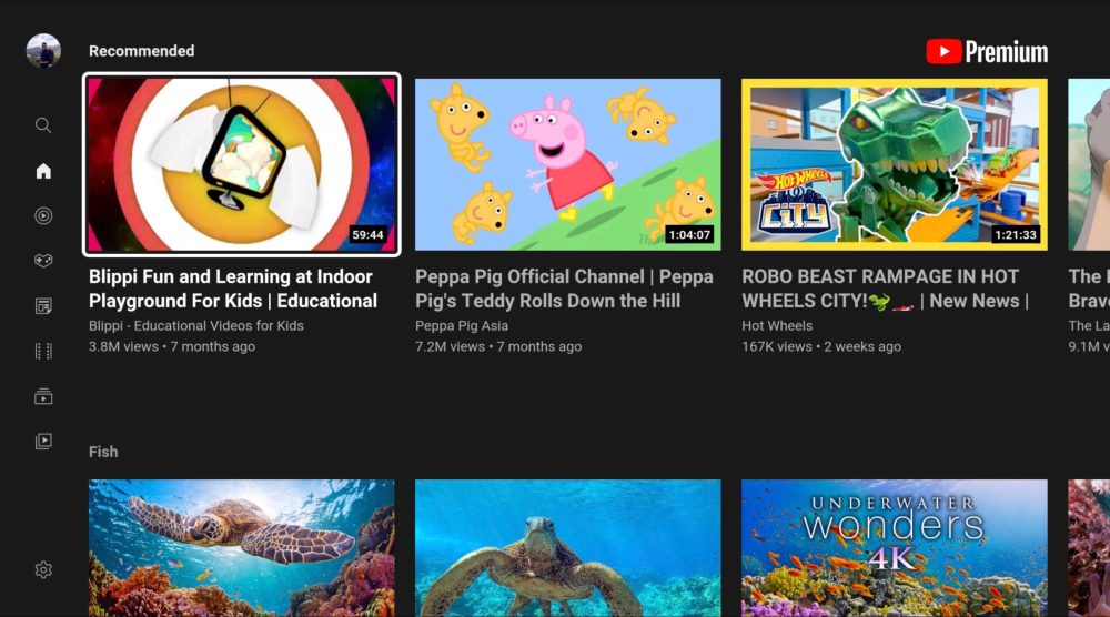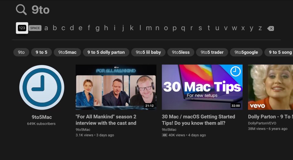
Google has started to roll out a major redesign to the YouTube application on Apple TV with tvOS. This update brings the latest YouTube interface that Google uses on other platforms to Apple’s streaming box, nearly a year after it first came to Google TV.
Google first started rolling out the basis of this new user interface to Google TV in November 2019. It then made some additional tweaks to the interface in March of the following year, bringing new borders, darker backgrounds, and other aesthetic changes.
This redesign is now rolling out to Apple TV users around the world. It represents a pretty noticeable update compared to the previous Apple TV interface, bringing a more modern and less boxy overall design. If you’re not a YouTube Premium subscriber, you might notice a large Masthead ad as well.
The YouTube app for Apple TV has faced some criticism for disobeying the tvOS platform consistencies, such as gestures on the trackpad behaving differently than in other tvOS applications. The jury’s still out on whether or not this latest update makes any improvements to that aspect of the application.
The new version of YouTube for Apple TV appears to be rolling out slowly, so you might not have it just yet. It was first spotted by a Reddit user in Germany, and we’ve confirmed that it’s also rolling out in the United States, but your mileage may vary.
What do you think of this newest YouTube app design for Apple TV? Is it an improvement over the previous design? Let us know down in the comments!


Read more about Apple TV and YouTube:
- Older Apple TV will require AirPlay for YouTube video playback starting next month
- YouTube no longer works on third-gen Apple TV, here are your options
- Apple TV gains 4K YouTube video playback, but HDR and 60 fps still missing
- tvOS 14 brings support for streaming YouTube in 4K on Apple TV
Author: Chance Miller
Source: 9TO5Google


