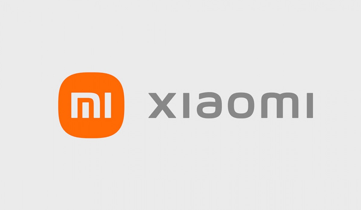
Day two of Xiaomi’s Mega Launch event brought us the brand’s first foldable smartphone – the Mi Mix Fold but there was another non-tech announcement on stage. The new Xiaomi logo is here and it brings a brand new “Alive” branding identity designed by Japanese graphic designer Kenya Hara.

The big change in the new logo is its rounded edges. There’s also the new MI typography which adds a more aesthetically pleasing look to the company’s name next to the logo. Xiaomi specifies that it wanted a more agile look to its brand identity and one which symbolizes its agile nature heading into the next decade.
Author: Michail
Source: GSMArena


