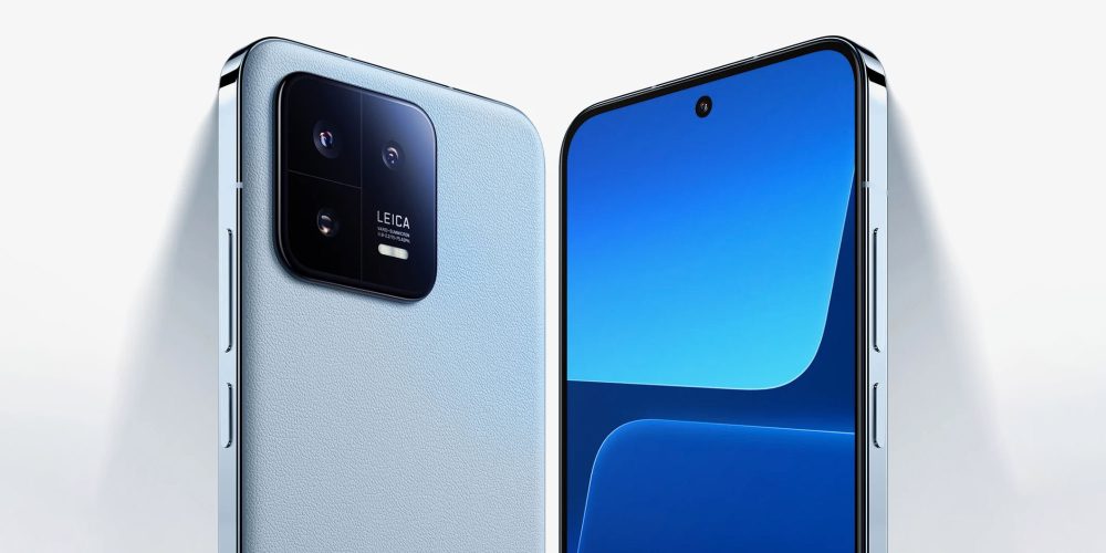
Apple’s design language has been copied by many other companies over the years, but one of the worst offenders has always been Xiaomi. With its new Xiaomi 13 flagship, the company is staying true to its age-old strategy, opting for a design that could easily be mistaken for an iPhone at first glance.
Xiaomi’s latest flagship looks familiar…
As pointed out by ArsTechnica, the new Xiaomi 13 doesn’t try to hide where it got its inspiration. The device features a 6.36-inch display with flat edges that feature a stainless steel finish. Even the color of the device used in most of Xiamoi’s press images is eerily similar to the pacific blue finish that Apple used with the iPhone 13 Pro last year.
On the bottom of the device, you’ll find a USB-C port for charging alongside a SIM card tray and speakers. The back of the device houses a square-shaped triple-camera setup that resembles Apple’s design, just with a distracting “Leica” logo.
The biggest differentiating factor between Apple’s newest iPhone design language and the Xiaomi 13 is the back. Xiaomi has opted for a soft-touch finish with a bit of a rounded design. Apple, of course, uses a flat glass design.

Despite being mocked on a regular basis, Xiaomi has repeatedly had no shame in cloning Apple’s designs. Last year, for instance, many were quick to point out that the Mi Pad 5 Pro bore many similarities to the iPad Pro. The company’s designs have evolved almost in tandem with Apple’s, with the company’s 2018 flagship smartphone looking nearly identical to the iPhone X.
Xiaomi CEO Lei Jun even acknowledged the company’s plans to “benchmark against Apple” in an interview this year, saying in an interview that competition in the high-end smartphone market should be viewed as “a war of life and death.”
Whether or not Xiaomi’s strategy of repeatedly cloning Apple’s designs will work in the long term remains to be seen. What do you think? Let us know down in the comments.
Author: Chance Miller
Source: 9TO5Google


