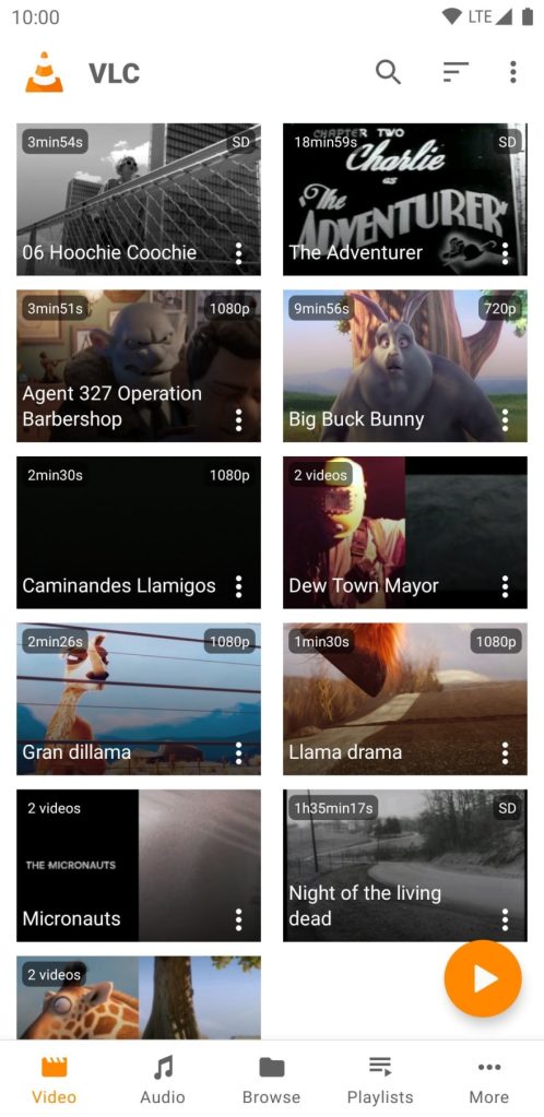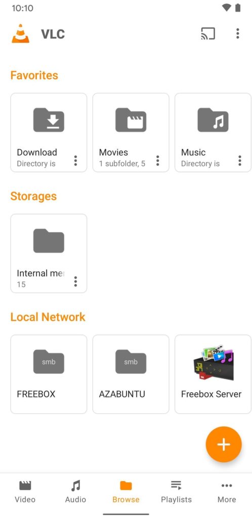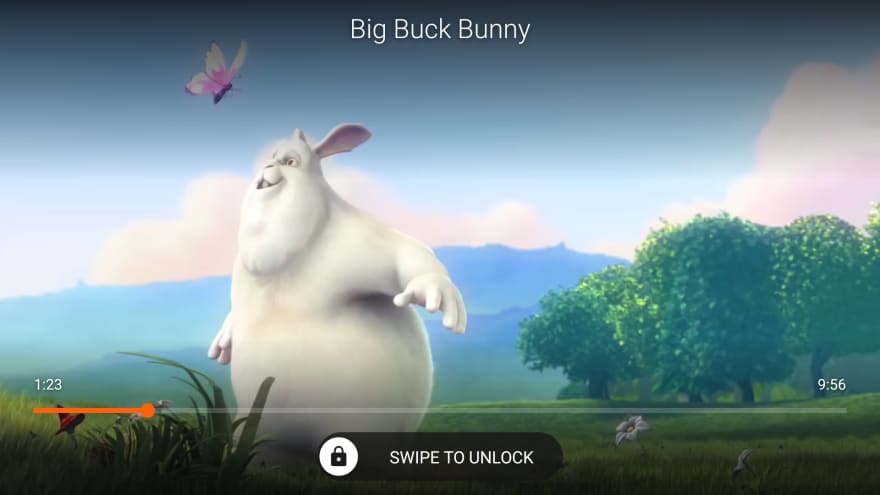
The VLC 3.3 update for Android has now dropped on the Google Play Store with a multitude of UI tweaks and enhancements that will make the utility-knife media player even more of a smartphone essential.
All of the new changes brought with the VLC 3.3 update were announced in an official blog post, the most notable new change being a more cohesive Google Material Design style UI.
Many of these enhancements were already available as part of the VLC 3.3 beta, but tweaks have been made since first appearing on the preview version of the app.
The main navigation sections are now part of a bottom navbar that will make it much easier to access sub menus and sections on devices with larger displays.
You’ll get “Video”, “Audio”, “Browse”, “Playlist”, and a “More” section within fingertip reach. The old system still relies on the side hamburger menu, which when using Android 10 or 11 gesture navigation can be a little bit frustrating to use.
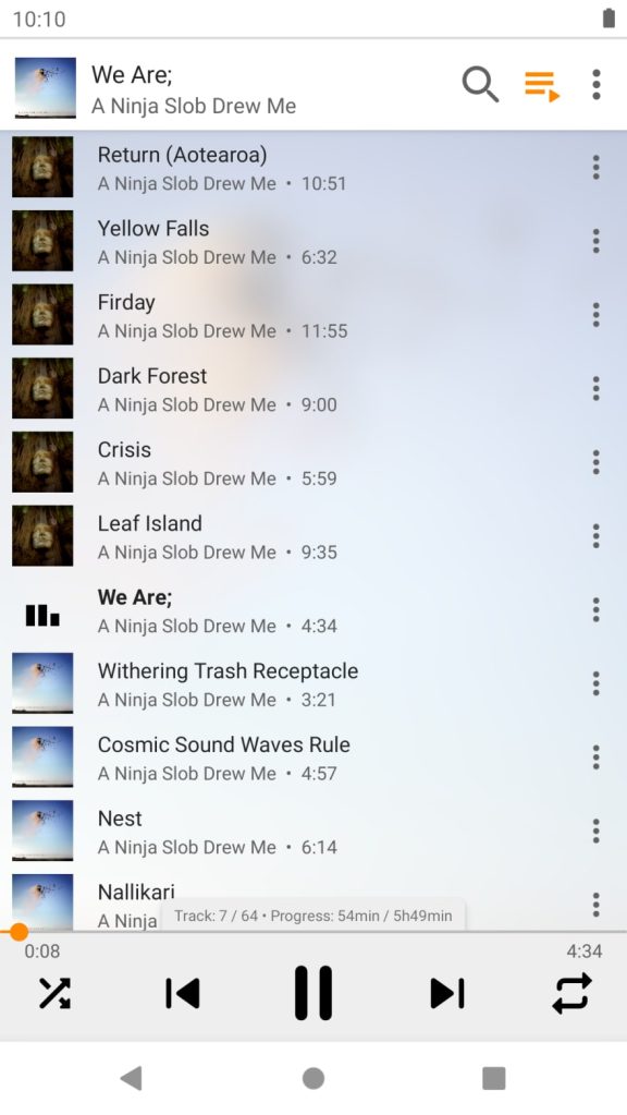
VLC 3.3 has also improved the audio and video player will now show progress much more clearly, with the audio player specifically notifying you of current playlist progress in a similar manner to that of the soon-to-be-defunct Google Play Music.
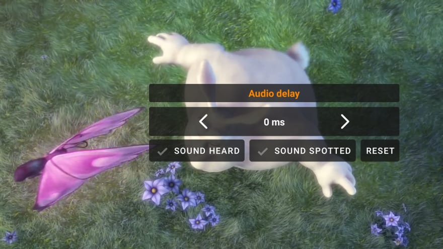
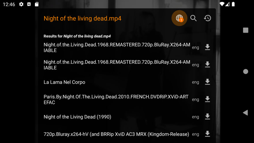
As for the video player, the lock player option has been tweaked so that you can lock video orientation alongside the scrubber controls and play/pause button. Subtitle downloads and video audio track selection has also been revamped for a cleaner look and experience. You can even fine-tune the audio tracks with a completely new interface that allows you to play multiple tracks in sync with a floating menu.
On top of that, VLC 3.3 also improves support for DVD and Blu Ray media, and when playing either format, playback progress will be saved for easier resumption later on. According to the announcement blog post, the 3.3 update is rolling out right now via the Google Play Store — while many of these features are also set to head to the Android TV version very soon.
Author: Damien Wilde
Source: 9TO5Google


