
The Galaxy Watch 4 is still, for now, the best smartwatch for Android users. With Wear OS on board, it serves almost every Android users well, whether they’re using a Samsung Galaxy phone, a Pixel, or others. But it’s still very much a Samsung-first smartwatch, and Samsung’s priorities taking the lead. One of the most frustrating things about the Galaxy Watch 4 is that its second button, now almost a year later, is still virtually useless.
There are two buttons on each version of the Galaxy Watch 4. The top button acts as a “home” button, with a single tap always returning you to the watch face. It can also wake the watch from sleep. The bottom button is a “back” button able to go back one screen in the interface if you have an app or settings page opened.
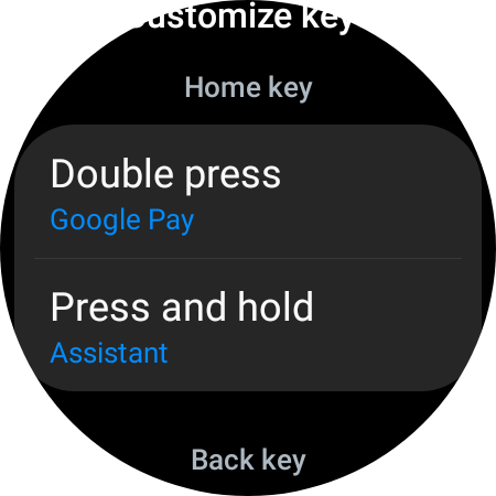
Both of these buttons have additional functionality, though. The top button can be used, by default, to access Bixby on a long-press and to access health tracking tools with a double-press. The bottom key is used to access Samsung Pay on a long-press, and the single-press action can also be remapped to open up your recent apps screen instead of going back.
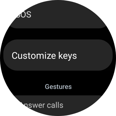
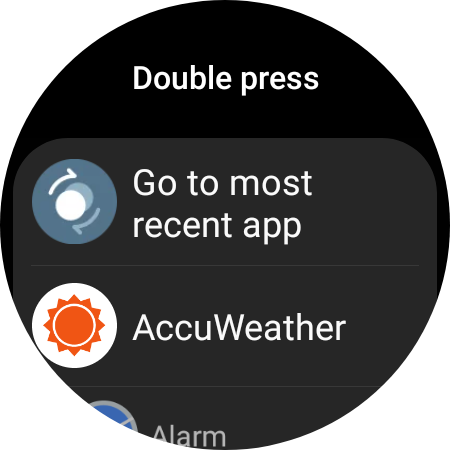
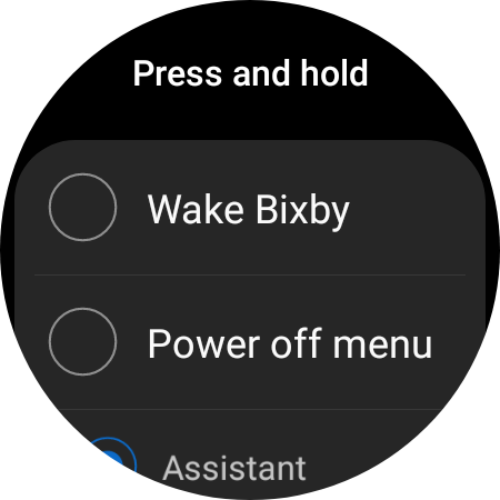
But the top button has a capability the bottom one does not. It can be remapped to do much more. As many other Galaxy Watch 4 owners did this week, I dove into the settings to adjust the long-press gesture of the top button to access Google Assistant instead of Bixby – it just feels so good to know that’s possible now. A double-tap gesture on that top button can also be remapped to access Google Pay.
However, I was quickly reminded while adjusting those shortcuts that, nearly a year into the Galaxy Watch 4’s life, that bottom button is still essentially useless. Unlike other Wear OS watches, which allow you to customize the functionality of either button, Samsung restricts this bottom button to only two functions. It either acts as back/recents, or as a shortcut to Samsung Pay. There’s plenty of validity to trying to keep things simple on this key, as “back” is a pretty important function. But given how much flexibility Samsung gives to the home button, it seems arbitrary that Samsung Pay gets this forced shortcut. There’s no way to remap that function to Google Pay, or to any other app you might use.
It’s frustrating!
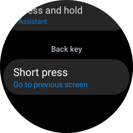

Samsung Pay was once a service with a killer advantage over Google Pay and Apple Pay – MST payments that worked on any card reader, but those days are long gone. As such, Samsung Pay is just another option, and it’s one that, arguably, has no advantage over the Google Pay that many Wear OS owners will already have set up with their cards. There’s no harm in having both services installed on the watch, but all of this time later, there’s no way to forget that Samsung Pay is there. And that’s especially frustrating given that a long-press gesture is far more intuitive than a double-press.
And really, there’s valid reason for people to want Samsung Pay replaced with Google Pay on their devices. Some users on Reddit, expressing the same frustration I have, pointed out that Samsung Pay doesn’t work as well as Google Pay in some regions. In Canada, for example, Samsung Pay doesn’t work with debit cards, where Google Pay does.
One can hope that Samsung will eventually tweak this functionality, but it seems unlikely, to say the least.
Samsung Pay isn’t going anywhere, and it still retains an intrusive presence on Galaxy smartphones. If Samsung won’t get around to updating Samsung Pay on phones so it doesn’t interfere with Android’s gesture navigation, it certainly has no problem leaving the Galaxy Watch 4’s bottom button as a hardcoded shortcut to the service that requires advanced third-party apps to get around.
It was also this way on Tizen, too. But that was before Samsung’s smartwatches actually had choice and a decent number of apps. I think it’s time for a change.
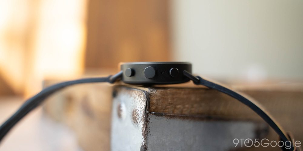
Wear OS set the precedent here, too. Wear OS allows smartwatches with multiple buttons to remap both of them. The Skagen Falster Gen 6, for example, has three input methods – two buttons, and a rotating crown. This is essentially what the Galaxy Watch 4 has – two buttons, and a rotating bezel. On Skagen’s watch, users can set an app to open with a press of either of those buttons.
More on Samsung:
- Samsung Galaxy Watch 5 Pro tipped to use sapphire glass and titanium
- Galaxy Watch 4 will get a new One UI Watch beta on top of Wear OS next month
- Google Assistant on Galaxy Watch 4 hands-on: Not much faster than Wear OS 2.0 [Video]
Author: Ben Schoon
Source: 9TO5Google


