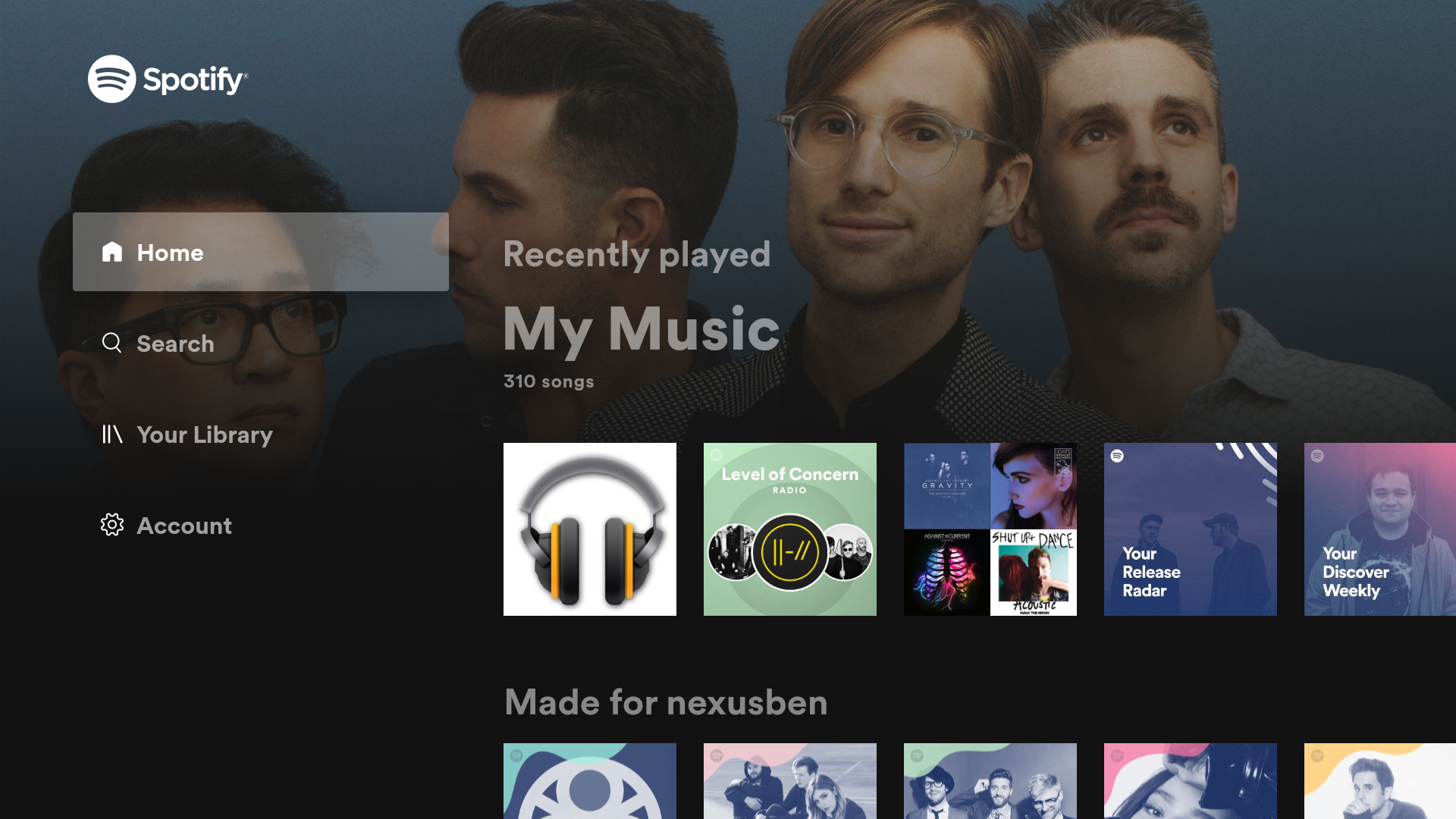
The best speakers in your home are often the ones attached to your TV and now, Spotify is giving its Android TV app a fresh coat of paint to make it easier to play your music on the big screen.
Rolling out to Android TV users this week, Spotify has completely redesigned its Android TV app. This redesign includes background images based on the bands and albums you listen to, as well as using a new sidebar for navigation. That sidebar has tabs for Home, Search, Your Library, and Account. These should be pretty familiar from the Spotify mobile app.
The Home tab contains recently played albums or playlists and, under, there are sections to include a user’s Daily Mix, recommended radio stations, and other forms of recommended content. The Search tab also brings in the “Genres & Moods” options which weren’t previously available on Spotify’s Android TV app.

Under the “Your Library” tab, Spotify’s overall organization is better for TVs. Podcasts are also now featured under playlist and album sections.
The redesign doesn’t extend to album or playlist screens, though, which remain unchanged and still feature too-slow scrolling. The Now Playing screen is also left untouched.
Finally, the Account tab has T&C’s, a toggle for the “Behind the Lyrics” feature, and the ability to sign out or switch users.
This updated design is available through the Google Play Store. It should work fine on all modern Android TV devices, though some have had performance complaints on devices like Xiaomi’s Mi Box.
More on Android TV:
- Android TV gets coronavirus news, other homescreen channels from YouTube
- YouTube TV adds support for Android TV’s homescreen channels
- You shouldn’t buy Google’s ADT-3 Android TV dongle, so here’s a quick look [Gallery]
Author: Ben Schoon.
Source: 9TO5Google


