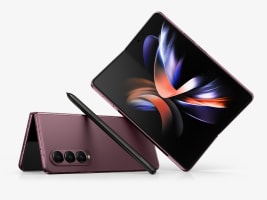
Throughout its first three generations, Samsung’s flagship foldable phone has made massive leaps and improvements. Simply putting together the original Fold with its flexible OLED screen was a triumph of engineering, even though it had some obvious flaws. Then on the Z Fold 2, Samsung got rid of the selfie notch, increased the size of the Cover Screen and redesigned the hinge to better withstand everyday wear and tear. And with the Z Fold 3, we got native stylus support and water resistance on a foldable for the first time.
But with the Galaxy Z Fold 4, it feels like Samsung has slowed down to polish the blueprint it’s been revising over the years. We’re talking sharper cameras with a longer zoom, better battery life, a renewed focus on multitasking and more. So while it might not look all that different, the Z Fold 4 feels like it’s five to 10 percent improved across practically every metric. Yeah, it’s still kind of bulky, and with a starting price of $1,800, it’s way more expensive than a typical glass brick. But that’s the tax you pay for a cutting-edge device that’s actually ready for the mainstream.
Pros
- Brighter main screen
- Upgrade main and telephoto cams
- Sleeker hinge
- Polished design
- Noticeably better battery life
Cons
- Still kind of bulky
- No built-in stylus storage
- Very expensive
Design and durability
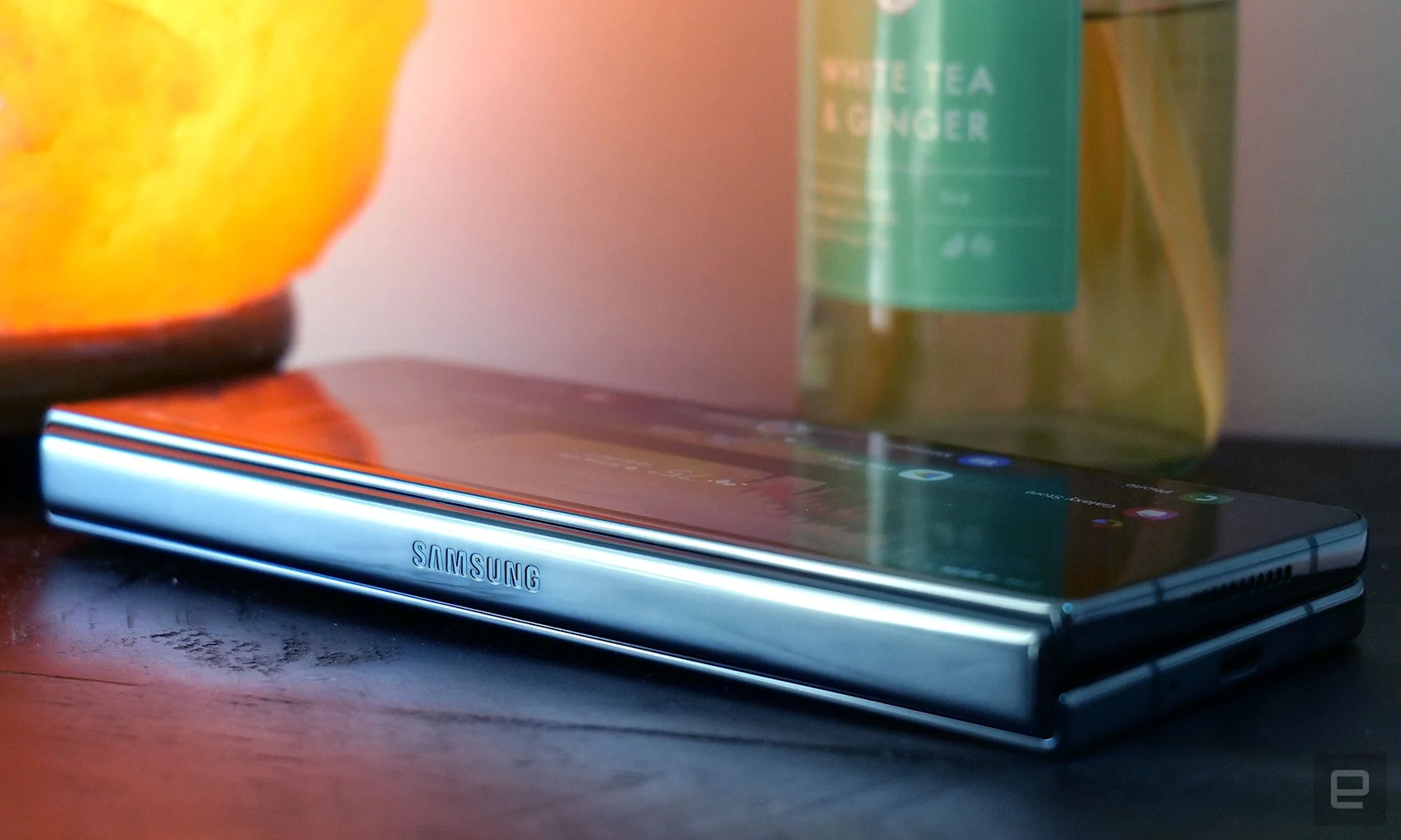
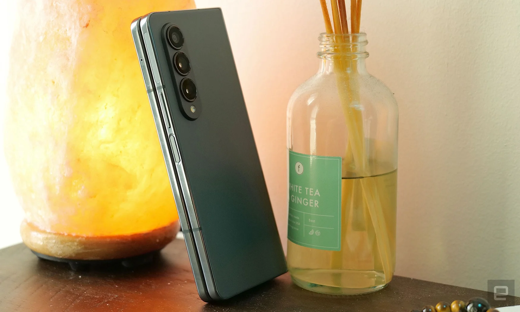
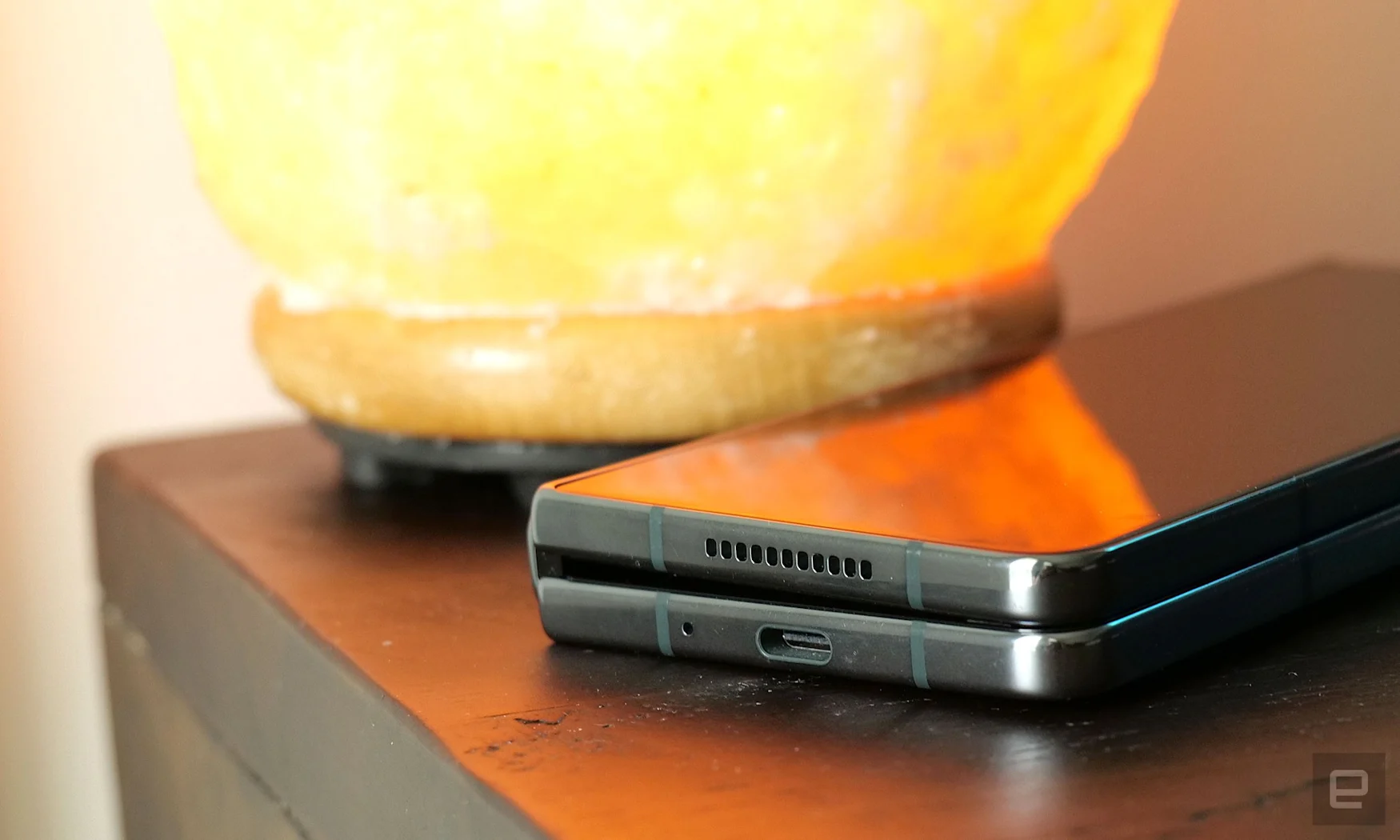
Weighing 263 grams or 9.28 American yeehaw units and measuring 15.8mm at its hinge when closed, the Z Fold 4 is less than 10 grams lighter and 1mm thinner than the previous model. That’s a difference that’s almost impossible to discern – even when holding both phones at the same time. But that doesn’t mean everything is the same.
The bezels and frame around the 6.2-inch Cover Screen have been trimmed down, allowing for a display that’s about 3mm wider than before. That might not sound like much, but it makes a big impact. Typing quick replies or searches on my Z Fold 3 often felt cramped, resulting in regular typos. But even without really increasing the Fold’s physical dimensions Samsung has improved the typing experience and cut back on mishits.
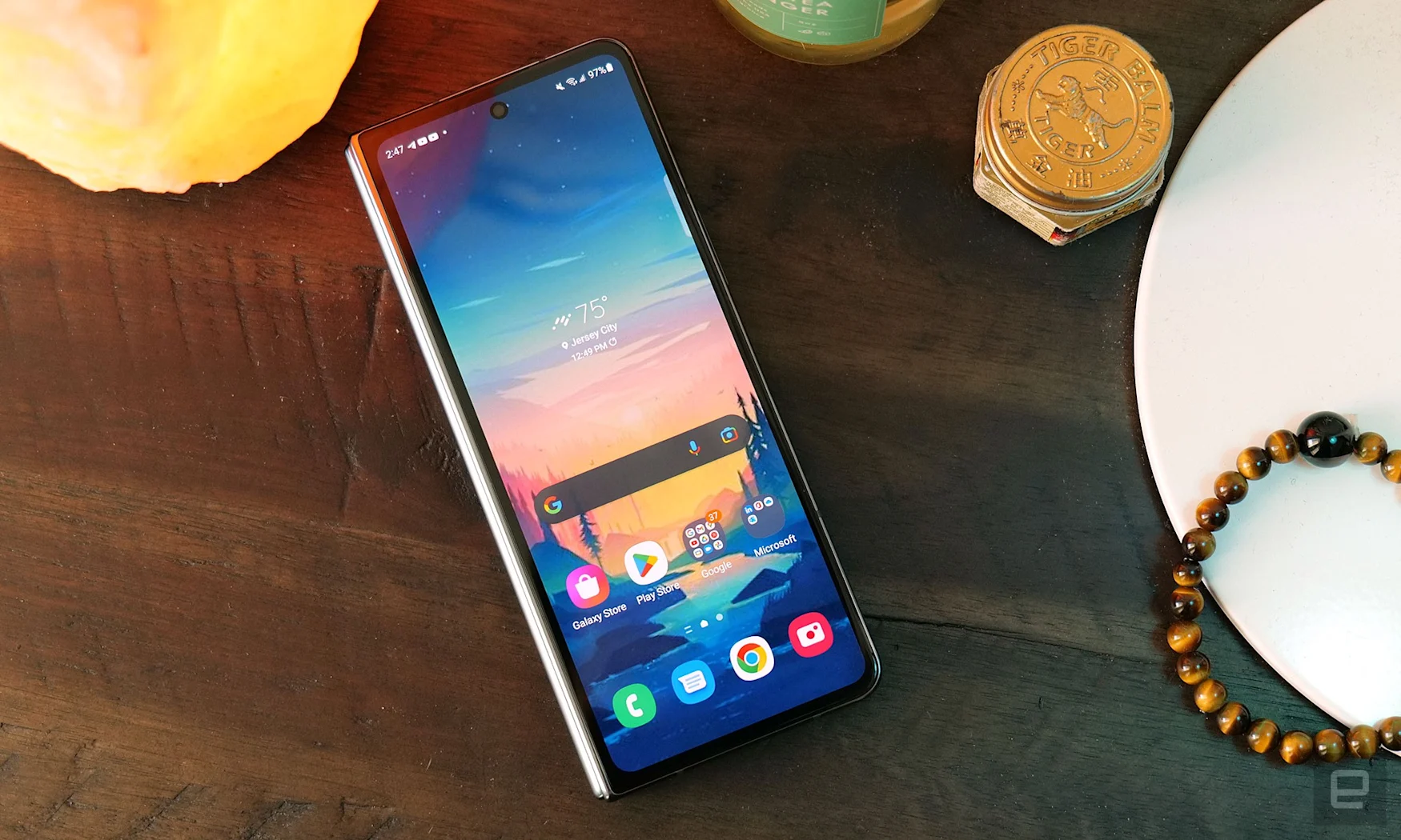
On top of that, the hinge is a bit flatter and thinner and the whole phone has slightly sharper edges, almost as if Samsung honed its design with a whetstone. And it’s a similar story on the inside, where the plastic bezels surrounding the 7.6-inch flexible OLED display have been trimmed down too. The effect is subtle, but everything is a bit sleeker and toned up, even though the phone is actually a touch wider than before. You still get a side-mounted fingerprint reader, which is fast and responsive and the best choice for this device until someone figures out how to make an under-screen sensor for flexible displays.
The Z Fold 4 sports Gorilla Glass Victus+ in front and back, along with the company’s signature Armor Aluminum alloy holding everything together. Samsung also says it has changed the construction of its flexible display to be 45 percent more durable than before, while the addition of new metal plates and sponges behind the display help prevent it from becoming mushy over time – not that it was really an issue on previous devices.
Of course, the one exception to the surprisingly rugged build on recent Folds’ is Samsung’s built-in screen protector, which once again comes with a warning on first boot that it should not be removed by anyone besides a certified technician. Now, I’ve been very open about the bubbling issues I’ve experienced on both my Z Fold 2 and Z Fold 3, and this remains one of my biggest concerns. This year, Samsung says it switched to a stickier adhesive and a new factory application process intended to prevent the screen protector from peeling away or bubbling prematurely. Naturally, I haven’t had time to see how this change will hold up over time, but you better believe I’m going to revisit this down the line.
Display
Next, let’s talk about the star of the show: the Z Fold 4’s display, or in this case displays. Both the 6.2-inch Cover Screen and the 7.6-inch main screen support a 120Hz adaptive refresh rate and excellent brightness. Using a light meter, I measured the Cover Screen hitting just shy of 700 nits on an all-white screen, while the interior display did even better at around 750 nits. And with Samsung claiming a peak brightness of over 1,000 nits, everything from games to movies just look better.
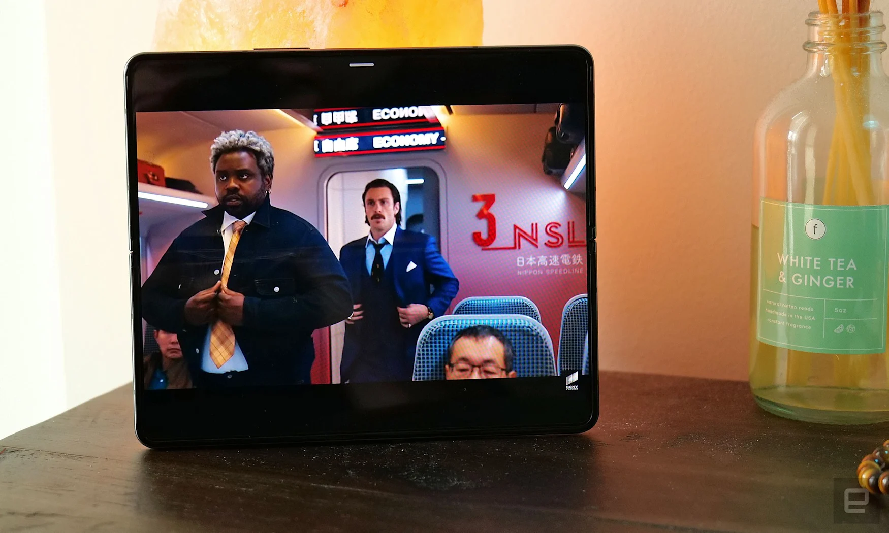
Honestly, this flexible main display is still the thing I like most about the Fold. You get a small vibrant screen on the outside that’s easy to use one-handed, so you can quickly look up directions or text a friend while walking around. Then when you have a chance to sit down, you can open up the phone to reveal a big and even more colorful display for all your productivity or entertainment needs. And all this comes on a device that easily fits in your pocket.
Yeah, there’s still a crease, and it’d be nice if it wasn’t there. But after using a Fold for even a short time, you stop caring about it and you start enjoying the screen for all of its strengths. When you want to bury yourself in a book, setting something like the Kindle app to display white text on a pure black background transforms the Fold 4’s OLED screen into the best e-reader around. Comics arguably look even better thanks to rich, punchy colors. And because there’s so much screen space to utilize, you get room for immersive viewing in tight quarters like on the subway, or potent productivity if that’s what you need.
Before I forget, while it’s still easy to see when you’re looking for it, the new subpixel matrix on top of the Fold 4’s under-display-camera does an even better job of camouflaging its 4MP sensor. Just don’t expect a big upgrade in image quality, because this thing isn’t good for much more than showing your face during video calls.
Performance and software
When it comes to performance, there isn’t really anything that can bog the Z Fold down. Recent games like Diablo: Immortal and Warhammer 40,000: Lost Crusade run super smooth. Same goes for when you have three different apps on screen at the same time. It packs a Qualcomm Snapdragon 8+ Gen 1 chip, up to 16GB of RAM and 512GB of storage (or 1TB if your order direct from Samsung). And in tests, the Z Fold 4 even flexes on its little brother, with multicore scores in Geekbench 5 of 4,036 versus 3,441 for the S22 Ultra.
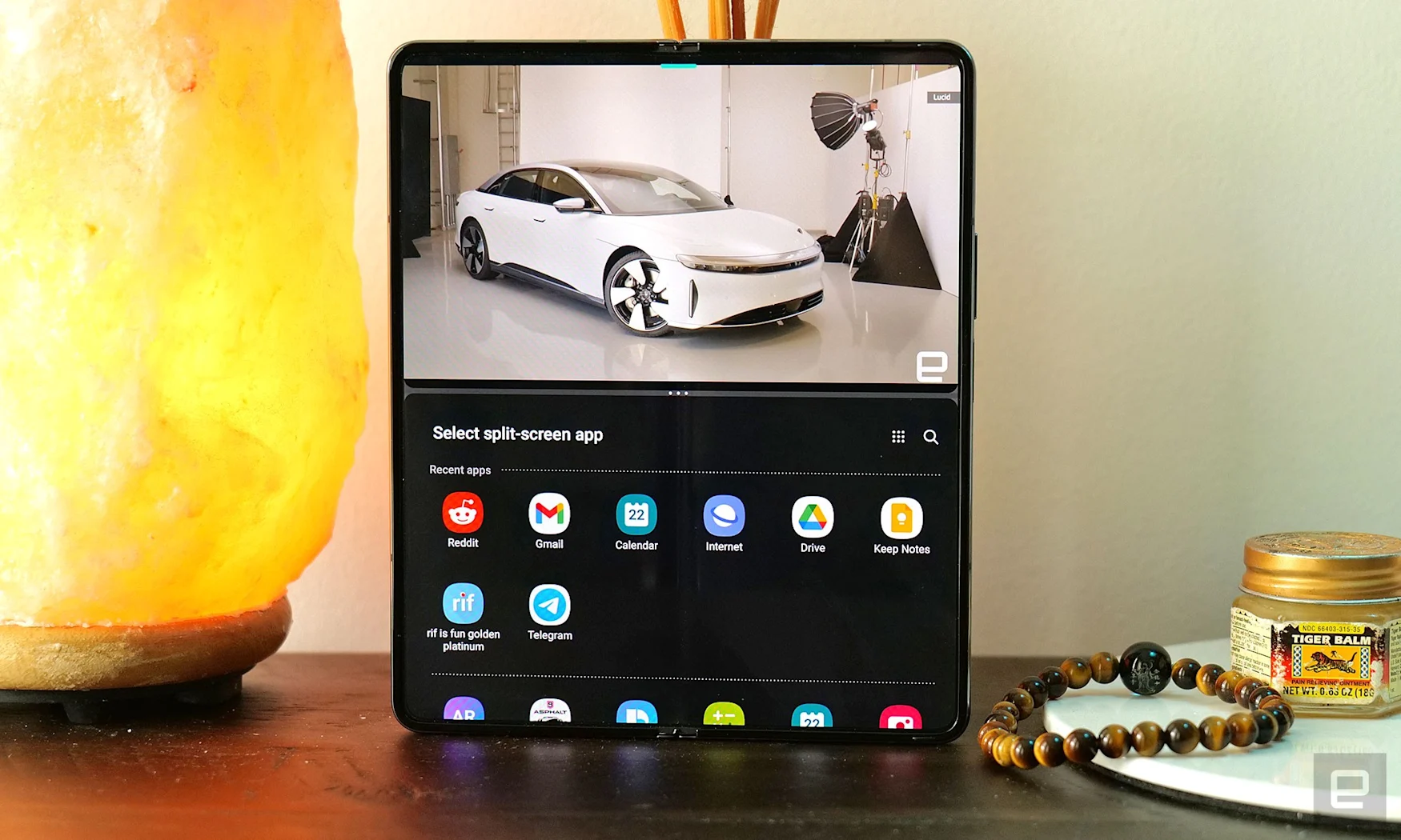
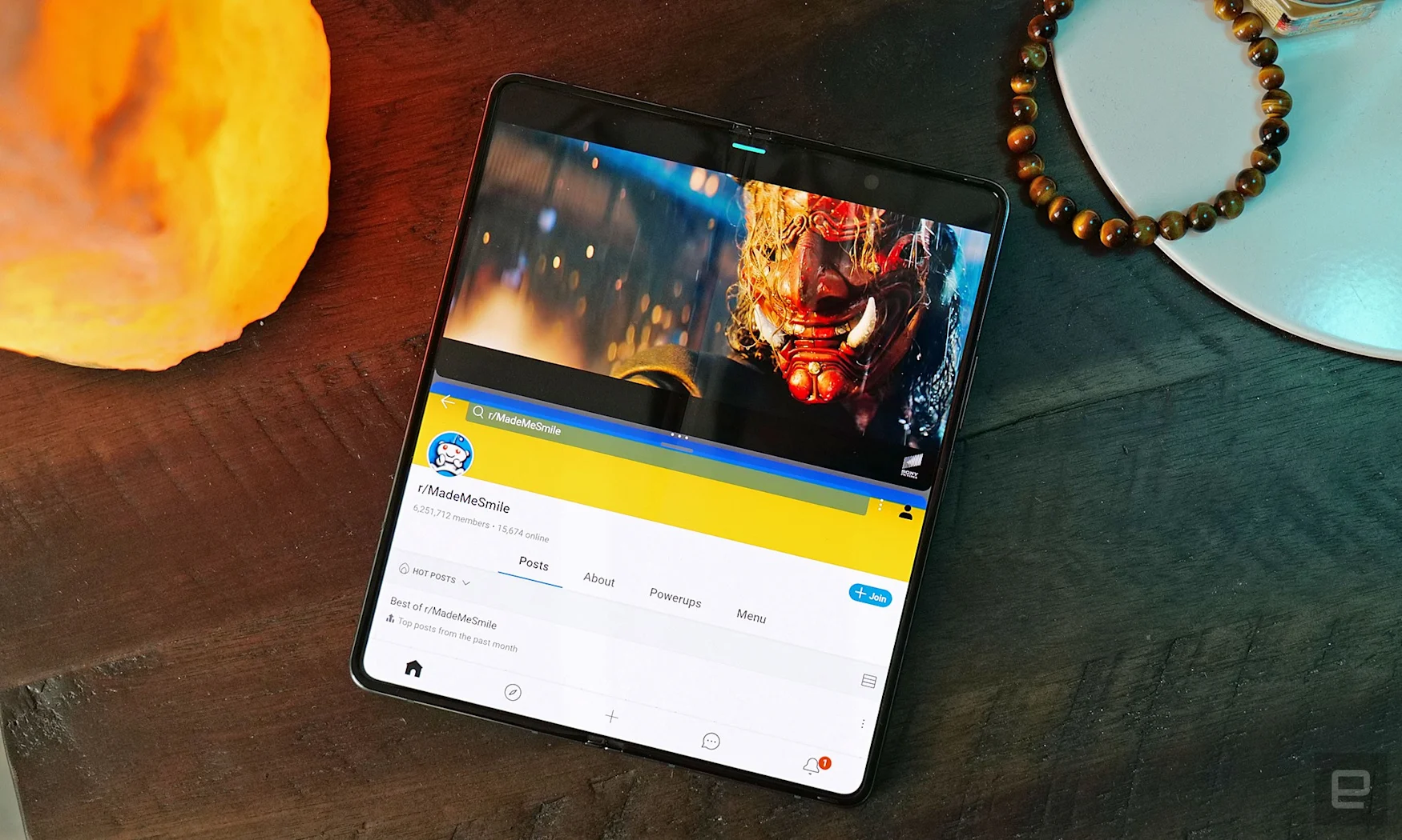
But more importantly, Samsung and its partners (like Google and Microsoft) continue to enhance the phone’s multitasking software thanks to expanded support for Flex mode and a platform based on Android 12L. Now if you’re scrolling through a news site like say Engadget, it’s even easier to open a link in a new window without losing your place. And when the phone is half closed, apps like YouTube and Netflix automatically adjust their UI to better suit your orientation.
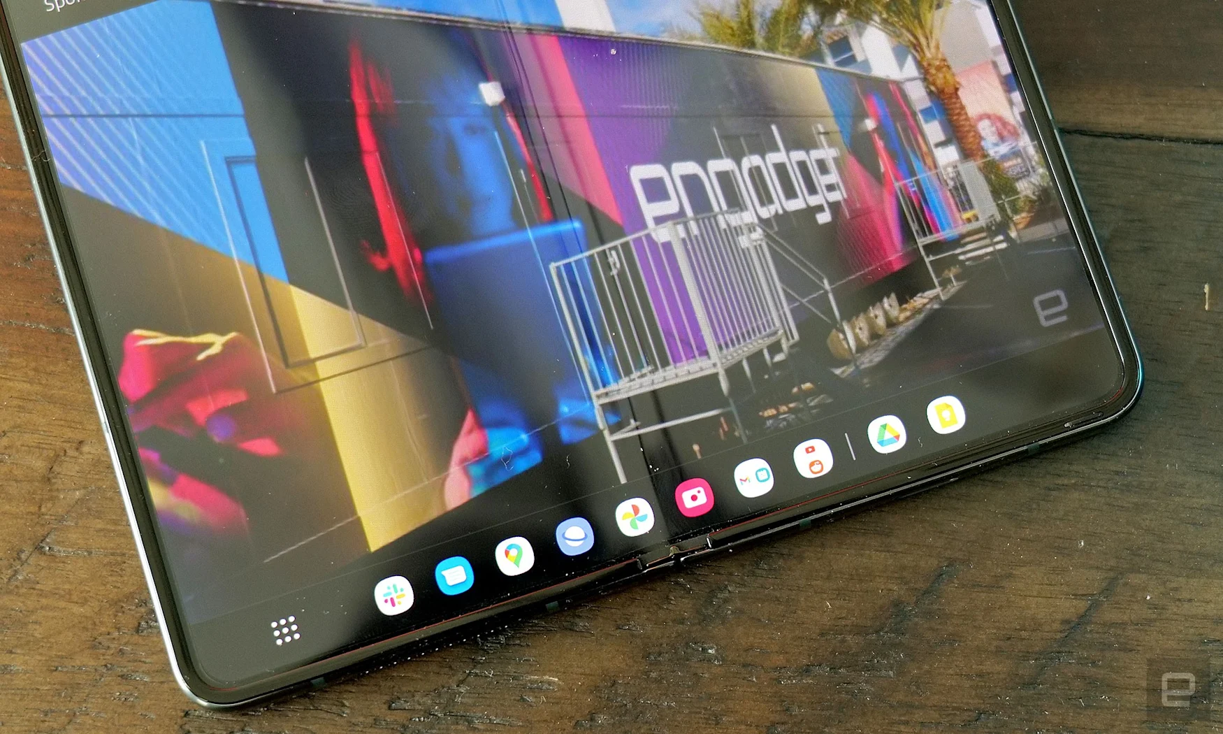
That said, my favorite improvement is the Fold 4’s redesigned taskbar, which now lives at the bottom of the screen and serves as a powerful extension of the traditional Android Home row. When you launch an app, the bottom row of icons cleverly shrinks and expands, giving you access to your Home Row, along with recently opened apps and any app pairs you may have created – all without taking up too much space.
And while they’re kind of hidden, if you dive into Samsung’s Labs in the Advanced setting menu, you can activate a number of even more helpful multitasking features and gestures. Take for example the two-finger swipe up from the bottom or sides of the screen that lets you instantly launch into split screen mode, which makes multitasking a cinch. Alternatively, if you want a more desktop-like approach, you can toggle on the multi-window menu option, which adds a little tab at the top of apps that holds another set of spilt screen options.
However, I must admit I’m not really a fan of Samsung’s new Flex Mode Panel, which presents a little laptop-like touchpad and some quick settings on the bottom of an app when the phone is half-open. It’s kind of clunky, and because some media apps like YouTube already have their own customized Flex Mode layouts, I’ve yet to encounter a situation where having a little mouse cursor is actually all that useful.

But that’s just one small swing and a miss, and for Samsung which is kind of plowing through uncharted territory with its attempts to add powerful multitasking features to a foldable phablet, one whiff among a bunch of handy hits is hardly something to get upset about.
Cameras
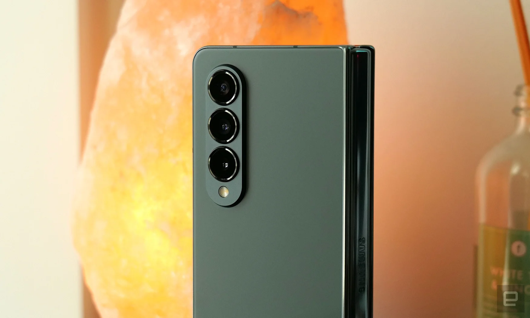
While the Z Fold 4 still can’t really hang with phones like the S22 Ultra or the Pixel 6 Pro, that gap isn’t nearly as big as it used to be. Not only do you get a new 10MP telephoto cam with a 3x optical zoom – up from 2x on the Z Fold 3 – there’s also a new 50MP main cam that catches 23 percent more light than before. That has a noticeable impact on low-light pics. And before I forget, there’s still a solid 12MP ultra-wide camera for capturing all your group shots and expansive landscapes.
At night details are crisper, with the Z Fold capturing a shot of the NYC skyline featuring soft, blurry lights on the buildings in the distance compared to a similar pic from the Pixel 6 Pro. And in another shot of some mangos at a fruit stand, the Fold 4 arguably captured better textures, though Samsung’s photo processing strumbled by picking a white balance that’s a bit too warm.
But if image quality is super important to you, phones like the Pixel 6 Pro still have an obvious advantage. Even in daylight where most every high-end phone can shoot a great photo nowadays, the Pixel 6 Pro captured sharper focus and richer detail than anything the Z Fold 4 could manage.
Battery Life
Remember when I said the Z Fold 4’s faster performance is hard to fully appreciate? Well, that may be true when it comes to processing power, but when it comes to energy efficiency, the improvement you get from the Snapdragon 8+ Gen 1 chip is plain to see. On our local video rundown test, the Z Fold 4 posted a time of 17 hours and 13 minutes for its main screen, compared to 14:03 for last year’s Z Fold 3.
That’s more than solid for any smartphone, let alone a foldable with a huge main display. Alternatively, if for some reason you’re in a situation where you’re only using the Cover Screen all day, it did even better with a mark of 20:45. And when you need to refill, the Fold 4 still has 25-watt fast charging (which sadly is isn’t quite as speedy as the 45-watt charging you get on the S22 Ultra), 15-watt wireless charging and wireless power sharing for topping off other gadgets in need.
Gallery: Samsung Galaxy Z Fold 4 camera samples | 6 Photos
Gallery: Samsung Galaxy Z Fold 4 camera samples | 6 Photos
Wrap-up
When it comes to how you feel about the Z Fold 4, I think a lot of that depends on your opinion about foldables in general. There’s no denying that Samsung’s latest and greatest is still way bulkier than a standard smartphone, and at $1,800 it’s a lot more expensive too. And when you consider that its design is essentially the same as before, I doubt the upgrades included in this generation are really going to sway the naysayers. For current Z Fold 3 owners, it’s also kind of the same. The improvements are nice, but not really worth shelling out a bunch of money to upgrade after only a year.
But for people who have been tempted by a foldable that’s arguably the most powerful pocket-size multitasker you can buy right now, now there are even more reasons to consider diving in. The Z Fold 4’s cameras are better, its performance is faster and its battery life is even longer without Samsung actually increasing the size of the power cell inside. Also, thanks to new software, it feels like the Z Fold 4 is really starting to unlock the true potential for productivity on a handheld device. And we haven’t even talked about stylus support, which is just as handy as ever, and is only brought down by the lack of built-in storage for stashing an S Pen.
Do I wish Samsung had cribbed some of the fancy features seen on other high-end foldables from Vivo, Xiaomi and others? Yes, absolutely, and I won’t be surprised if we get some major design changes on next year’s offering. But as a total package, Samsung has tweaked and refined the Z Fold 4’s kit with just enough for it to retain its title as the flagship foldable phone to beat.
Author: 86
Source: Engadget


