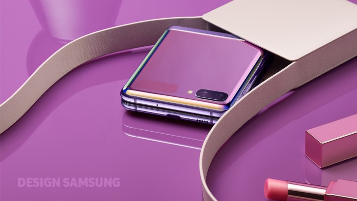
The Samsung Galaxy Z Flip is the companys second foldable phone and its quite different from the first (the Galaxy Fold). This made it necessary for Samsung to completely rethink the design heres the abridged story of how the Z Flip came to be the way it is.
The core design principle of the Galaxy Fold was to bring a larger screen than was previously possible. The Flip went in the exact opposite direction, making a compact, stylish design the priority.

Samsung went through many design iterations, trying to find the perfect size that allows for comfortable grip the phone had to easily fit into users palms and pockets.
While the Galaxy Fold was geek chic, the company wanted to add a fashionable touch to users lives with the Z Flip. So it tapped Thom Browne to create a custom version with a pebble gray exterior marked by the signature colors of the New York fashion brand.
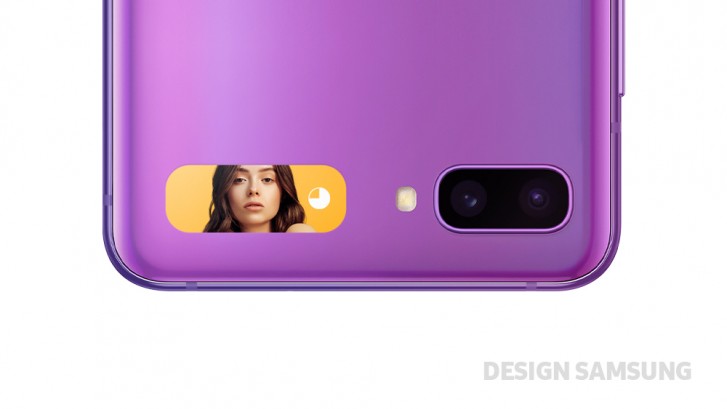
Like in the good old days, when the phone is closed you rely on the small external screen to check the time, battery level and any notifications. This display is tiny, but it can still be used to shoot selfies with the main camera if you are determined to do so.

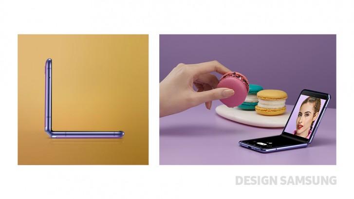
While researching hinge designs for the Galaxy Z Flip, Samsung stumbled at a new way to use a foldable phone. The Hideaway Hinge is built in a way that allows it to keep the phone bent at any angle.
Users place the phone on a flat surface and tilt the top half an any angle thats convenient this can be used for video calls, watching video or even just angling the front camera just right for a group selfie.

Samsung sees this ability of the Galaxy Z Flip to be its own kickstand as a game changer. Going forward, the company will continue exploring ways to enrich the Galaxy Z lineup and create new experiences based on foldable designs.
Author: Peter .
Source: GSMArena


