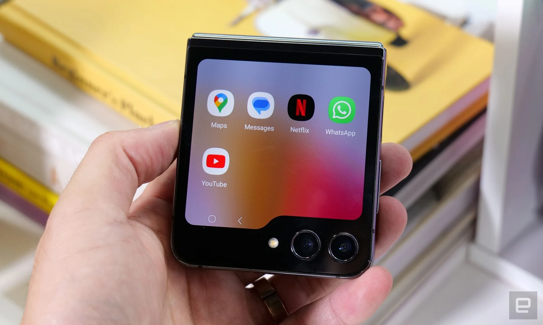
After I reviewed the Motorola Razr+ earlier this year, I grew besotted with its external screen. Not only was its 3.6-inch outer panel larger than the 1.9-inch version on Samsung’s Galaxy Z Flip 4, it was also more useful. Since then, I’d been hoping that Samsung would adopt a bigger outer display on its next-gen Flip foldable, and today, my wish has been granted. The Galaxy Z Flip 5, which the company launched today, sports a 3.4-inch window on the outside that’s 3.78 times larger than before.
It also has a new “Flex Hinge” that allows the device to fold shut without leaving a gap between the two halves of the internal screen. Throw in the typical processor upgrades, double the base storage and some software enhancements, and the Z Flip 5 appears to be a small, but meaningful step up for the same $999 starting price as last year.
A larger external screen with lots of potential
The highlight of the Z Flip 5 is clearly its larger external display, which Samsung has infuriatingly decided to rename the Flex Window. I don’t know why, since this panel doesn’t fold and the old name of “Cover” screen still makes sense. Confusing name aside, it’s easy to see why the bigger panel is more useful. Widgets like Calendar or Weather can show data for multiple events and days. Buttons are larger, so you can more easily skip songs in the media player, start or stop timers and more.
With more room, Samsung was able to squeeze two additional shortcut buttons in the Quick Settings drawer that appears when you swipe down from the home screen. Dragging up opens Samsung Wallet, so you can quickly pay for your morning coffee.
To be clear, the Flip 5’s 3.4-inch panel doesn’t stretch across the entire back half of the phone. It’s shaped like a file folder, sort of like a rectangle that’s been awkwardly cut to avoid the pair of cameras at the bottom right. This makes for a very strange aspect ratio that many apps might struggle with, but for the most part, the software sees the screen as a rectangle. The little tab at the bottom left is largely ignored and is devoted to a Samsung Pay shortcut or a space for any ongoing activities to show their progress. If you have a timer running or a song playing, for example, a small progress bar appears there.
Because Samsung now supports more widgets on the cover, getting through all of them can become a slog. I saw about a dozen of them on the demo unit, and having to swipe 10 times to get to the one I want would suck. Thankfully, the company introduced a new gesture that lets you pinch out to access Multi Widgets view, and from there you can quickly jump to the tile you want. Don’t confuse this with the All Apps page on Android — it may look similar, but it only shows you the widgets that Samsung has made available on One UI 5 for the Flip 5.

Another thing that may have you thinking the Flex Window can give you the full Android experience is that it supports a handful of apps like Message, YouTube, Google Maps, WhatsApp and Netflix. In countries like Korea, you’ll also find popular options like Kakao Talk. These aren’t widgets — they run like the full-fledged versions of themselves on the outside screen. I watched some YouTube videos, drafted messages and looked up restaurants in the area on the smaller panel and found them to be pretty much identical to the larger versions.
Though the practicality of using full Android on the external display is debatable, I still find it questionable that Samsung limits what apps can run natively on the Flex Window. That’s not to say you can’t find a workaround. The company itself offers an app called Good Lock that will let you run any Android app on the tiny panel. Still, it’s different from the Moto Razr+, which basically runs Google’s whole operating system up front.
Samsung’s approach is meant to ensure that only users who are invested enough to install a separate app to mimic the full Android experience on the Flex Window can. This way, if things break or look weird, you only have yourself to blame.
Another area where Moto and Samsung differ on the cover screen is the QWERTY keyboard. Both companies let you respond to messages and notifications with a full-sized keyboard, and Moto takes up the entire canvas to give you bigger buttons. Meanwhile, Samsung only uses about the bottom two thirds of the space, while retaining the message or input field at the top so you can see what you’re entering or responding to.
I like having larger keys, but Moto’s layout adds a step where, after typing your reply, you have to back out of the keyboard to the app and hit the submit button. On the Flip 5, the Send button is right above the keyboard and you can tap it when you’re done. I’ll have to spend more time with a review unit to better evaluate the two approaches and see which I prefer.
Author: Cherlynn Low
Source: Engadget


