Technology today is already quite assistive, from location-aware reminders to notifications telling you when to leave, factoring in live traffic conditions. In fact, that’s now the base level of usefulness we expect from our gadgets. After using Google’s 2nd-gen Nest Hub for the past week, I experienced the next level of computers passively suggesting what improvements can be made in your life, and it will take some time to get used to.
Design of the Past
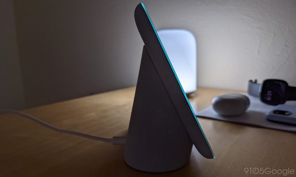
At a glance, the Nest Hub (2nd gen), as it’s officially called, looks exactly like the 2018 Home Hub. Google carried over the “floating screen attached to an oblong fabric-covered base” aesthetic.
The only physical change is a flat display that sees glass sit atop the rear plastic backing. While minor, this makes the screen much easier to clean as there is no longer a raised lip that dust can be wedged into. It’s minor but much appreciated when wiping. Another change is how edge-to-edge Smart Display gestures are no longer encumbered by that perimeter, which prevented flat, smooth swiping.
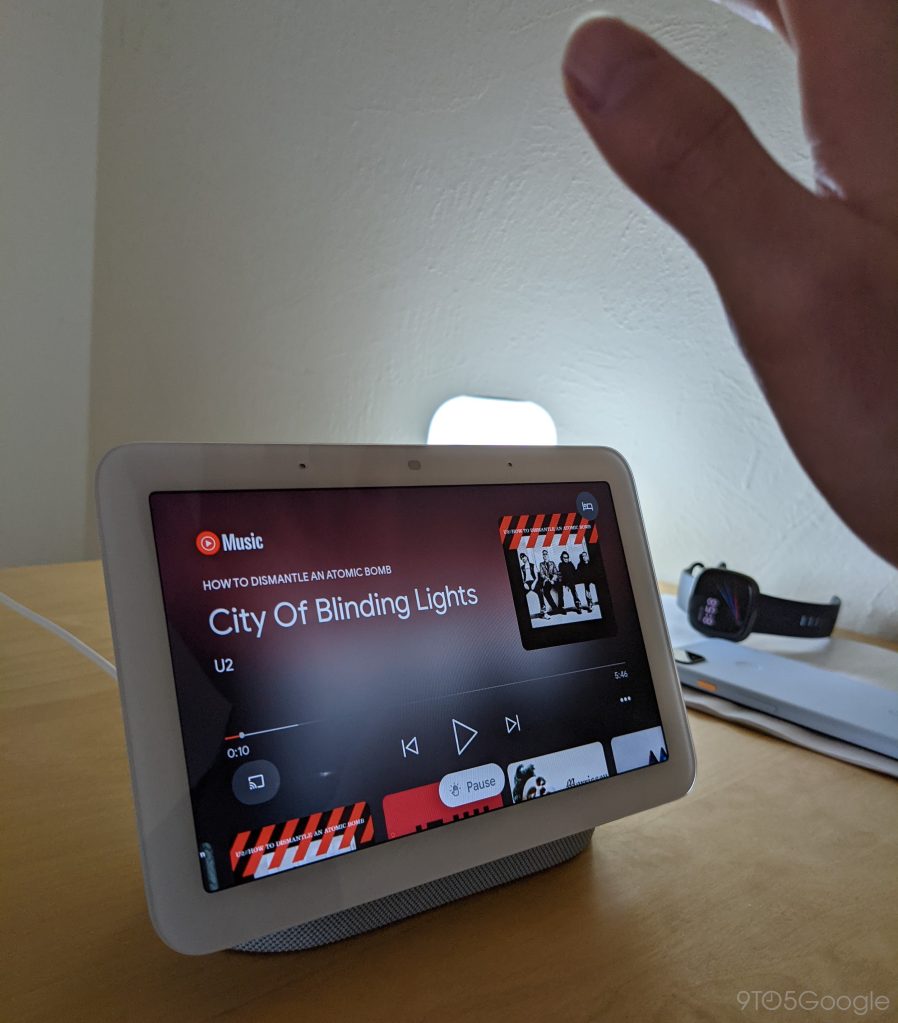
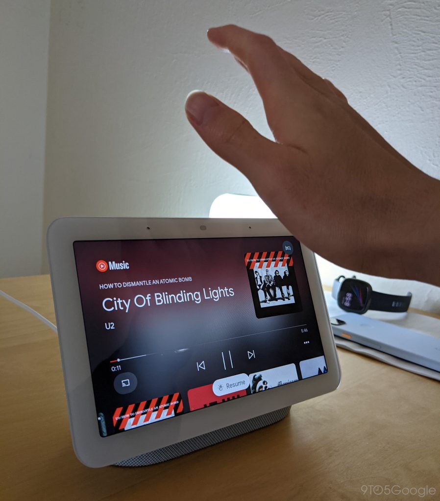
Hardware-wise, the other big change is something that you can’t see. Following the Pixel 4 and new Nest Thermostat, Google has brought its Soli sensor to the Nest Hub. We’re told the radar component is located in the top-right, but it’s not at all visible. In Settings, you can disable “Motion Sense” entirely, while you also have the option to turn on/off “Quick Gestures.”
At launch, you’re able to play/pause media by “air-tapping in front of your display.” This gesture is absolutely delightful and works much better than the camera-based feature on the Nest Hub Max. It’s been wonderful for listening to music while resting in bed with your eyes closed and just vaguely gesturing over the Smart Display to end playback.
The convenience and fact that you don’t have to be very precise — taps can start ~18 inches away in our experience — when gesturing makes it all the more frustrating that you can’t yet skip or go back to the last track with a wave. This action is available on the Pixel 4 but is currently only used to snooze alarms by the Nest Hub.
In terms of performance, the only change I observed is that the 2nd-gen Nest Hub boots faster than the original or even the Hub Max. The quad-core 64-bit 1.9 GHz ARM CPU is clocked higher than the Nest Mini (1.4 GHz) or Audio (1.8 GHz) and is paired with a “high-performance ML hardware engine” that processes your most frequently commands on-device. In practice, animation performance and loading speeds are mostly unchanged.
Sensing the Present
The other big feature made possible by Soli is “Sleep Sensing.” This new Hub marks Nest’s entrance into health, though that fact is overshadowed by Google’s broader hardware division buying a whole other company to do basically the same thing. The brand started with thermostats and later expanded to cameras, smoke detectors, and a security system, while “Google Nest” added speakers and Smart Displays to the lineup.
Wellness is a natural extension of providing assistance in the home as most users in the Google ecosystem already get help from Assistant when they’re out in the world. I am certainly one of those people and have been wearing sleep trackers for much longer. Despite that history and experience, using Sleep Sensing on the Nest Hub was new and unexpected.
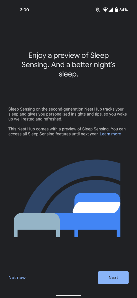
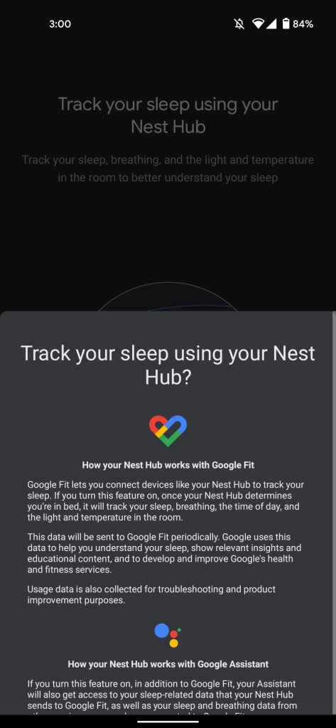
The setup process involves agreeing to a “preview of Sleep Sensing” in the Google Home app. Right off the bat, it’s emphasized how “your Nest Hub does not have a camera” so “no distinguishable images of your body or face are generated.” Rather, the low-power radar monitors the movement of your limbs and body, while also being precise enough to track the rising and falling of your chest during breathing.
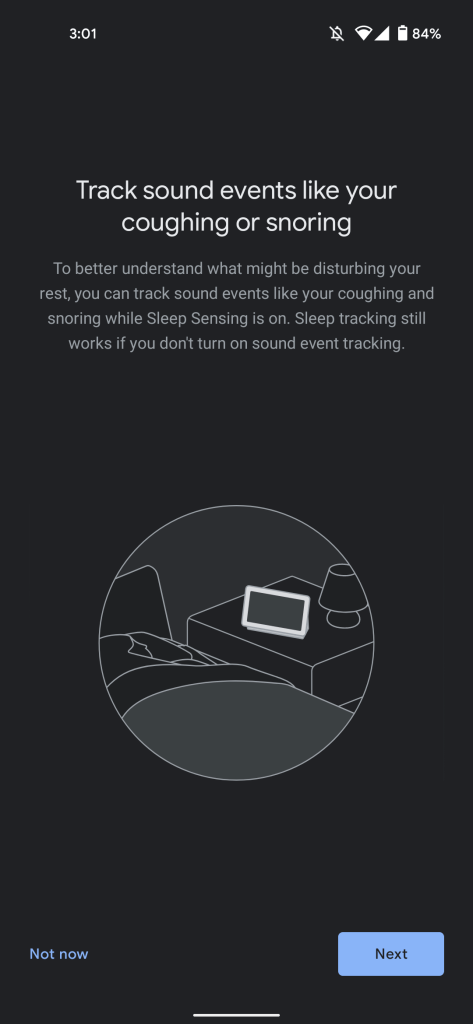
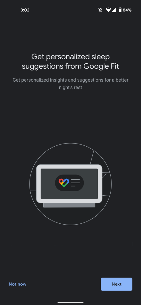
There is the optional ability to track “sound events,” like coughing and snoring. This is meant to “better understand what might be disturbing your rest.” For example, frequent coughs might mean it’s time to clean or replace your old mattress. However, sleep tracking will continue to work without the microphone active. Users have to also agree to connecting the sleep feature with Google Assistant and Fit for personalized insights.
After the in-app setup, you’re asked to position the Nest Hub next to you so that it’s 1-2 feet away from your resting position. For consistent results, it’s recommended that the Smart Display remains in the same spot every night. You’re finally asked to lay down for a minute as part of calibration.
Google will tell you with an icon in the top-right corner when Sleep Sensing is active, as well as with a banner on the always-on clock above the time. Users are able to disable it for whatever reason by sliding up quick settings and tapping a new sleep button; Quick Gestures continue to work.

In all, very little effort on your part is needed to have the Nest Hub track sleep. Compared to the fitness tracker I wear daily, there’s no charging or remembering to wear it. While I don’t mind something on my wrist overnight, I’m still always aware of it, even after having done it for so long. In fact, I have historically not worn it over the weekend out of a sense of wanting Friday-Saturday freedom and unencumbered wrists. The Nest Hub removes any thought needed as you start slumbering.
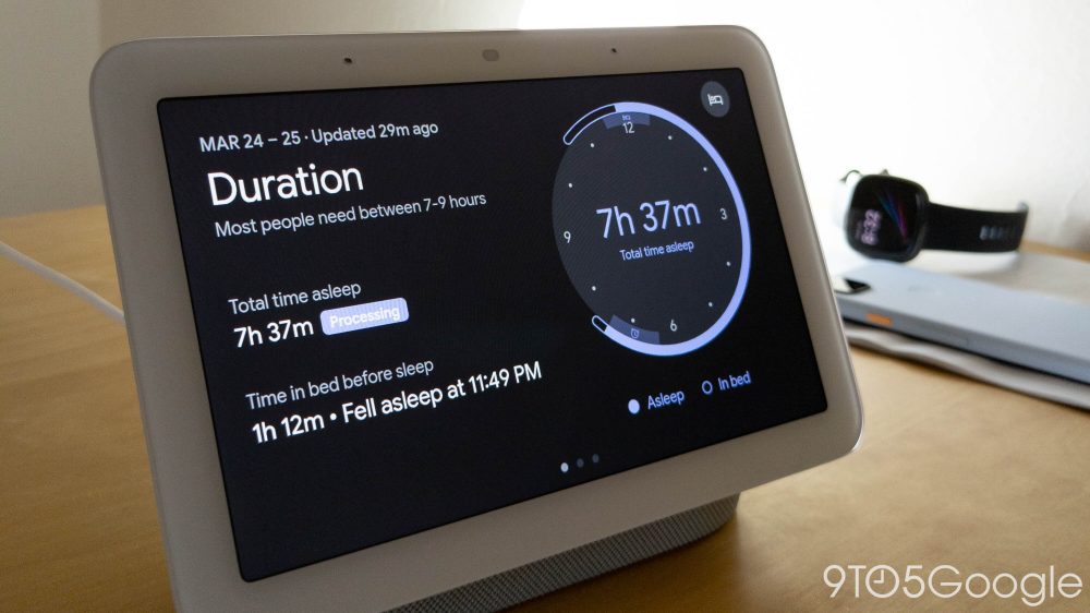
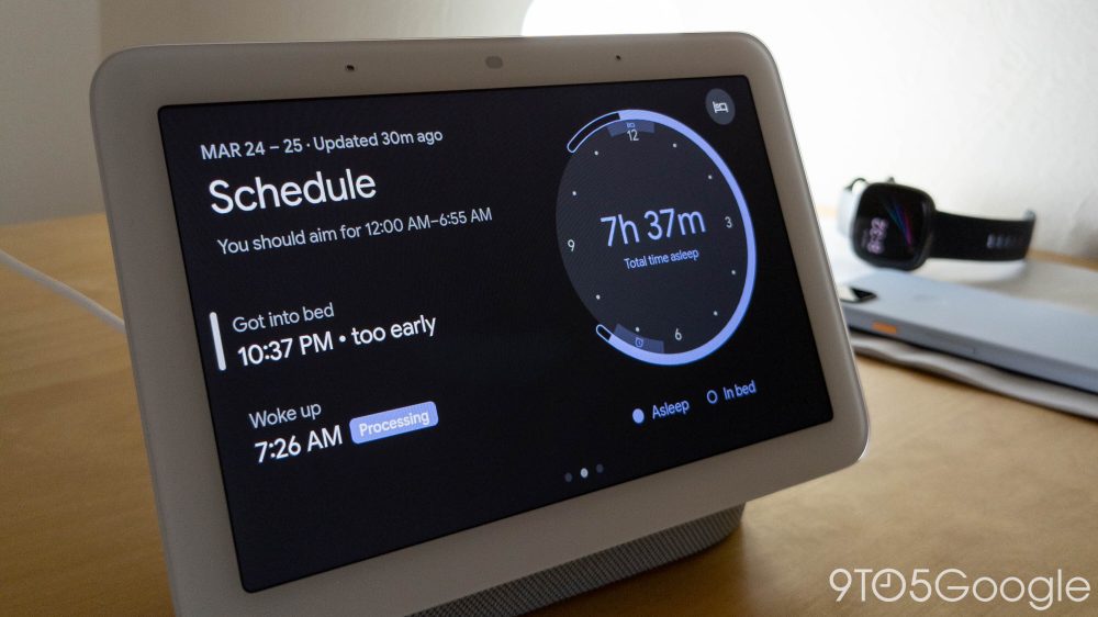
After using it for over a week, I’ve found radar-based sleep tracking to be mostly in line with the Fitbit Sense that I wear, though the Nest Hub could be better at recognizing when you’re awake but still in bed. Results are shown on the homescreen or by asking Hey Google: how did I sleep, did I snore last night, how was my breathing, etc.
| Nest Hub | Fitbit Sense | |
| 3/20 | 8:51 | 8:51 |
| 3/21 | 8:21 | 8:11 |
| 3/22 | 6:01 | 5:23 |
| 3/23 | 5:49 | 5:32 |
| 3/24 | 7:45 | 7:23 |
| 3/25 | 7:36 | 7:03 |
| 3/26 | 6:48 | 6:15 |
| 3/27 | 7:46 | 6:50 |
| 3/28 | 7:23 | 7:31 |
| 3/29 | 6:44 | 6:18 |
If you use a dedicated sleep tracker (and like it), you’re missing sleep stages that tell you about REM, Light, and Deep. But at the end of the day, most people will suffice with simply knowing how long they slept.
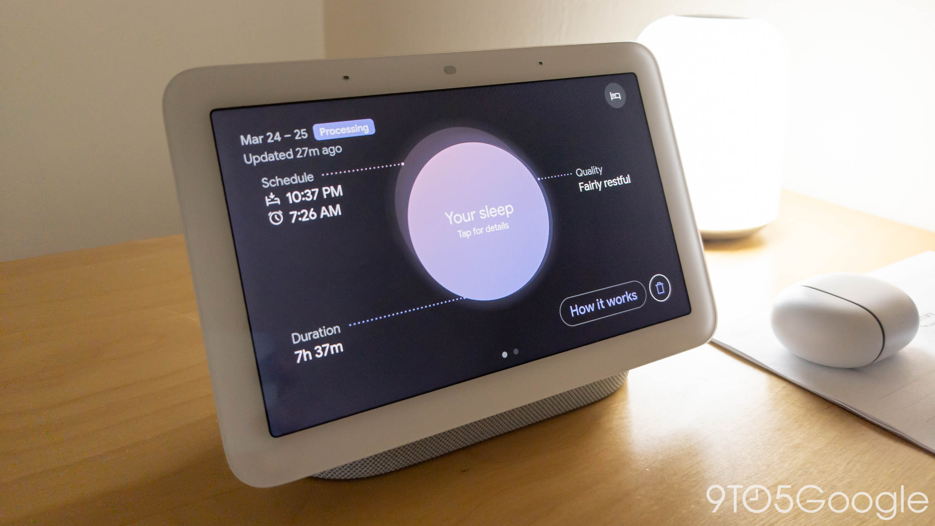
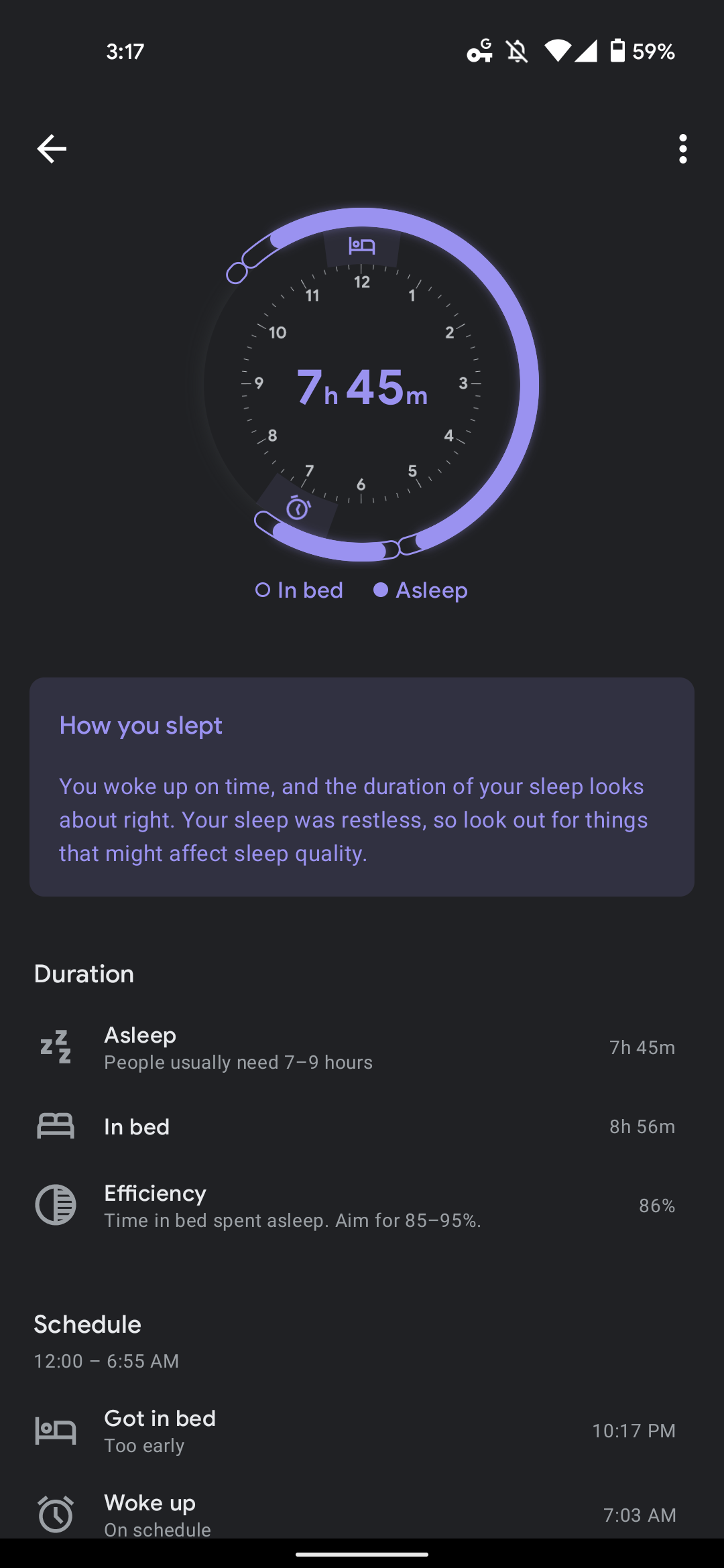
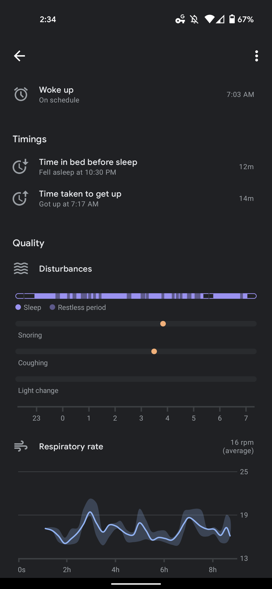
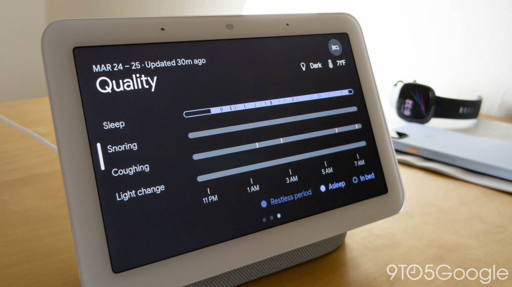
That “Duration” (7-9 hours recommended) is one of Google’s core sleep tenets, with “Schedule” and “Quality” being the others. The former is meant to encourage you to keep consistent hours, while the latter factors in snoring, coughing, light change, and temperature — which is a new sensor in the 2nd-gen Nest Hub but only for sleep tracking and not other purposes today.
This forms a delightful graphic where each of those three elements is represented as circles. A good night of sleep sees the three shapes become one. It’s a very nice way to visualize sleep data and one of the most user-friendly and — frankly — human in the field. It’s not just scores or very dense line graphs with a multitude of colors and spikes. The friendliness is an easy win for Google and nothing about the other data collected, including breaths per minute, is surprising.
Previewing the Future
What was entirely unexpected to me, even after years of wearing similar devices, were the sleep suggestions offered by Nest Hub. They appear as 2×1 cards on the homescreen, with last October’s redesign a clear precursor to being able to surface passive amounts of information throughout your day, including a countdown closer to bedtime.
One I have received several times over the past few days is an information panel about “The effects of sleeping in.”
Lots of people sleep in on days off, but studies have shown that this can affect long-term health. For example, in some people it can lead to an increased risk of obesity. When you can, it’s better to stay consistent across the week. Making small tweaks to your schedule can help you feel more rested in the long run.
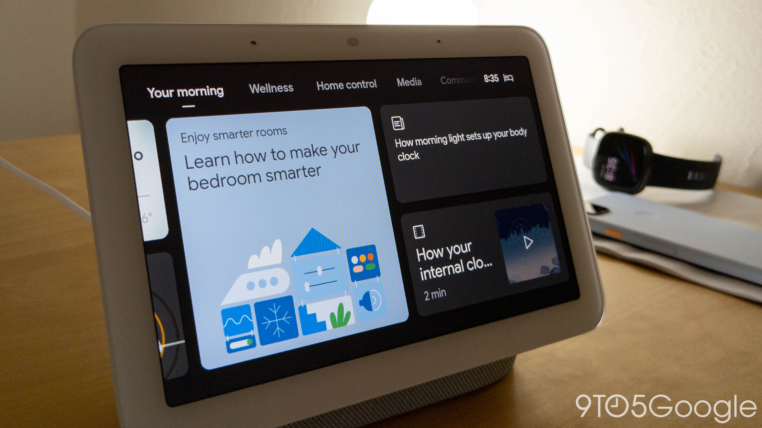
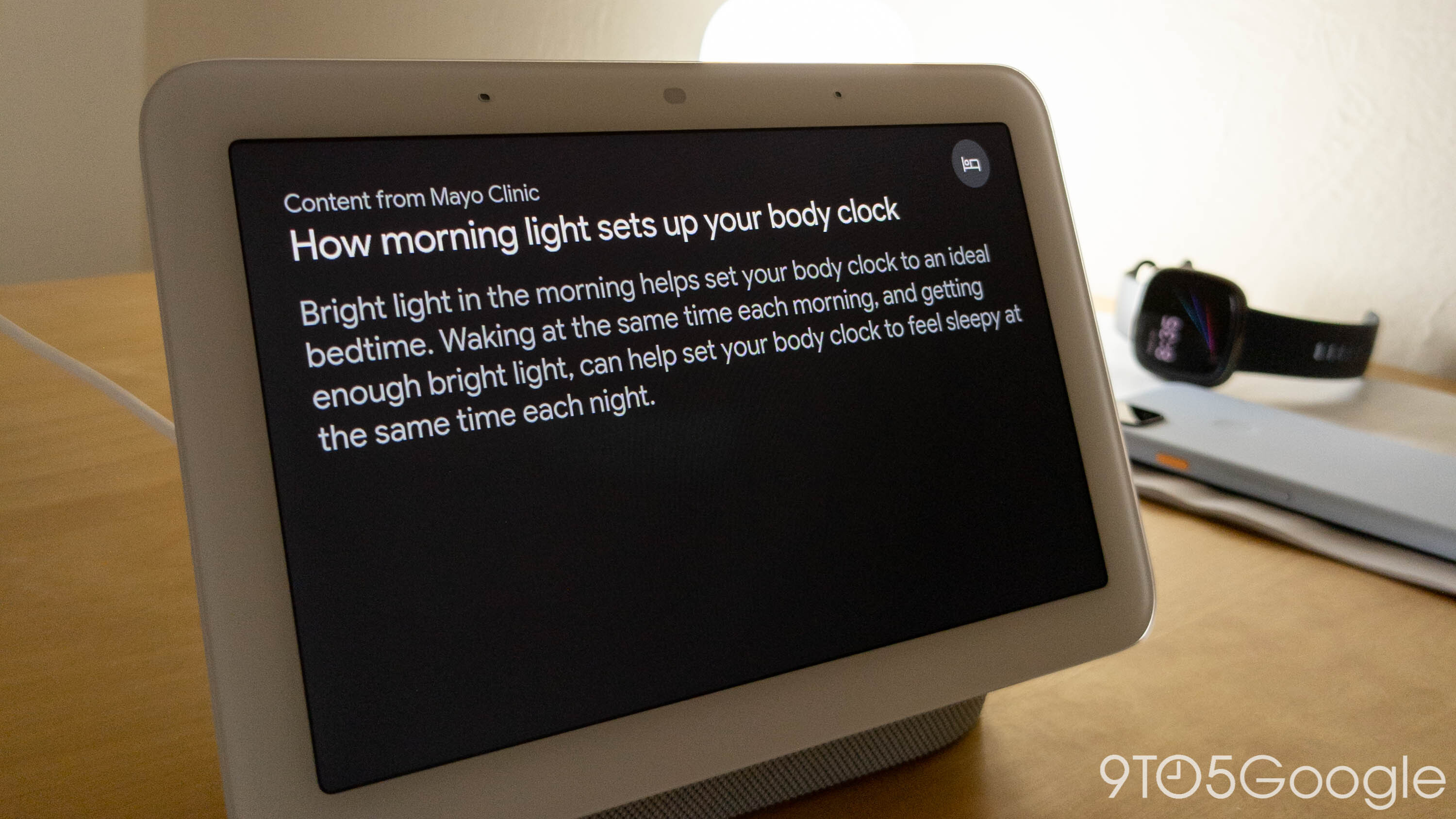
My initial reaction, and one that I still have today, was “excuse me.” On analysis, it’s a very irrational response that speaks to how human thinking (and wants) can be so short term, but being told by a computer that the luxury of sleeping in on a weekend is bad was somewhat annoying. I’ve found other snippets of information like “How morning light sets up your body clock” to be interesting, but I cannot get over that card I saw after the first night of having a Nest Hub track my sleep.
I fully admit that most people do not have deep thoughts about sleep — compared to exercise or diet — but it deserves equal attention and thoughtfulness. At the very least, it requires a more introductory tone.
That said, those kinds of suggestions and subsequent feelings are inevitable as technology becomes bigger parts of our lives. People want and like the idea of having help in their lives. So far, the help has been rather non-personalized and generic (but still useful). The next generation of these assistants will be more pervasive as they extend into the remaining parts of our lives.
Meanwhile, after a week, you get a “Sleep report” with insights and personalized tips in the new Wellness tab. It highlights an area of concern and why you should care, with “education” videos and a corrective “Sleep suggestion” offered. In my case, the Nest Hub recognized an inconsistent sleep pattern and recommended setting a schedule. After two weeks of use, Sleep Sensing will start directly offering personalized sleep and wake-up times.
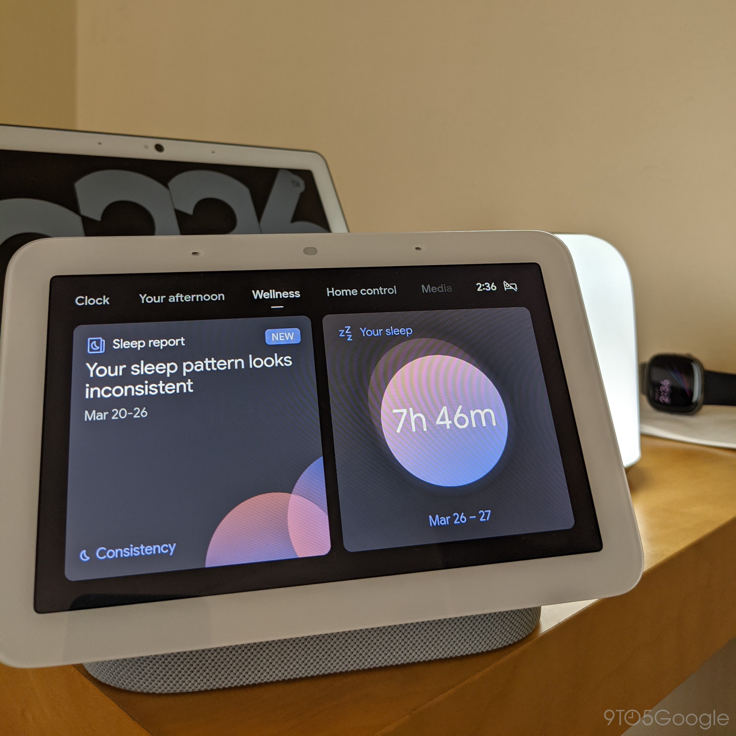
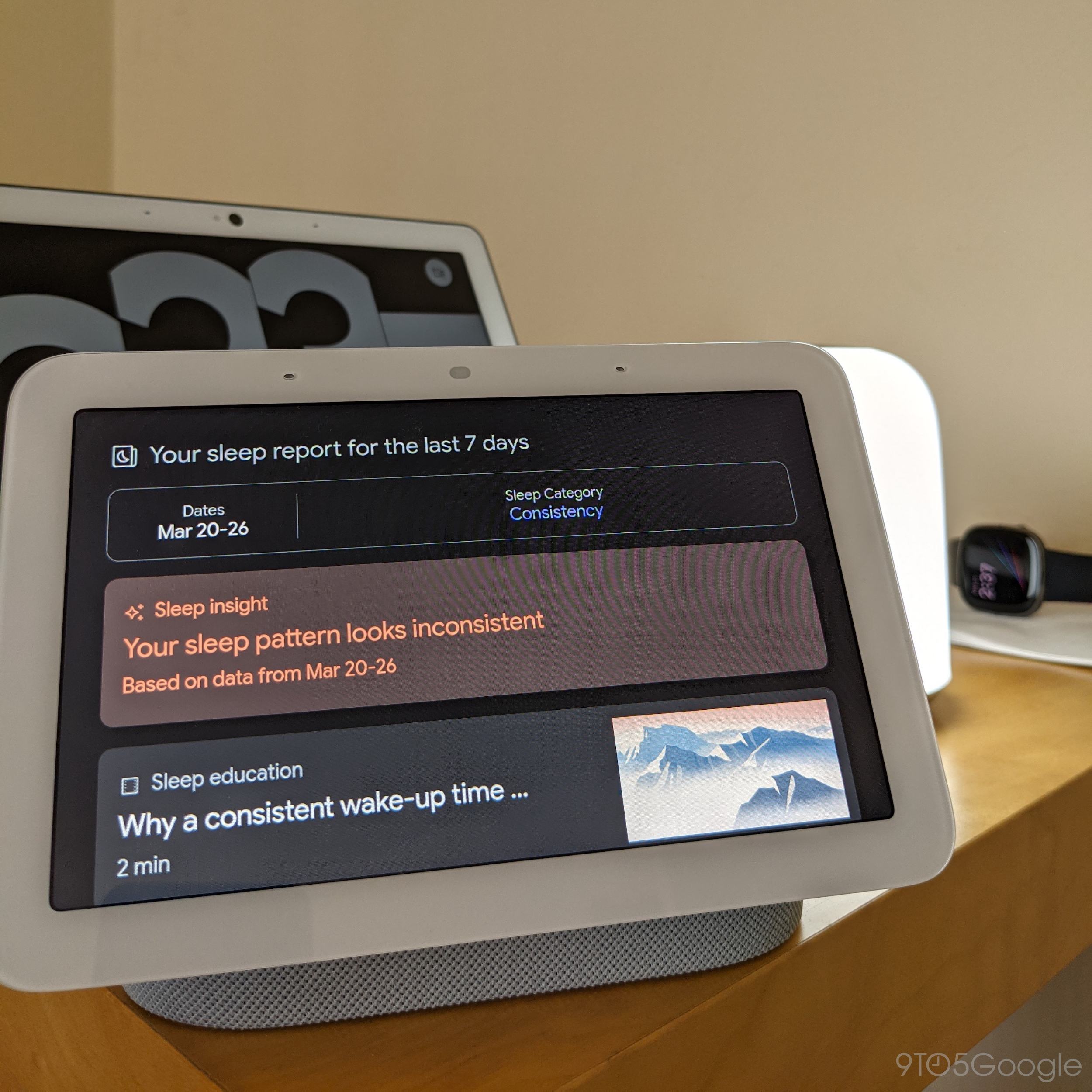

Speaking of the future, the immediate one for the Nest Hub sees Sleep Sensing becomes a paid feature. Google is giving all users a preview until next year to experience how it works for them and to give the company time to integrate Fitbit and its Premium subscription. People’s willingness to pay for sleep tracking will come down to how useful and impactful suggestions are to their lives. This will require a few weeks — if not months — to properly determine, and I’m not convinced yet. That said, I believe Assistant only needs to deliver one very good suggestion/schedule change to hook people in. Regardless, a better solution might be giving users basic information (like what time they slept and woke up) for free and letting them pay for more advanced stats and help.
Final Thoughts
The Nest Hub (2nd gen) sets Google Assistant down the path of having an all-encompassing look at your day and wellbeing. As much as my initial reaction to that aspect was quite visceral, it’s exciting to get a glimpse of the future in a $99 package that is already useful in so many other ways. The speaker and alarm — enhanced by Soli gestures, photo frame, mini TV, and smart home control center you want is now also an entirely optional sleep tracker that more than works and is — mostly — friendly about it.
Author: Abner Li
Source: 9TO5Google


