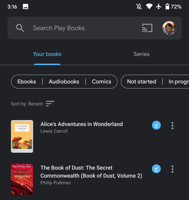
The last big update to Play Books saw the web client in August add beta features like “Custom shelves.” The Android app now has a Material Theme account switcher that replaces the navigation drawer.
Instead of a hamburger button in the top-left corner of Play Books for Android, there is now a magnifying glass icon integrated into the search field. Previous menu items are now accessible by tapping your Google Account profile image on the other side of the bar.
This standard UI found in the Google app, Gmail, Drive, and countless other first-party clients lists all the signed-in accounts on your device. Underneath are “Play Books settings” and “Help & Feedback.” The voice search icon does get bumped until you tap the field, while Cast for audiobooks appears to the left of your avatar.
A small change, the Play Books Material Theme switcher results in a delightfully clean and modern app. Google looks to have made some other tweaks in the “Library” tab with this update.
Top tabs have been simplified to just “Your books” — instead of “Shelves” and “Ebooks” — and “Series.” A row beneath provides access to filters for content type, completion status, purchases/uploads, offline, and authors.
The Play Books Material Theme switcher should be widely rolled out with version 5.6 and 5.7 from the Play Store.

Author: Abner Li.
Source: 9TO5Google


