I’ve used an iPhone for 12 years, but Android devices have always intrigued me. Every once in awhile, one comes along that really peaks my interest. The Pixel 6 is one of those phones. I’ve been waiting for Google to finally step up to the plate and make “the whole widget.” They’ve finally done it this year and as far as I can tell, they’ve done a great job.
I’ve owned a couple of Pixels over the past couple of years, primarily for trying out the latest versions of Android. It can’t hurt to keep an eye on the competition. I had the original Pixel from 2016 as well as a Pixel 3a. The Pixel 6 feels like it’s in a class of its own. It has a unique and frankly striking design that sticks out among the rest of the field. I still think the iPhone 13 Pro looks better than either of the new Pixels, but you have to give Google credit for breaking the mold.
Hole punch camera
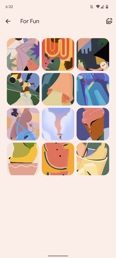
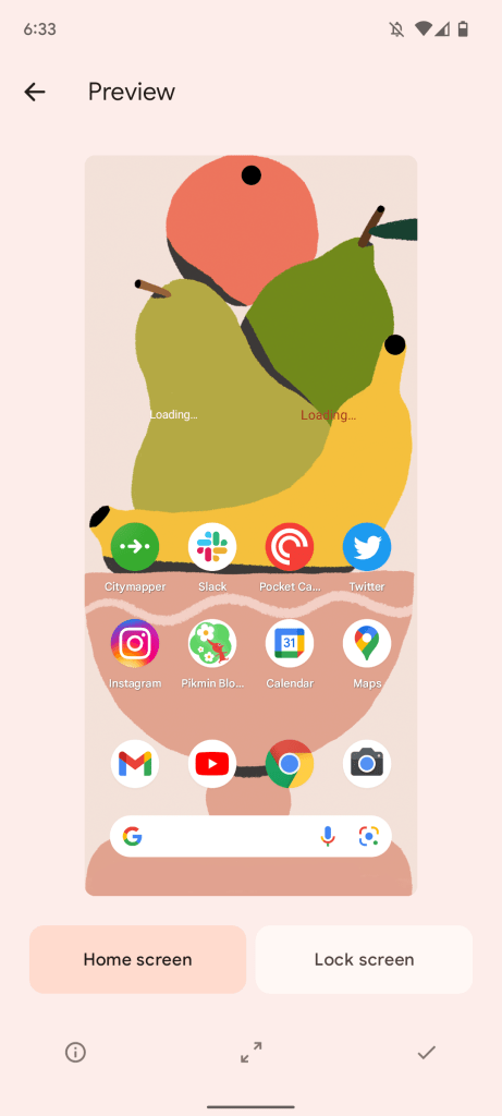
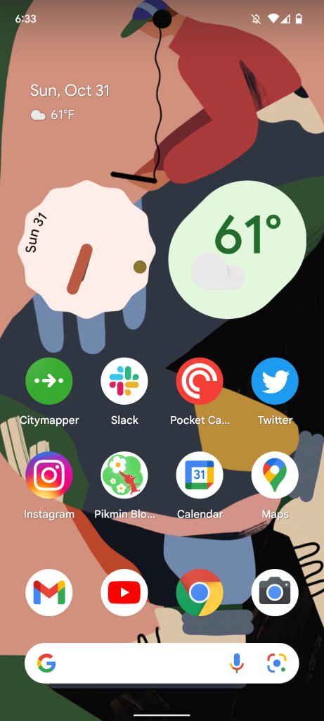
The first thing that I noticed was the hole punch camera on the front. It’s one of the biggest differences between the Pixel 6 and the iPhone 13. I’ve never had an issue with the iPhone’s notch, but after just two days with the Pixel 6 I can confidently say that the hole punch camera is a better solution. It’s far less obtrusive and doesn’t interfere with content nearly as much. It leaves more room for status bar items, and it kind of looks like it’s just another item up there. Google’s even built in several wallpapers that accentuate the camera. Apple’s never tried to embrace the notch with creative designs.
If you opt to use dark mode, you barely ever see it. But I don’t mind seeing it here, because it doesn’t take up any valuable real estate. It’s so small and smack dab in the center of the status bar. It can be odd while watching videos in full screen because of the way content appears on either side, but hey you get to see more of the video than you would on an iPhone. It’s kind of like a little island that floats on the side of your content.
Under display fingerprint sensor
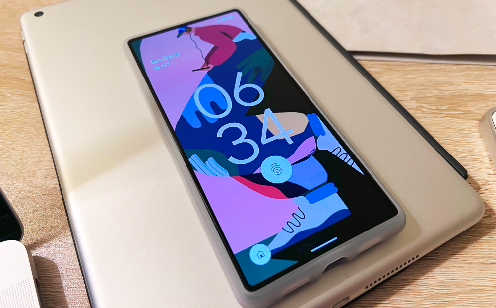
Face ID was great before COVID. It was fast, secure, and more natural. But in a world where masks aren’t going away anytime soon, I want a fingerprint sensor on my phone. Under display fingerprint scanners aren’t quite as fast as the ones on previous iPhones’ home buttons, but that extra second earns you way more screen real estate. The under display fingerprint sensor isn’t slow though like some have said. Over the course of 48 hours it seemed to speed up as it learned my fingerprint. It’s also more accurate than the side mounted power button fingerprint sensors I’ve used.
The phone guides you to where the sensor is and lights up that part of the display super bright to get a clear scan of your fingerprint. It’s really cool technology and it’s something I wish Apple would explore for future iPhone models.
Incredible rear-facing cameras
The Pixel has always been known for its excellent cameras. For a long time Google kept a single lens on the phone and utilized computational photography to create amazing photos. This year they’ve completely overhauled the camera system and have added additional lenses. The photos look stunning from the Pixel 6, even better in my opinion than the iPhone 13 Pro.
In general photos look less processed and night mode is no context. Images in darker environments look way better from the Pixel 6 than the iPhone 13 family. Ultimately though, it comes down to personal taste. You might prefer the way an iPhone processes photos or even the way Samsung processes photos.
90Hz versus 120Hz
I’ve wanted ProMotion on the iPhone ever since I first used it on an iPad in 2017. So I’ve been loving it on the iPhone 13 Pro. I was worried that I’d have an issue with using a 90Hz display after spending so much time with 120Hz ones, but I can barely discern a difference. It probably explains why Apple didn’t put a 90Hz display on the regular iPhone 13. It would take away ProMotion as a key selling point for the pro models.
Really good haptics
I have never used another phone with haptics nearly as good as the iPhone’s. Starting with the iPhone 6s, Apple implemented the Taptic Engine for more precise tactile feedback. It’s only gotten better over the past six years, outclassing any other device.
The Pixel 6 is the first Android phone to have really good haptic feedback that feels natural. The haptics on key presses with Gboard feel especially solid.
A cozy case design
I’ve loved Google’s fabric cases, particularly because of their unique designs. But the new cases that Google is making for Pixel 6 and Pixel 5a are really nice. They’re made out of recycled materials and feel excellent in the hand. They have just the right amount of grip.
The color options are really nice as well. Google has made colors specifically for each model of the Pixel 6. There’s a light rain case for the sorta seafoam Pixel 6, a cotton candy case for the kinda coral Pixel, and a stormy sky case for the stormy black one. These cases don’t obstruct the unique design of the Pixel 6 and rather accentuate it. It highlights the camera bar and color scheme quite well.
![Pixel 6 Diary: An iPhone user's first 48 hours with Google's latest flagship Here's every official case for the Pixel 6 and 6 Pro [Gallery] - 9to5Google](https://9to5google.com/wp-content/uploads/sites/4/2021/10/Pixel-6-official-case-lineup.jpg?quality=82&strip=all)
I wish Apple would explore some new materials for their cases. The silicone and leather ones are starting to feel a little old. Neither has a particularly good grippy feeling. The leather cases get sticky and the silicone cases become grimy. It’d be quite cool to see Apple do some recycled cases with some new materials and some fresh looks.
Follow along
I’ll keep using the Pixel 6 because I truly am loving it. So stay tuned for more diary entries on my experiences with Google’s first true flagship phone.
9to5Google’s take
Our pals over at 9to5Google have already fully reviewed the Pixel 6’s pro counterpart. I highly recommend that you check it out here. You should also keep an eye out for their Pixel 6 review coming soon.
Author: Parker Ortolani
Source: 9TO5Google


