Apple debuted iOS 14 this month with huge benefits for iPhone users. , homescreen customization is here! While we’re slightly jealous of things like the polished widget designs of iOS compared to Android, there’s one thing I can say for certain. The process of doing any theming or customization on iOS 14 sounds legitimately awful compared to Android.
For years iOS has essentially forced users to all have the same homescreen. Apps were in the same grid, the same layout. In the latest versions of iOS, that has changed. Officially, Apple is giving users customization through widgets, a core feature of iOS 14 that allows everyone to have a new homescreen that’s entirely unique.
Beyond that, a little-known trick from iOS 12 has taken the world by storm. The ability to create Siri Shortcuts, change their icon, and put them on your homescreen in place of apps combined with iOS 14’s App Library means homescreen customization is actually possible, and with impressive detail, too.
Honestly, I’m so glad this has finally happened. Finally, millions of people can truly make their phone their own — you’d have to be a monster to be against that. Below are just a few examples of the custom creations I’ve seen trending on Twitter.


That said, I’m in shock at just how ridiculously complicated it is to customize the homescreen on iOS 14 compared to Android. Just looking at the massive number of screenshots and videos showing off custom iOS 14 homescreens, it seems like it should be a relatively easy task. Well, it’s anything but. As our colleagues at break down, creating an “aesthetic” on iOS 14 is a complex and time-consuming task. We’ve got a full tutorial on for that process, but here’s the short version.
- Use “WidgetSmith” to create the calendar, clock, and other widgets you want
- Pick out a set of icons that can cover every app/game on your phone
- Create a Siri Shortcut for an app on your homescreen
- Apply the appropriate icon to that Siri Shortcut and add it to the homescreen
- Repeat for
The folks over at explained what it’s like to actually do this process, and I think it sums up my point quite nicely.
I don’t care how cute the photos look. I don’t care how easy Instagram and TikTok tutorials make it seem. For the love of God, please, please, please practice self-care and do not customize your iOS 14 home screens for the aesthetic.
To be fair, some of these home screens look fly as hell. Some people have gone as far as to re-create a NookPhone from Animal Crossing: New Horizons in real life. Browsing through people’s creative ideas is cool, and you may find yourself tempted to attempt it for yourself.
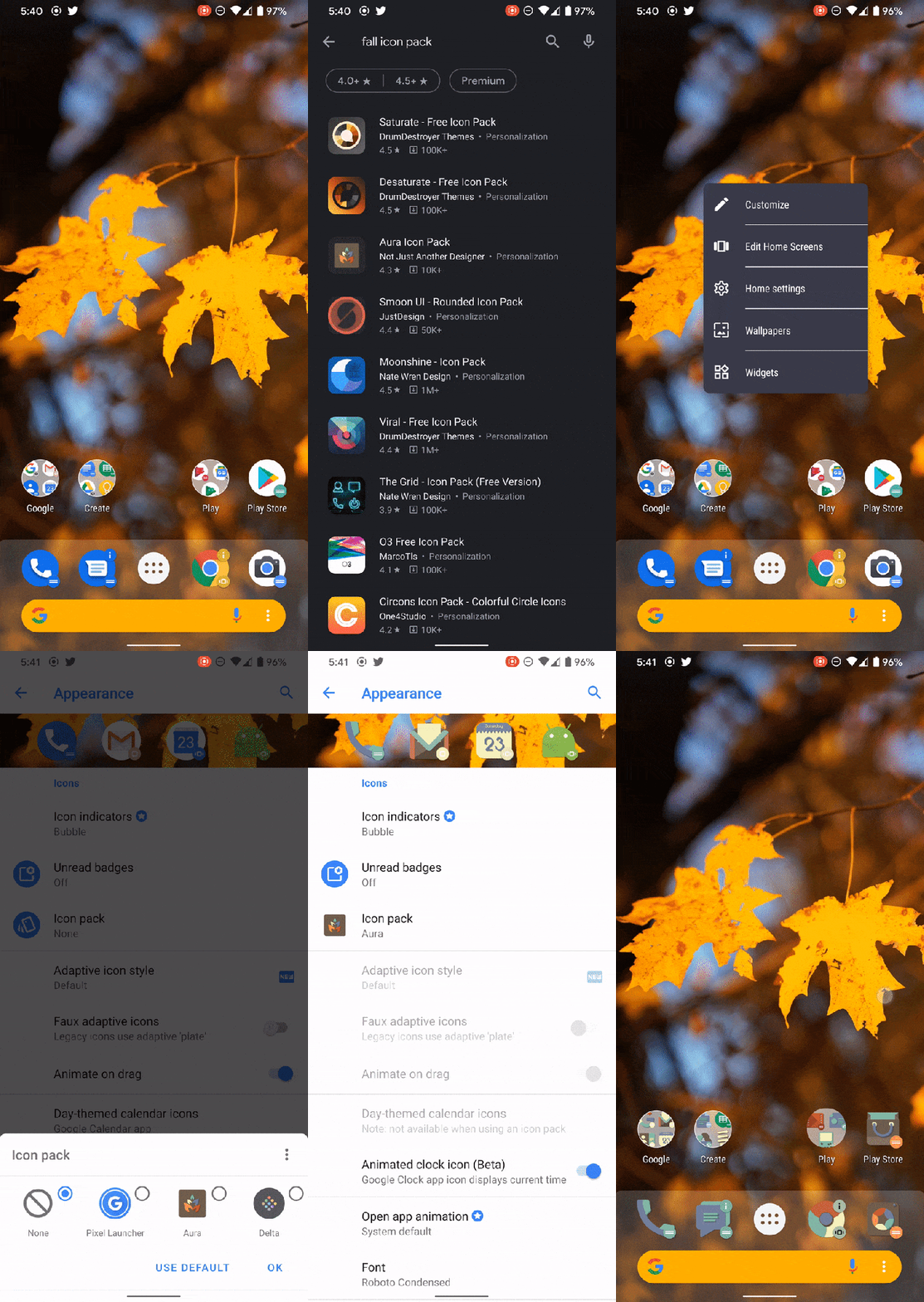
Customization of any kind is great, but the method used in iOS 14 is when you think about what we’ve had for years on Android. By comparison, here’s a quick description of applying a theme equally as complex and as thorough as what’s been trending on iOS.
- Download a launcher: Nova, Action, etc
- Download an icon pack from the Play Store
- Apply the icon pack on the launcher to every icon at once
- Add widgets as you please, you can even create them in KWGT

Where fully theming an iPhone can take quite literally hours to accomplish, you can fully craft a theme on your Android phone in minutes, and when all is said and done, it’ll probably look better because those custom launchers are more flexible with spacing, sizing, icon titles, and more. For proof, just take a look at the stunning custom themes Ara Wagoner has created over at .
My point is this: iOS 14 has homescreen customization now, and as an Android user, it’s fun seeing iPhone users so excited over finally being able to express themselves with their homescreen. However, iOS still has a long way to go. Right now, iPhone users are basically having fun with a hacky workaround.
More on Android & iOS:
Author: Ben Schoon
Source: 9TO5Google


