I’ve been a huge proponent of Google’s Android TV essentially since it first launched, and over the years, I feel the platform has only been improved for the better. Now, though, reports are being thrown around that there are plans to revamp the Android TV interface again. Please don’t screw this up, Google.
As we reported earlier this year, Google plans to deliver a second-generation Chromecast Ultra device sometime this year that will deliver Android TV — possibly rebranded as “Google TV” — and long-awaited features such as a remote. That’s awesome and overdue!
Now, another report has added a bit more to the story. Apparently, Google is also planning to refresh Android TV’s UI with this new rebrand and hardware in a pretty big way. Specifically, Google wants to change the focus of the homescreen to push direct content apps you’ve installed.
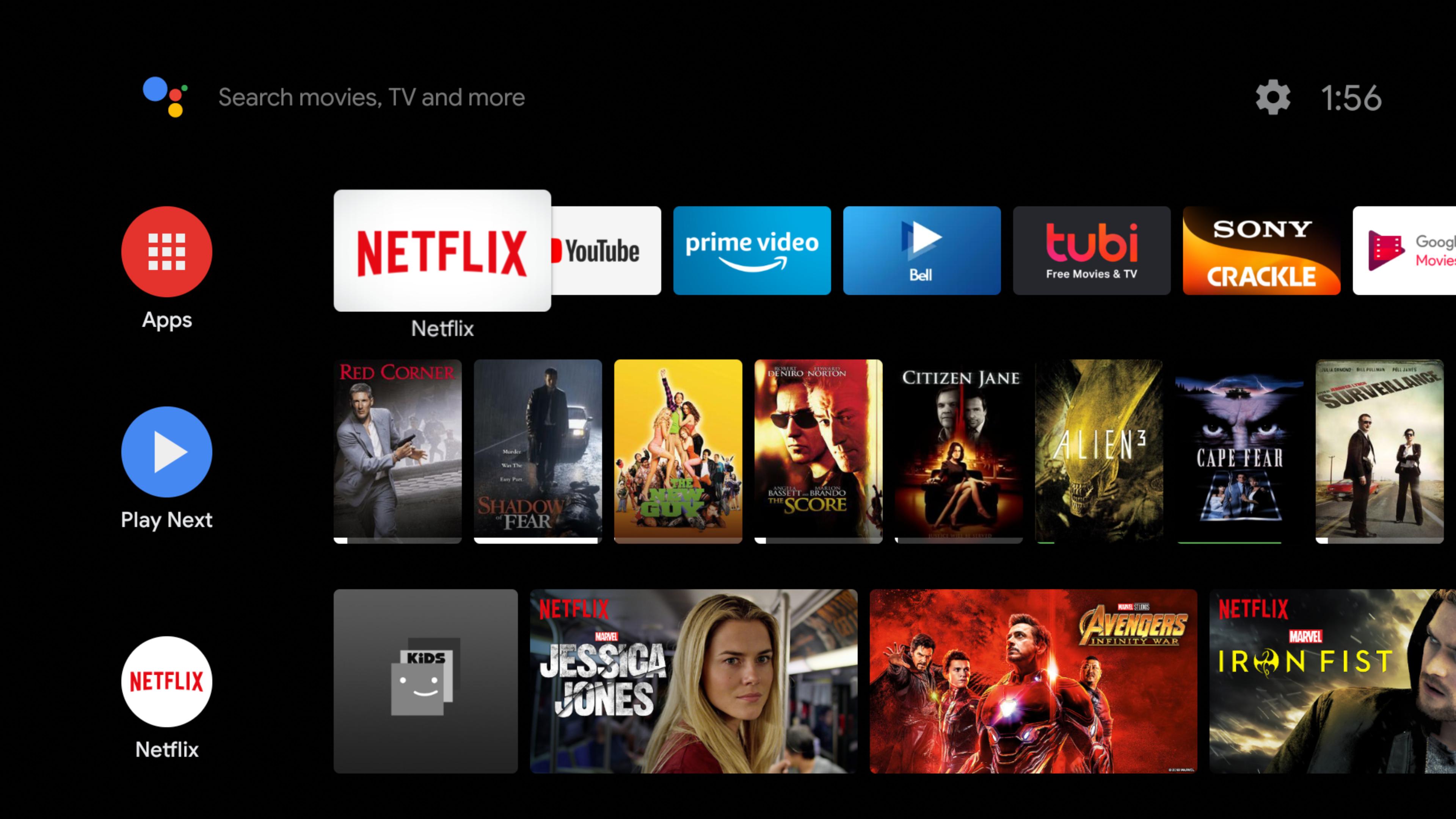
In its current state, Android TV’s homescreen puts apps as the first thing you see, and you’re free to customize the order and “favorites” as you please. It results in a quick and easy row that users can quickly get to the service they want. Under that, there are content recommendations and the “Play Next” row that focuses on the content you’ve yet to finish in your favorite apps.

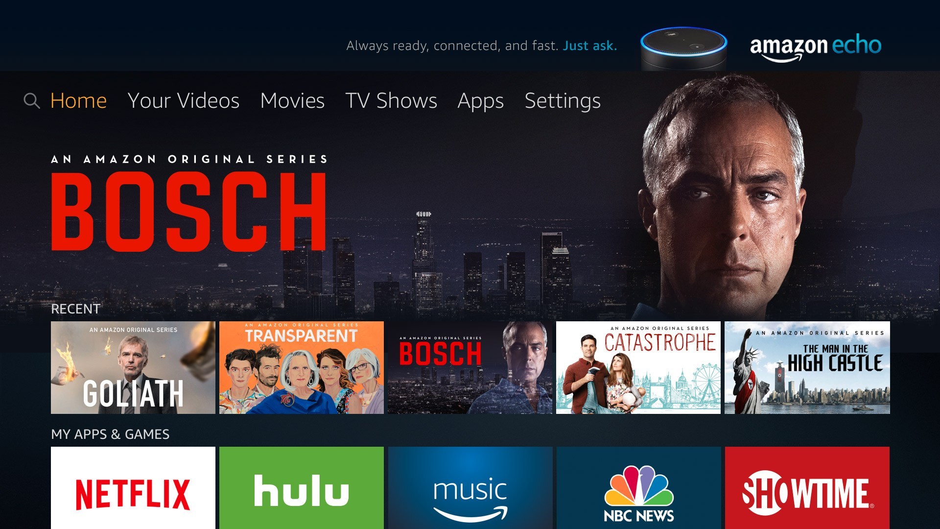
What reports, though, is that Google wants the Android TV interface to focus on content first, apps second. The result? Apparently, a homescreen that looks a lot more like Amazon’s Fire TV interface. How bad could that be?
Oh… no

As someone who’s spent a ton of time covering the ins and outs of Android TV and just enjoys it as a consumer, this is pretty much the nightmare scenario. I like Android TV because it balances apps and content recommendations better than anyone else. Roku almost gives apps focus, burying content recommendations as a result. Fire TV is the exact opposite that leads to a cluttered interface that’s only made worse with advertisements. Apple’s tvOS has a good balance, too, but personally I prefer the apps to be the main focus versus the recommendations.
There’s so much content out there that recommendations can be valuable for surfacing what’s new, but burying apps isn’t the way to go. By doing that, you’re asking customers to spend more time getting to what they already know they want — which feels like the majority’s use case — and also asking content partners to give up their app experience for the platform’s onscreen. As the report points out, some like Netflix are not going to be happy with that.
What it comes down to is this. There are consumers who need recommendations to figure out what to watch, but I’d argue that have at least some idea of what they want to see when they sit down on the couch. For those consumers, an app-first experience is great because it lets them skip the clutter and get to what they want to watch. A content/recommendation-first experience is good for people who have no idea what they want to watch. For those people, I believe Android TV is still very capable in its current form to serve that use.
The company is the winner when a platform goes heavy on recommendations. It opens the door to content deals and ads and things end up, well, like the disaster that is Fire TV’s interface seen above. Sure, it results in cheaper hardware, but is that worth the trade-off? I’d argue no.
Please, Google, don’t ruin Android TV.
More on Android TV:
- Report: Android TV getting a content-focused UI redesign that downplays apps
- Exclusive: Google plans new Chromecast Ultra based on Android TV (w/ remote!)
- Rumor: Google is planning to rebrand Android TV to… Google TV
Author: Ben Schoon.
Source: 9TO5Google


