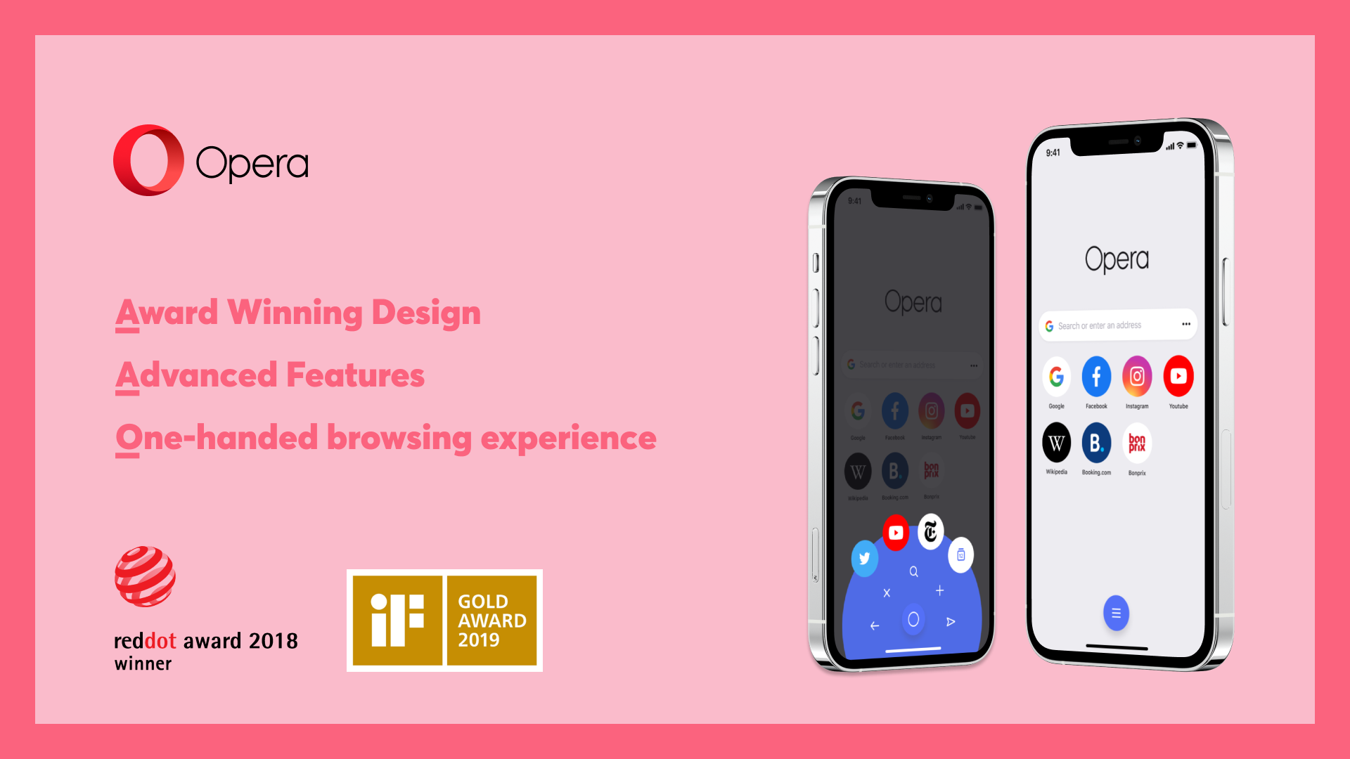
A major update is arriving for the Opera Touch iOS browser today – now rebranded to just Opera. The latest version features an all-new refined UI to modernize the browser’s minimalist design that builds on its foundation of privacy, speed, and a one-handed experience.
Announced in a press release today, the company says the new Opera for iOS “introduces a modern UI, keeping its minimalist design and the powerful features that Apple users love” like a private, safe, fast, and one-handed browsing experience.
Design elements like the diagonal background, shadows, and more have been removed to make up the modern look and feel:
The revamp of the user interface in Opera also unveils a neater and flatter design that gives the browser a more refined appearance than before. The new-look replaces the diagonal background pattern, initially introduced into Opera Touch, with flat surfaces and removing shadows on bubbles and other elements. New icons have been added in the bottom bar and the Fast Action button.

Other changes include a new color palette and reworked text:
The purple that was originally introduced when the browser was launched is now gone. The light, dark and private mode themes have all changed. Every page, background, text, or element is affected to create a brand new impression and beautiful look.
Opera offers a feature like Apple’s Continuity called Flow to make it easy to use the browser between iOS and Mac:
When users click the Flow icon on the sidebar, a QR code appears, which can be scanned with the Opera browser on their iOS device. This connection securely links the users computer and mobile device so they can share links, notes, images, files and other information seamlessly with no logins needed.
Another unique feature is a built-in Ethereum wallet and of course, with iOS 14, you can set the new Opera to be your default browser.
The new Opera browser for iOS is a free download from the App Store and will be available from 7 am PT this morning.
Author: Michael Potuck
Source: 9TO5Google


