When I first pulled the Nothing Phone 1 from its slender retail box, I just stared at it, flipped it over in my hand and scrutinized the see-through bits and pieces. Nothing’s attention to detail was noticeable everywhere. I’ll admit it outright: I love how it looks.
The company may be pushing a narrative of epoch-defining design, but its first phone also comes with decent, if not groundbreaking, specifications and, gasp, a competitive price point. While the aesthetics scream flagship device (and there’s definitely some iPhone DNA here), the price tag, around $476 (£399 here in the UK, no availability in the US), puts it in the arguably more competitive midrange weight class. That puts it up against the iPhone SE, Samsung’s Galaxy A series and Google’s Pixel A devices – don’t forget, the Pixel 6a is just around the corner. Can a literally flashy phone steal your attention away from all these heavy hitters?
Pros
- Unique transparent design
- Glyph Interface is eye-catching
- Competitive price
- Competent cameras
Cons
- Glyph Interface isn’t super useful
- Some features veer into gimmickry
- Screen has substantial bezels
Hardware
Both colors of the Nothing Phone 1 are eye-catching. And, while the white version looks cooler, the black really emphasizes the unique glyph lights. Gorilla Glass covers the front and back, and Nothing has curated what components you can see and smoothed out some of the lines.
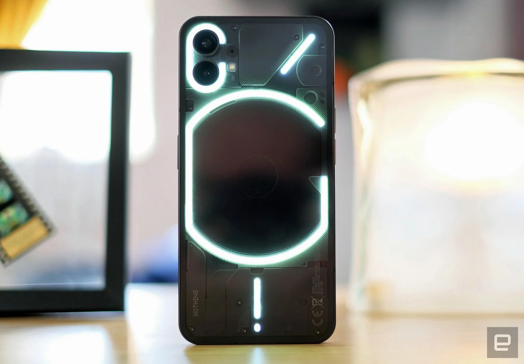
Let’s talk about the Glyph interface, as Nothing has coined it. It uses over 900 LEDS to create four different light-up elements across the back of the phone. Some have extra features, which I’ll come back to, but collectively they light and flash to signify phone calls or notifications… and prompt strangers to ask, “what’s going on with your iPhone?” The only thing it attracts more than onlookers is fingerprints. You’ll buff this phone a lot to ensure the transparent design can be properly shown off.
Yeah, it’s eye-catching to all humans within 10 feet, but fortunately, you can reduce the brightness and, well, the severity of a phone call or text from someone. There’s also a thoughtful warning that the Glyph Interface may not be safe for anyone with epilepsy or other light-sensitivity conditions. As I have a history of seizures myself, it’s a nice consideration, but as someone noted, what about the people around me?
Nothing has made 10 unique ringtones with dedicated Glyph patterns that light up in sync to the lo-fi chippy noises – one of several signs that the Teenage Engineering DNA runs deep here. Most of the ringtones and patterns are somehow… just plain cool? I think it’s something to do with the perfect synchronization or the fact that it’s not the hollow, orchestral stirrings of a corporate audio sting.
A light strip at the bottom of the Phone 1 doubles up as a charging gauge when the device is plugged in. You will have to enable the feature within the phone’s Glyph Interface settings. I wish the battery gauge also worked on the power strip even when it wasn’t plugged in. Perhaps we’ll get more Glyph functionality in the future.
Now, for all those claims of a unique smartphone paradigm, besides the back, the phone looks and feels like an iPhone – especially the edges of the recycled aluminum frame. Unlike Apple’s phone, there’s no mute switch, and that might be an intentional design choice to put some distance between Nothing and OnePlus. (Nothing boss Carl Pei co-founded the latter and I’ve made my feelings on the OnePlus alert slider known for some time.)
Like the iPhone, the power button is on the right side, while the volume buttons are along the left. At the bottom edge, you have a single-firing (but loud!) speaker, SIM card slot and USB-C port.
There’s a red LED on the back of the phone to indicate when Phone 1 is recording video, like a camcorder from the ‘90s. It’s equal parts privacy feature and intentional retro nod. Another cute touch: The SIM card remover handle is resin-tipped, and looks like a little transistor.
The Phone 1 is a big phone. It dwarfs my iPhone 13 Pro. Its 6.55-inch 1080p screen puts it closer to the iPhone 13 Pro Max and the Pixel 6 Pro. Though, at 8.3mm thick, it’s more substantial than Apple’s biggest iPhone.
The midrange spec creep starts at the display, which has a relatively substantial bezel similar to the Galaxy A53 but it’s unlikely to be a dealbreaker for many. There’s a holepunch camera, (16-megapixel) and the display itself is vivid and bright (up to 1200 nits), while refresh rates can reach 120Hz. Adaptive refresh rates are one of the modern touches that help devices feel (and, well, look) premium.
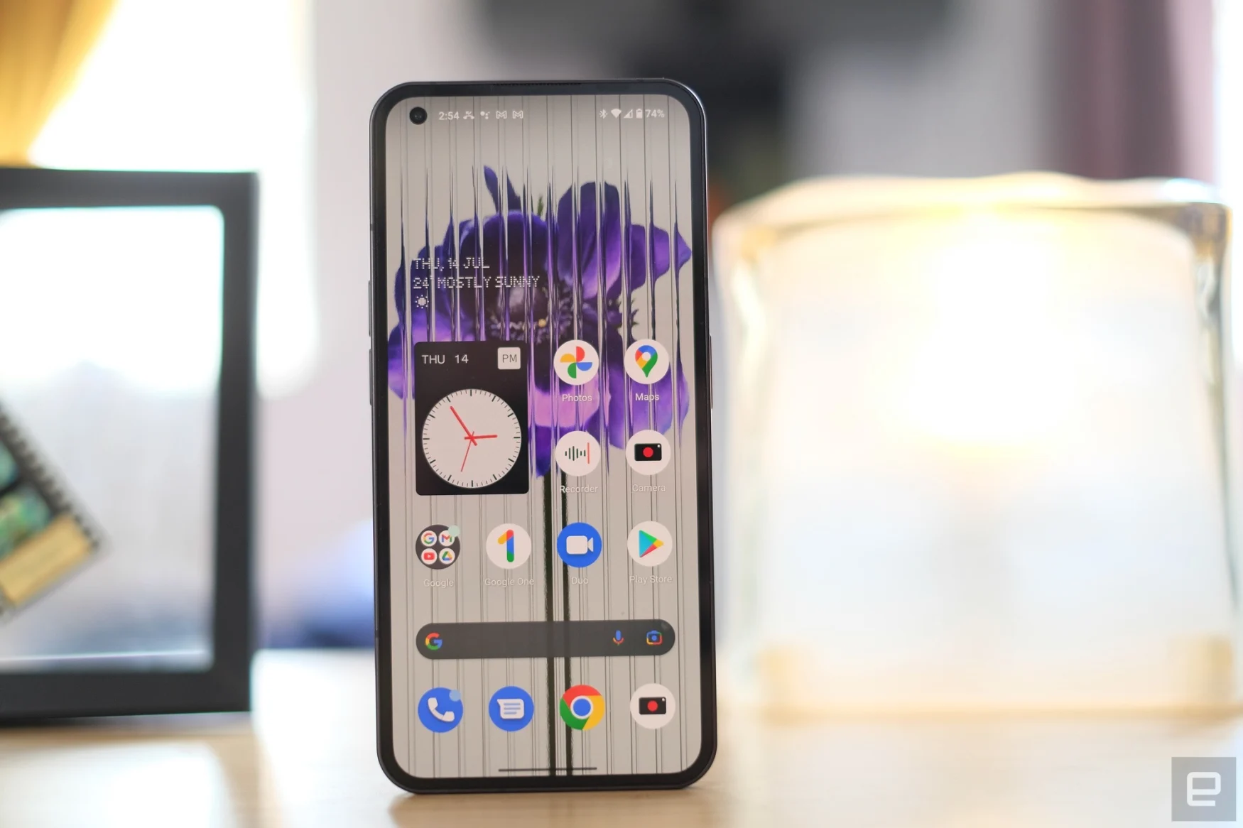
The Phone 1 feels premium then, despite the next compromise: the mid-range Snapdragon processor ticking away inside. Qualcomm’s Snapdragon 778G+ chip has been lightly customized for Nothing, meaning the Phone 1 can offer wireless charging (and reverse wireless charging) capabilities, unlike phones using the standard Snapdragon 778G. The Phone 1 was still able to handle some battles and exploration in Genshin Impact, though it did get rather warm in the process.
Nothing says you can 33-watt fast-charge the Phone 1 to 50 percent battery capacity in 30 minutes, and my testing pretty much replicated this. Wireless charging tops out at 15W, while you can reverse charge at up to 5W from the Phone 1 itself. I wonder if wireless charging is all that desirable? Or was it an issue of having something nice to show off on the transparent back? Something to frame a Glyph around? Perhaps I’m just a cynic. (Ok, definitely.)
In our battery rundown tests, the Phone 1 was able to play a video on loop for just over 16 hours, which is better than several Android phones we’ve tested in the last year, including the OnePlus 10 Pro, although it’s worth noting that Nothing’s has a lower-resolution display.
In typical use, I managed to get a day and half out of a full charge. With more video recording, or gaming or streaming, this would mean I’d be under 10 percent by 9PM. This is ameliorated a little with the fast charging, but a bit more battery life would have been nice.
Software
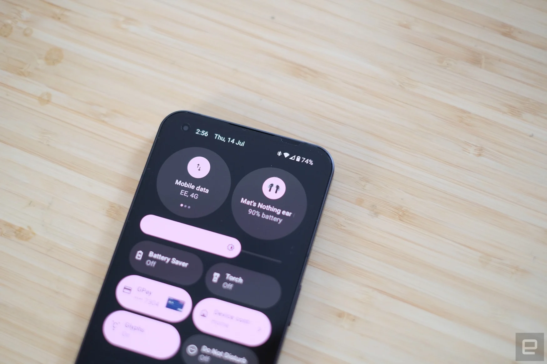
The dot-matrix ‘Nothing’ font that arrived with the company’s debut earbuds, is peppered around the company’s take on Android 12. There isn’t much different about this “bespoke” interpretation of Google’s mobile OS, though. There are those Glyph-connected ringtones, some monochromatic wallpapers, and unique widgets in the drop-down menu, but otherwise, it’s mostly the Android you know.
A Nothing spokesperson told me that they’re working on expanding features through third-party APIs — one example currently live is the ability to unlock your Tesla from this dropdown menu. You can turn on the AC in advance, flash the lights and a few more lightweight features. But that’s an incredibly tiny slice of Venn diagram overlap: Tesla driver and Nothing Phone 1 owner.
Another obvious display of the company’s partnership with Teenage Engineering, is its voice memo app, which has a minimalist tape deck aesthetic. You can rewind and fast-forward, and there are several noise-canceling options to better isolate voices. It’s not podcast-ready but if you’re recording a meeting or leaving a note for yourself from a loud pub they should at least help.
If there’s one thing I can’t get on board with, it’s Nothing’s addition of a native NFT Gallery. I don’t have any NFTs, but if I did, I’d be able to track their prices and “show them off” in five different sizes on the Phone 1. Let’s move on.
As it’s a new phone from a very new company, I had my reservations about stability. But so far, I’ve had no major issues. Resource-intensive apps may take slightly longer to load compared to flagship phones, but that’s about it. The company has also vowed to bring three years of Android updates to the Phone 1, which should help keep things secure and stable.
Cameras

If you‘ve been checking out many of our phone reviews over recent years, you’ll have noticed that multi-camera setups often include a dud – a monochrome sensor here, a 2-megapixel macro camera there. There’s a reason why the Pixel 6 and iPhone 13 are still capable of decent photography, despite “only” having two cameras – diminishing returns. This phone also has a dual-camera system. At this mid-range price, this is where things often go awry. But, thankfully, that’s not the case with the Nothing Phone 1.
Nothing has gone for Sony’s IMX766 sensor and combined it with f/1.9 lens with optical image stabilization. If you’re a smartphone obsessive, that might sound familiar, because that’s what you got on Oppo’s Find X3 Pro, a flagship Android phone from last year that was double the price of the Phone 1.
The secondary ultrawide camera uses a 50MP Samsung JN1 sensor with an f/2.2 lens. This doubles as a macro camera, but don’t expect incredible macro photography from a phone.
You can expect crisp images in good lighting, though. I’ve been impressed with the still quality from the Phone 1. There seem to be some image software tweaks here, but they’re relatively light. Comparing daylight shots from the Phone 1 against the Pixel 4a, Google’s seemed to offer more contrast, but it’s hard to call a winner between the two. Both offered up 12-megapixel images, so detail levels were generally a match, Nothing just seems to have gone for slightly more muted colors.
With brighter parts of the image, you will notice some chromatic aberrations: a purplish hue around those bright spots. Night-time photography is decent enough, with the usual night shooting mode in attendance. It didn’t best the top smartphones, but it was able to rescue a few lowlight shots that would have otherwise been a dark patchy mess. Despite the algorithms at work, results were a little noisy.
The Glyph Interface can also be used as a sort-of ring light, to illuminate nearby subjects without the oomph of a standard flash. It added a gentle, slightly blueish hue to photos when enabled. It’s a clever idea but the execution is a little lacking. If Nothing could offer finer color temperature controls, like many ring lights do, this could be genuinely useful.
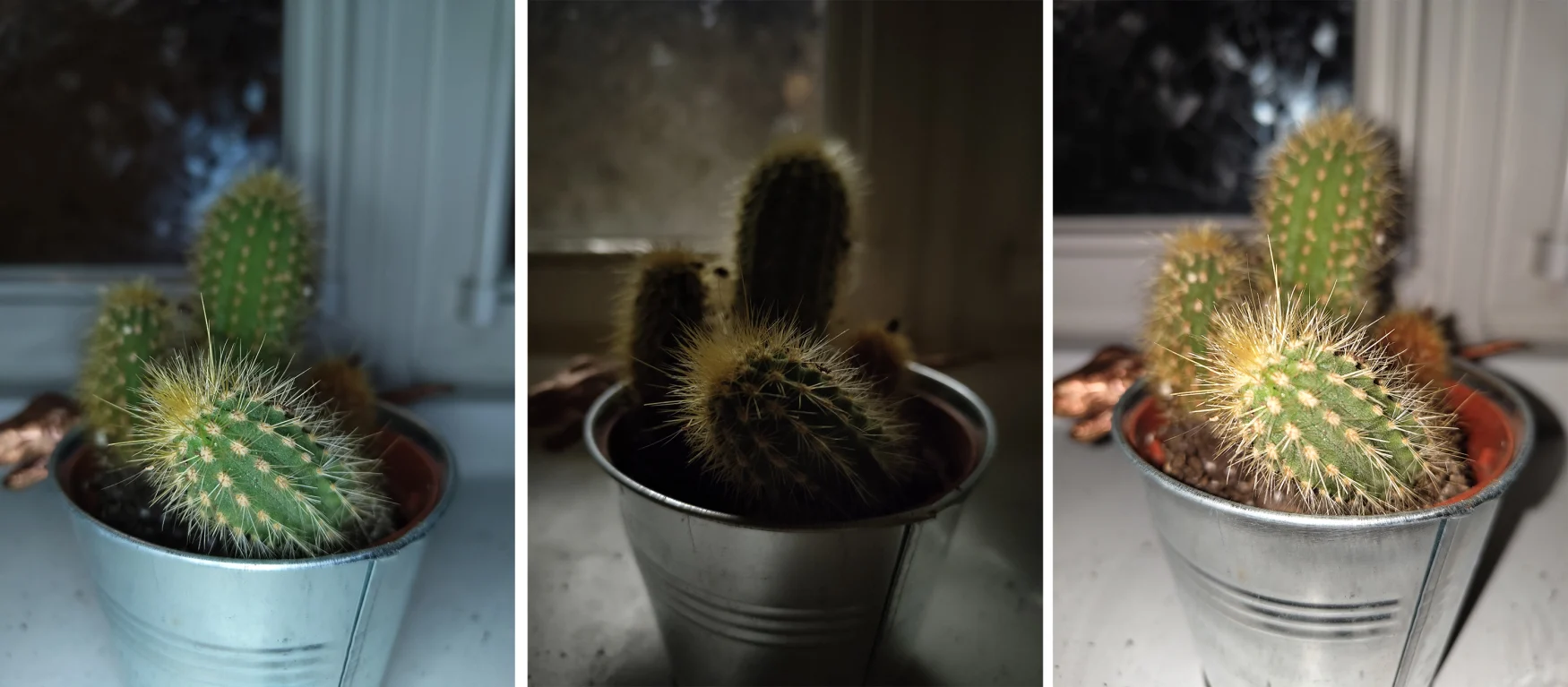
The camera app offers all the usual imaging features of a phone in 2022: HDR, Portrait mode, timelapse and even an expert mode for finer controls over white balance, ISO and more. I found the basic photo mode more than versatile enough. The biggest limitation was the 2x zoom, which crops part of the image sensor. There’s some digital zoom thrown in if you’re desperate. I started to miss the more expansive telephoto options on other – usually more expensive – smartphones.
The Phone 1 can capture 4K video at 30FPS or 1080p at 60FPS. Video quality was smooth and serviceable. There’s a little bit of rolling shutter wobble when you’re panning around, and in lower light I noticed it hunting for focus if I was moving while recording. It also struggles to balance exposure between a pinkish sky at dusk and a darker street.
Wrap-up

At the Nothing Phone 1’s launch event, Carl Pei said that “stability [was] way more important than a ton of flashy features.” It was an odd choice of words when the biggest differentiator of your company’s new phone is literally a flashing feature.
The good news is that all this effort into how the phone looks – and it’s certainly eye-catching when the Glyphs light up – hasn’t been undone by wobbly software, mediocre cameras or disappointing build quality. It’s a competent Android phone.
The price, the style and the attention to detail are all impressive. Nothing is walking a fine line between gimmick and feature at times, but as a new company, it gets to do that. There’s no predecessor phone to replicate, and this goes in Nothing’s favor. Having said that, its biggest rival could be Google’s Pixel 6a, with a similar price point, and its own unique look.
This is a new phone from a new company, so I’ll be keeping an eye on this phone longer term. But, Nothing has made an impressive debut. Don’t believe all the hype, but the Phone makes a compelling argument for mid-range shoppers and anyone that wants a phone that looks different but does things pretty much the same.
Author: 88
Source: Engadget


