The new Google Pay for the US launched almost a month ago in early access, and it’s now getting a straightforward dark theme on Android.
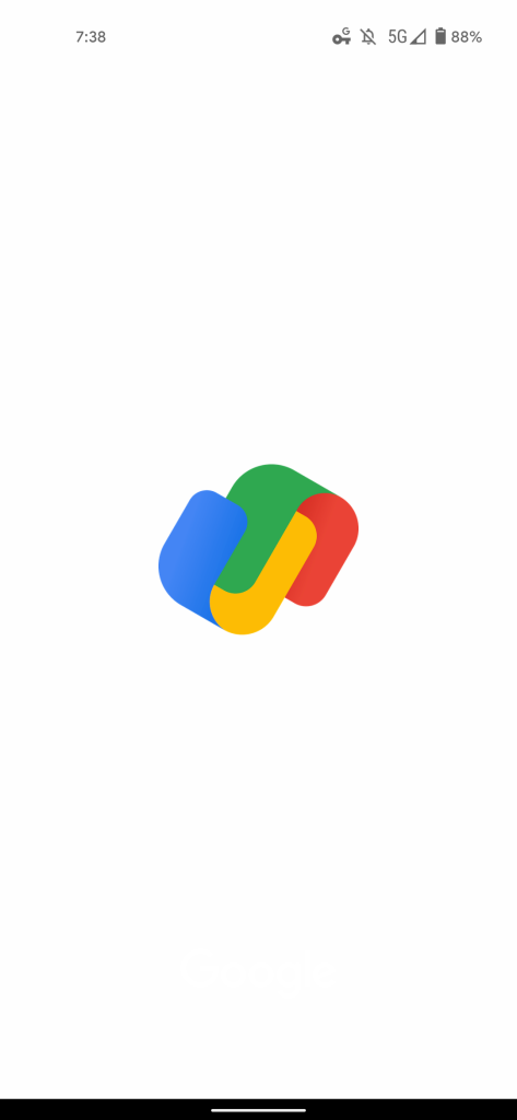
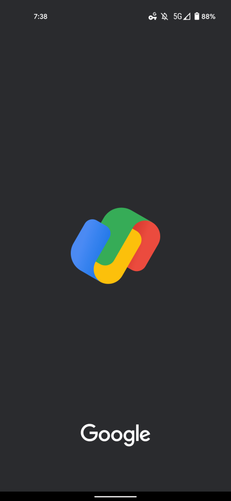
At launch, the service’s new intertwined logo is briefly shown against a bright background before switching over to gray depending on your system theme. There is no in-app toggle to set independently.
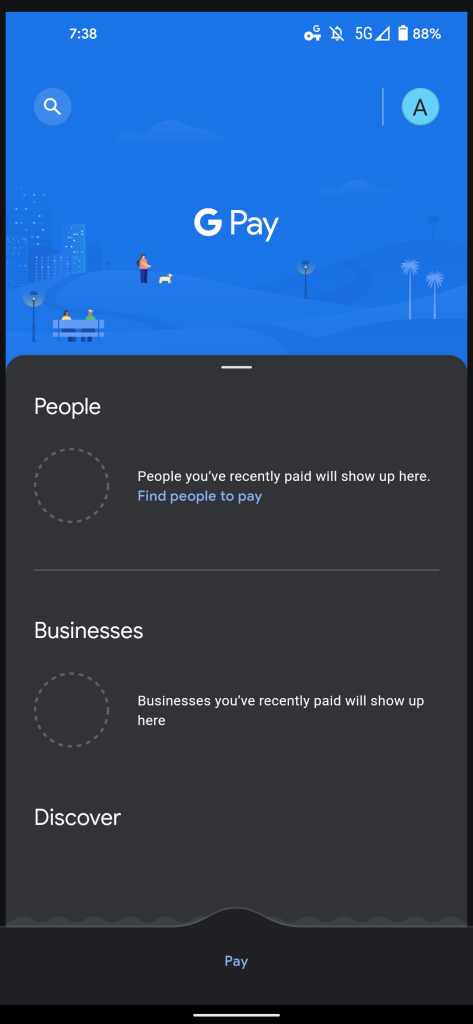
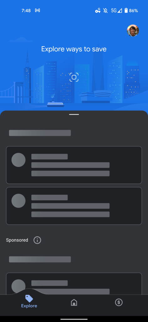
The dark mode applies to the main sheet and bottom bar. That latter component sees a lighter blue accent color for the current section icon and text. Compared to the sheet above, a darker shade of gray is also leveraged to provide better visual separation.
Unchanged is the blue top section that shows cover art and other usage prompts. The dark theme extends to settings after tapping your profile image and the search experience.
Version 119.1.4 of the new Google Pay brings the dark theme and is widely rolling out this morning via the Play Store.
More about Google Pay:
- Google Pay rewards are powered by Rakuten
- New Google Pay kills peer-to-peer payments on the web in January, adds transfer fee
- Google Pay is now locked to only one smartphone at a time
- Google launching ‘Plex’ bank accounts with Citi, other partners next year
Author: Abner Li
Source: 9TO5Google


