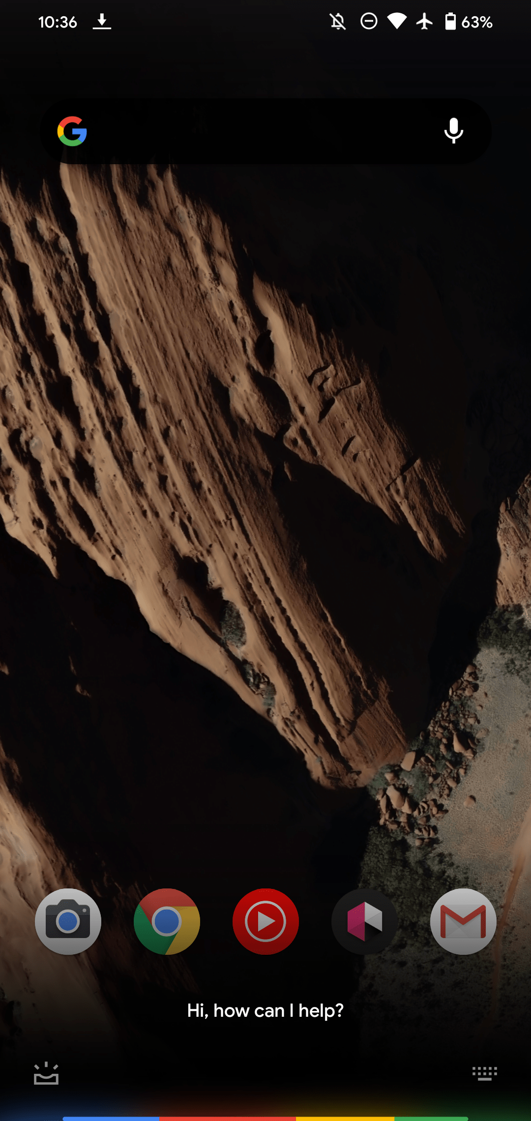
Besides on-device processing for faster commands, a new interface was one hallmark of the new Assistant that first debuted on the Pixel 4. The look very much reflected how Google wanted Assistant to be in the background. That’s now changing, as the new Google Assistant’s original UI is disappearing this weekend.
Over the last day, the translucent-to-transparent interface that saw the “Hi, how can I help?” prompt — along with shortcuts for Snapshot and keyboard input — emanate from the four-color light bar has disappeared.
It’s replaced by a compact sheet that’s either dark gray or white, depending on your theme. Regardless, the Assistant ‘g’ logo is solid and not multi-colored, with the same prompt appearing and the text entry button in the right corner. In terms of height, it roughly takes up the same space as the previous UI but without the ability to see your dock or background.
While the original look is disappearing, this is still the on-device new Google Assistant, as evidenced by some commands (i.e., turn on/off flashlight) working offline without an internet connection.


We’ve had this UI on one of our devices for some weeks, but it recently disappeared. It’s now back on that phone and all of our other NGA Pixel (4 and newer) units that we’ve tested today. This is occurring on both Android 11 and 12 devices that are running recent versions of the Google app (beta).
For context, this is not the first time Google removed the translucent UI. A similar thing occurred in October of 2020, but today’s rollout seems wider.
This new look does match how Assistant looks on all other Android devices. That design was widely rolled out in December, though it has seen some tweaks since and notably brought the light bar to all phones and tablets.
Google could be updating NGA’s look to unify Assistant’s appearance, but it’s somewhat of a shame that the replacement is very plain and lacks the nuance introduced by the original design. As we originally wrote:
This much-improved preservation of context and subtlety reveals how Google wants you to interact with Assistant. In the past, voice was an experience that took up the entire display and often brought you to a scrollable feed. The new Assistant on the Pixel 4 is now more akin to Google’s proclaimed ambient computing future where interacting with help should occur without a forethought of disrupting your life.
Author: Abner Li
Source: 9TO5Google


