Gmail on the web has long recapped key details about flights and other travel arrangements at the top of emails. A similar summary capability with expanded use cases and card-based UI is now coming to Gmail for Android and iOS.
When you receive a flight confirmation or email about an order, Gmail on mobile will now show a card just underneath the subject line. It includes keys details pulled from the body of the message: take-off and landing times, flight duration, passenger name, seat, and confirmation number. Multiple cards can appear in the case of departing and return flights.
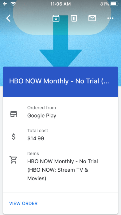
Purchases (both physical and digital) will identify who you “Ordered from,” “Total cost,” and “Items.” This so far works on Play Store and Google Play transactions, but not Amazon, which seems like an oversight. At the bottom of some cards are shortcuts to see more details or track a package.
These summaries make it extremely convenient to find key details when in a hurry without having to browse the full email. Cards can be collapsed, while Gmail for iOS has an entirely different interface. The summary comes first and includes a cover image, with the email starting underneath.
Back in February, we spotted development of this “smartmail_card” capability and the Gmail summary cards now look to be widely rolled out this week.

More about Gmail:
- Google readying Chat, Meet, & Tasks functionality directly inside Gmail for Android [APK Insight]
- Google details what coronavirus-related spam, malware Gmail is blocking
- Meet adding Gmail integration, grid layout, improved low-light quality, more
- Messages in Hangouts Chat can now be forwarded to Gmail
Author: Abner Li.
Source: 9TO5Google


