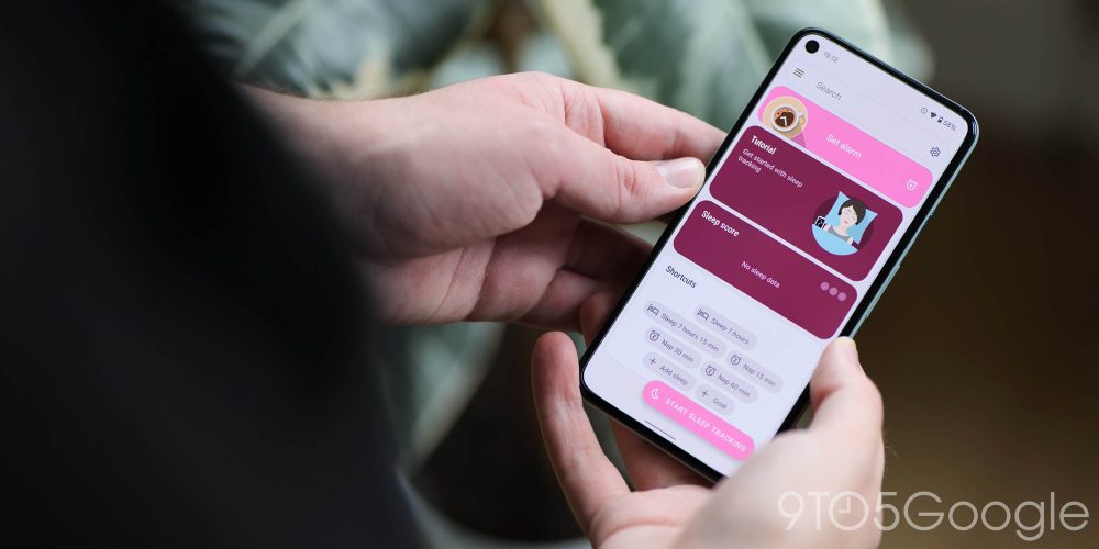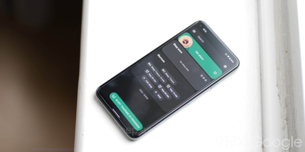
Android 12 is bringing a huge overhaul to the main UI, and thanks to the Material You element, it’ll start theming your favorite Android apps, too.
So just to recap, Material You is Google’s way of creating an interface that is almost fully customized based upon things such as your wallpaper. Instead of just app-specific themes, almost everything is accented or tuned. At this stage, not every app will outright honor your wallpaper/system theme, but we’ve spotted several first-party and third-party apps that take on aspects of Material You theming such as Dynamic Color to apps with full redesigns including icons and accenting.
We’re expecting all of Google’s major first-party apps — and plenty of major third-party offerings — to support Material You theming ahead of the full Android 12 launch. The ball has already started rolling with more and more apps updating to include the tweaks necessary to match your system theme. All of these changes rely upon you running at least the Android 12 Beta 3 update on your device, and while support is there, expect to see increased theming ahead of release.
Video — all of the latest Material You-themed Android apps
Subscribe to 9to5Google on YouTube for more videos
Chrome Canary
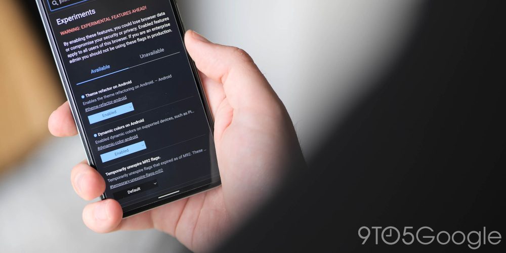
Don’t confuse Chrome with Chrome Canary, which is the bleeding edge of Google’s web browser but distilled down into a mobile form. As the forefront of Chrome, Canary is the first of Google’s browser apps to adopt any sort of Material You theming.
Now there are some caveats. Firstly, this relies heavily upon having a few Chrome flags enabled. The #dynamic-color-android flag only makes some modest changes to the Settings page. That’s it. But you may see some color tweaks to the address bar when using the autocomplete feature. The highlight color should follow the primary color from your current theme.
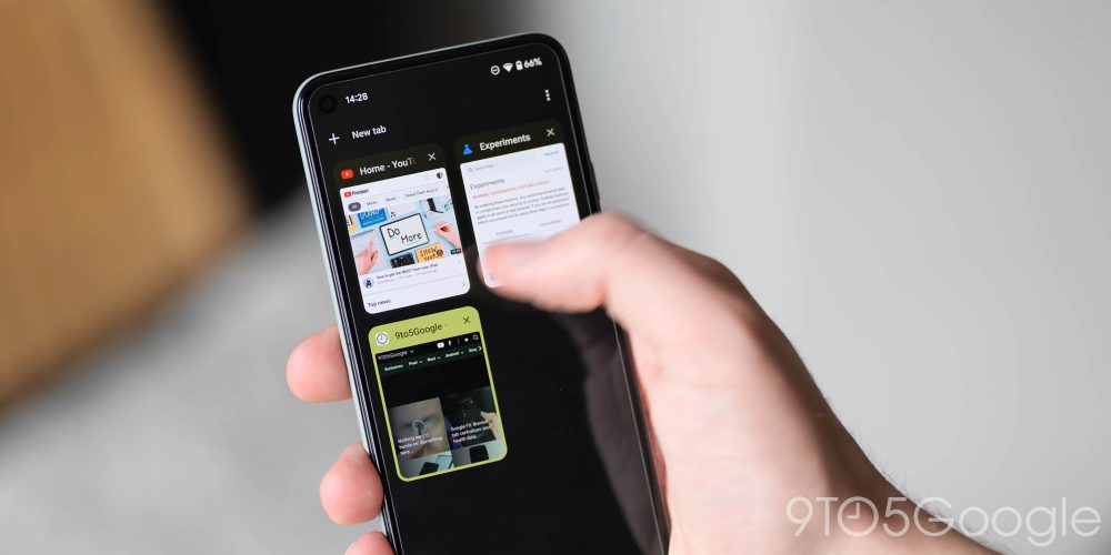
By enabling the #theme-refactor-android flag, the divisive grid tab switcher will have more accenting as determined by the Material You theming system. Your last viewed tab will use a darker shade of your main theme color, while other tabs will come with a lighter hue.
Gboard
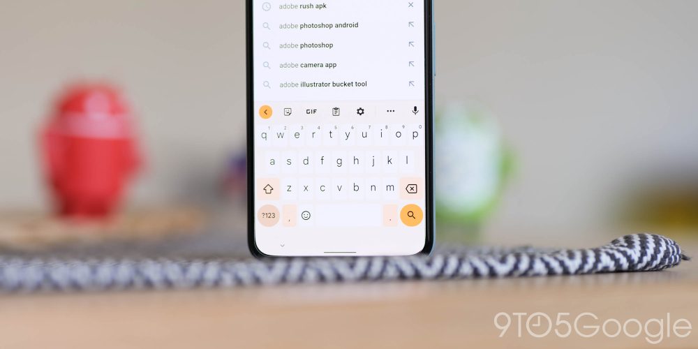
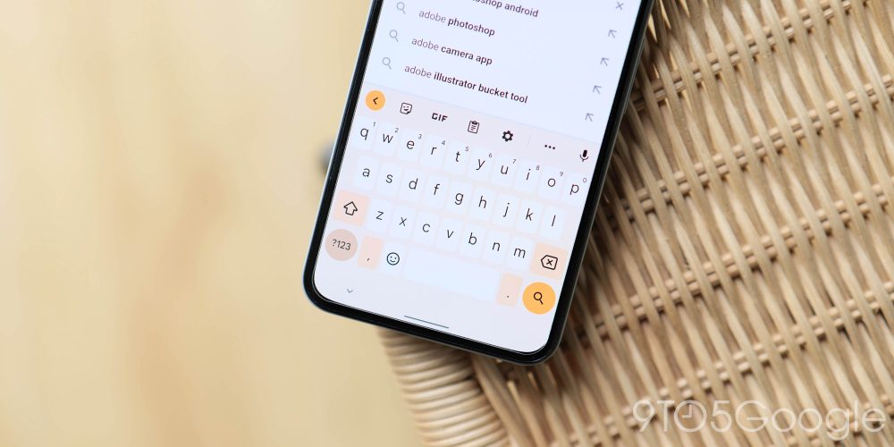
Rolling out now to small portions of users, Gboard will prove to be a pivotal app to adopt Material You theming as one of the most popular keyboard options on Android. The changes are quite substantial but most visible when your device is in “Light” mode, as the keyboard, key borders, and accenting adopt your wallpaper/device main colors.
A lot of the redesign is also dependent on whether you have key borders enabled, as the bulk of character keys are themed, while special character buttons are shaped and colored for greater prominence. Only a handful of users are seeing this, but expect it to arrive in a future update in the coming months.
Files Go
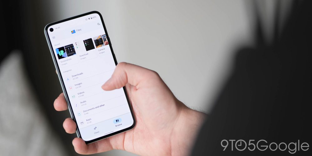
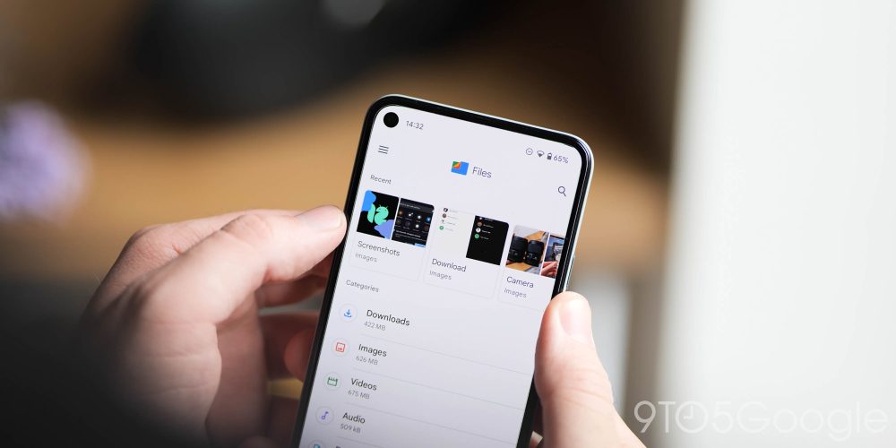
The Files by Google app has also been on the receiving end of a Material You redesign with the most noticeable change being the bottom navigation bar. Previously, you’d know which tab was selected based on which tab was shaded blue. In the new design, a pill shape surrounds the icon of the selected tab. The bar itself is also now a shade of light blue versus the white it used to be.
Similarly, the upper bar — with the Files by Google logo and the search button — has been given a Material You-style makeover, removing the shadow effect. Instead, to differentiate app’s visual layers, this upper bar now transitions from white to blue when you scroll down.
For now, Files by Google does not fully make use of the Material You colors, though this points to support being ready before Material You formally launches on Pixel phones later this year.
Google Camera
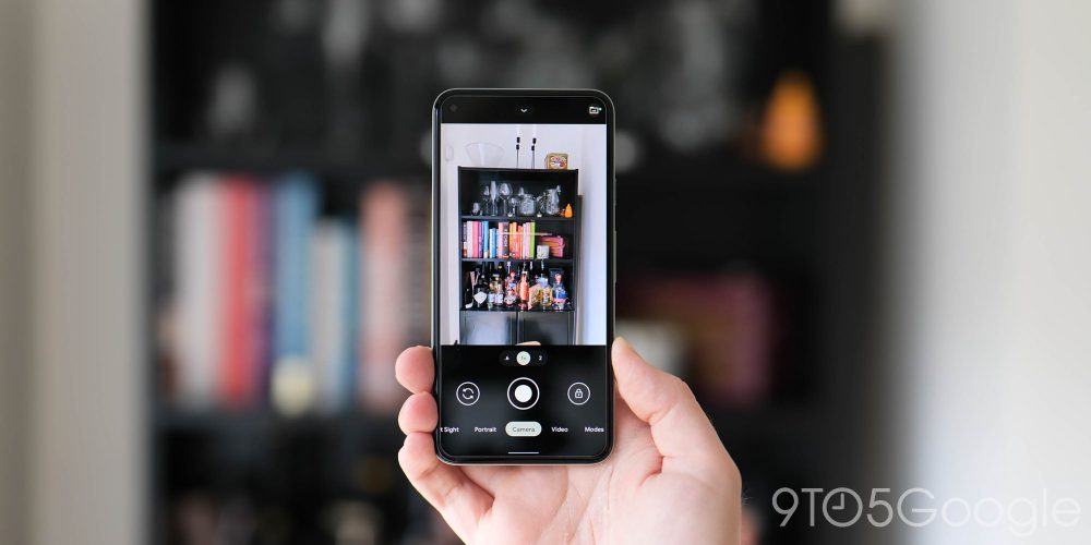
Google Camera 8.3 is bundled with the Android 12 Beta 3 update, and — you guessed it — it has some Material You app tweaks. This covers vast portions of the UI, including the floating settings menu and associated toggles, plus the main control area.
The settings page also does away with the dividing lines between sections, letting the colored text of each subheading act as a separator. Similarly, the text on this page — and the quick settings, but not the main camera interface — has been switched from the previous Roboto font to the newly launched Google Sans Text.
Google Contacts
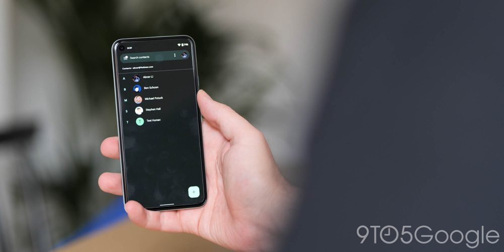
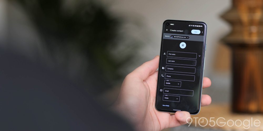
As far as first-party apps go, Google Contacts is the first to see what we’d consider a sizeable Material You redesign. It starts with a pill-shaped search field up top that replaces the previous rounded rectangle shape. This element, along with the background and a non-circular FAB that is much more raised with a prominent shadow, adapts to your Dynamic Color.
The tinting is very prominent in the bar and FAB, while more subtle in the background. The hue differs depending on whether the system light or dark theme is enabled. Other places you see Dynamic Color include the alphabet letters organizing people and when you open a particular contact. When you scroll up to hide a person’s image, the Call/Text/Video bar is tinted.
All of the various buttons and areas you can interact with should also respect your device wallpaper settings, while there is even an updated splash screen on Android 12 that animates the icon in from the left to top off a substantial overhaul with version 3.50.
Tasker
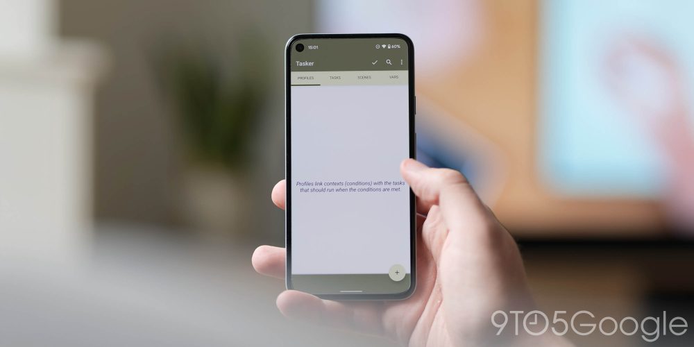
One of the most popular automation apps now supports Material You for the app itself, and you’re also able to use the theming settings with your own projects. This is available as part of the latest beta build and just requires a toggle to be set to “Material You” within the preferences section. For your own projects, you can use the “Get Material You Colors” action to use as you deem appropriate.
Sleep as Android
This is not an app that I am hugely familiar with but one that is very popular and turns your phone into a sleep tracker. Sleep as Android is almost completely Material You-styled. It reacts to your preset wallpaper when running the Android 12 Beta. It currently only themes the sleep-tracking app based upon one key color in your wallpaper and adjusting things to account for the main hue.
Not every bit of the app has been themed just yet, and there are still some readability tweaks to be made, but things are off to a great start, especially when you consider that Google hasn’t finalized APIs.
Inware
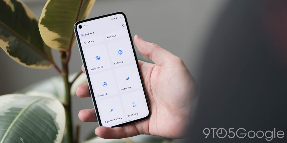
Long time 9to5Google contributor Dylan Roussel has updated device information management app Inware with support for Dynamic Color theming with regard to Material You. A toggle in the app settings lets you adhere to your device system colors that drapes accented hues on all areas of the app.
Have a favorite Material You-themed app?
The number of choices isn’t exactly deep, but we’re likely to see a massive volume of applications start to support Material You fully over the coming months. What is your current favorite, and what are you really excited to see? Have you seen an app with the theming enabled that we haven’t mentioned? Let us know in the comments section below.
Author: Damien Wilde
Source: 9TO5Google


