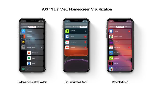
Instead of just the grid of app icons, there will be a new page or new mode so users can look at their apps in a top-to-bottom scrolling list. Now, some intrepid readers have made mockups of what that might look like.
Apple has traditionally not changed the home screen on iOS very much. The grid of apps is tried and tested, familiar to users, and dates all the way back to the original iPhone.
However, Apple has expanded the metaphor slightly over the years, like adding app folders with iOS 4 and redesigning the ‘page zero’ Spotlight screen to include Siri suggestions and widgets. In 2019, iPadOS 13 integrated the widget sidebar with the first home screen.
The changes expected to debut with iOS 14 are less a redesign and more an addition to what we already have. You can imagine some way to toggle between views (similar to the list view toggle on the Apple Watch) or simply swiping across to a new home screen page, which contains the list view.
Parker Ortolani mocked up what that screen could look like in his renders. A simple segmented control lets the user switch from seeing all apps A-Z, to apps sorted by recently used, and then only those with notifications that need attention. The Spotlight search field is on-screen ready to filter down the list. Ortolani also visualized how folders could be presented in the list, with an option to expand and see the apps inside.
You can see how a home screen page dedicated to apps with unread notifications could be very useful. 9to5Mac reported that the list view would combine an alphabetized list of installed apps with Siri suggestions. You can see in Ortolani’s mockup how the Workout app is being recommended based on current location, emphasized with a darker background appearance.
Another twist on this design can be seen in the mockups by iSpazio.net, again inspired by the 9to5Mac report. In this version, it feels closer to the watchOS approach — with a permanent mode toggle at the top of the screen. Users could tap on the list and grid icons to switch the home screen to those respective layouts.
iSpazio also imagined how Apple could make the list item for each app more useful, by providing a summary description for each item about why the user should open it. For instance, the Messages app is labeled ‘2 new Messages to read’, the Calendar app shows the next calendar event inline, and the Photos apps prompts the user to open it and look at significant Moments. These features could be enabled through iOS 14 extensions to the Siri suggestions and notifications APIs.
This week, 9to5Mac obtained iOS 14 internal source code and reported on a plethora of features in development at Apple from environmental noise alerts to a new wallpaper experience, new HomeKit features including Night Shift for smart lights, a new augmented reality app, and much more. Ortolani mocked up many of these features in this Twitter thread if you want to get a sense of how these iOS 14 features might come to fruition.
iOS 14 is expected to be announced in June, alongside previews of other major Apple software operating systems like watchOS 7 and macOS 10.16. This would usually happen on the WWDC keynote stage.
However due to the coronavirus outbreak, gatherings and conferences have been canceled across the industry and Apple is not expected to be holding a physical WWDC this year — although the company has yet to confirm its plans. We would expect a small scale media-only event in June to announce the new operating systems like iOS 14, with the developer sessions of WWDC simply streamed live online.
Author: Benjamin Mayo.
Source: 9TO5Mac


