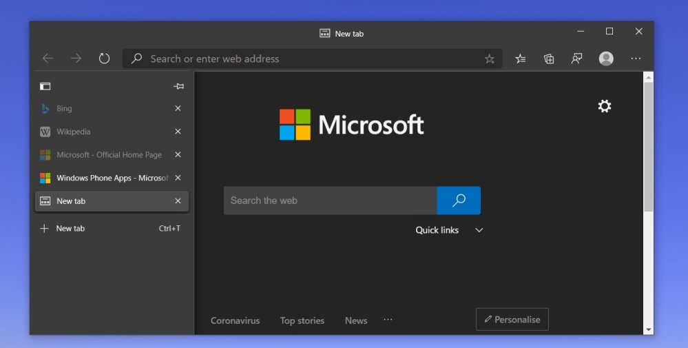
The Chromium-based version of Microsoft’s browser has gotten very popular since its debut earlier this year, and as it continues to develop, new features and ideas are being added. Now, there’s another new addition. Microsoft Edge is adding a vertical tab UI.
First pointed out by Windows Latest, Microsoft Edge is testing out vertical tabs in both the Dev and Canary releases of Edge. This feature ditches the traditional tab strip that Chrome, Safari, and other browsers have long implemented. Instead, Edge shows the name of a singular tab at the top of the screen and hides other tabs under a side menu.
A new button in Edge allows users to switch back and forth between the vertical and horizontal tab designs on the fly. When the vertical tab UI is being used, Microsoft Edge still respects the useful Ctrl + Tab option for switching between your various tabs. Users can also hold down the Ctrl button to see and rearrange tabs.

Personally, I wish this would come to Google Chrome, too. It’s a clean design that might come in handy for focusing on a specific task. Tab groups would also be extraordinarily useful like this. There’s no indication it will be added to Chrome, but given this is all based in Chromium, who knows?
More on Microsoft Edge:
- Microsoft pulls the plug on original Edge browser next year after replacing w/ Chromium version
- Microsoft’s new Chromium-based Edge is now the second-most popular desktop browser
- Microsoft Edge takes over Windows on first startup, basically ignores your browser choice
Author: Ben Schoon
Source: 9TO5Google


