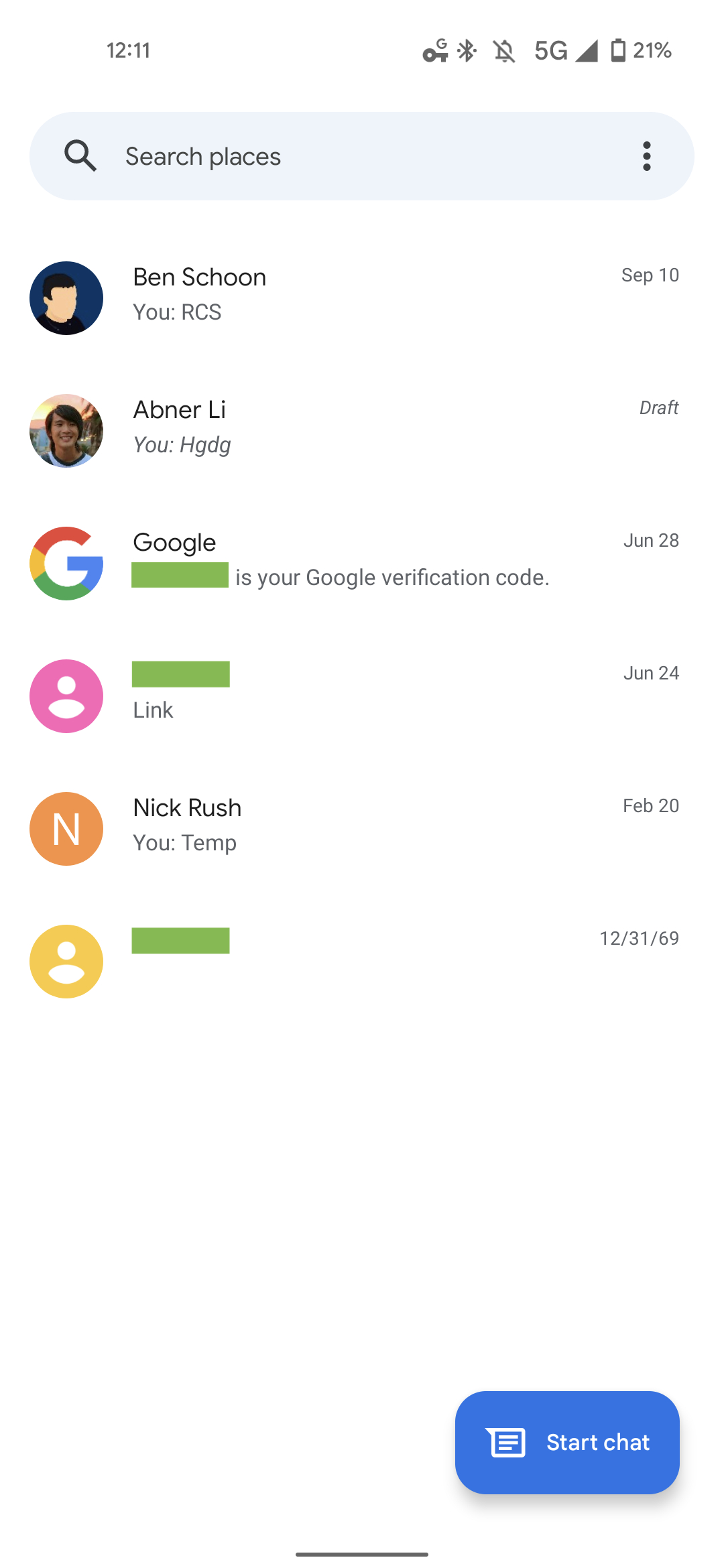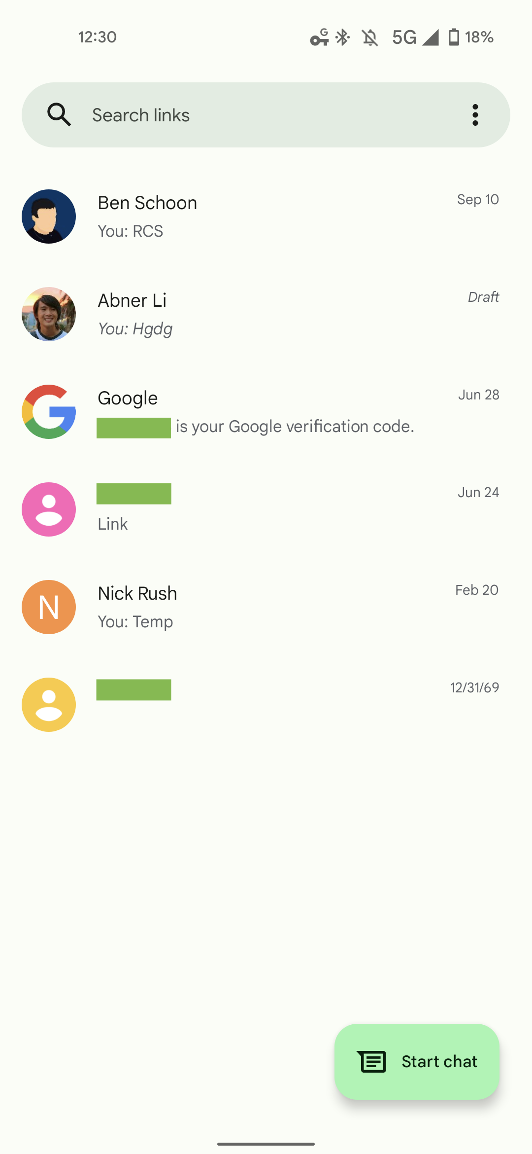
The latest beta version of Google Messages widely introduces a Material You redesign, but the Dynamic Color aspect for Pixel devices running Android 12 is currently incomplete.
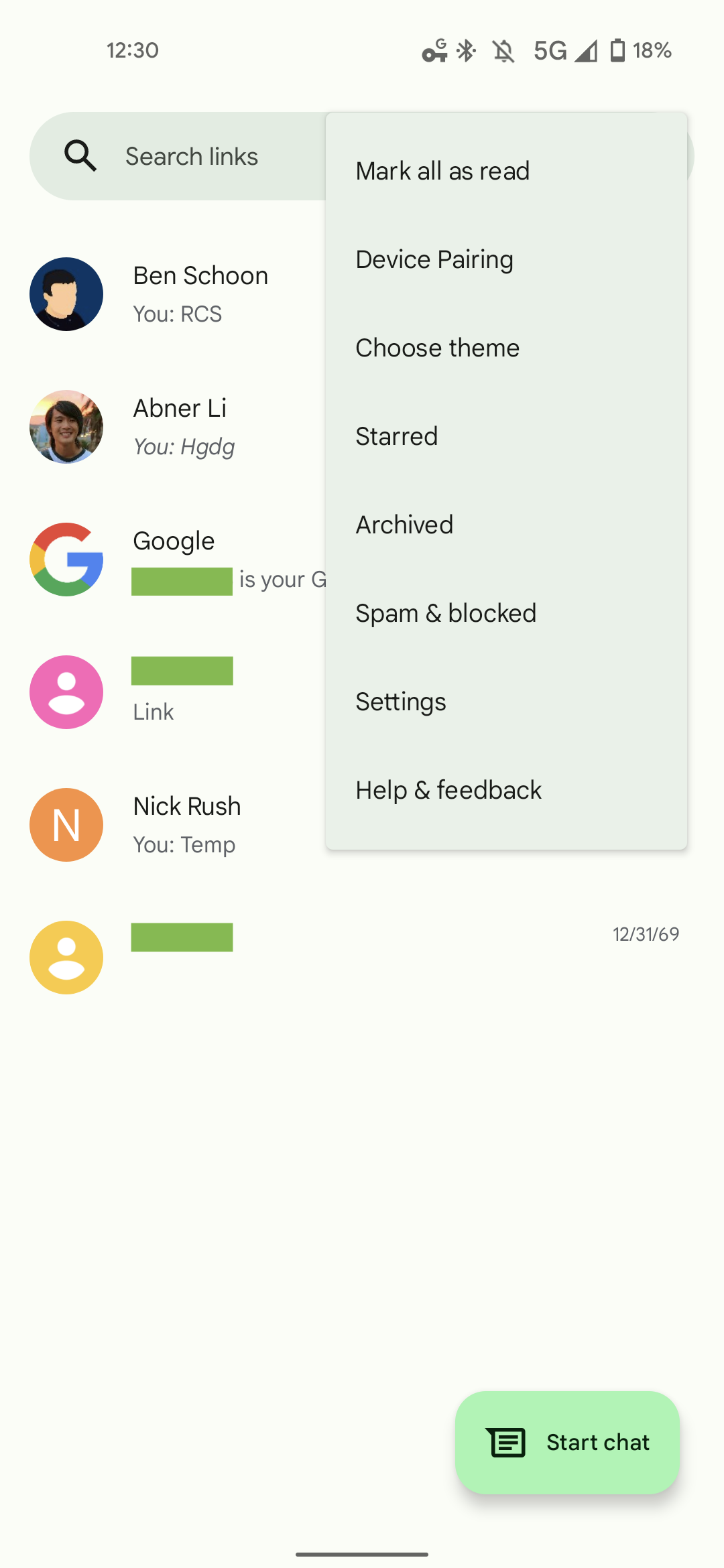
On the homescreen, you’ll immediately notice the pill-shaped search field and rounded rectangle FAB. Those two elements feature Dynamic Color, with the latter button brighter than the top bar, overflow menu, or settings screen. Search sees some tweaks and the background is lightly tinted throughout, but that’s curiously the extent of Dynamic Color at the moment.
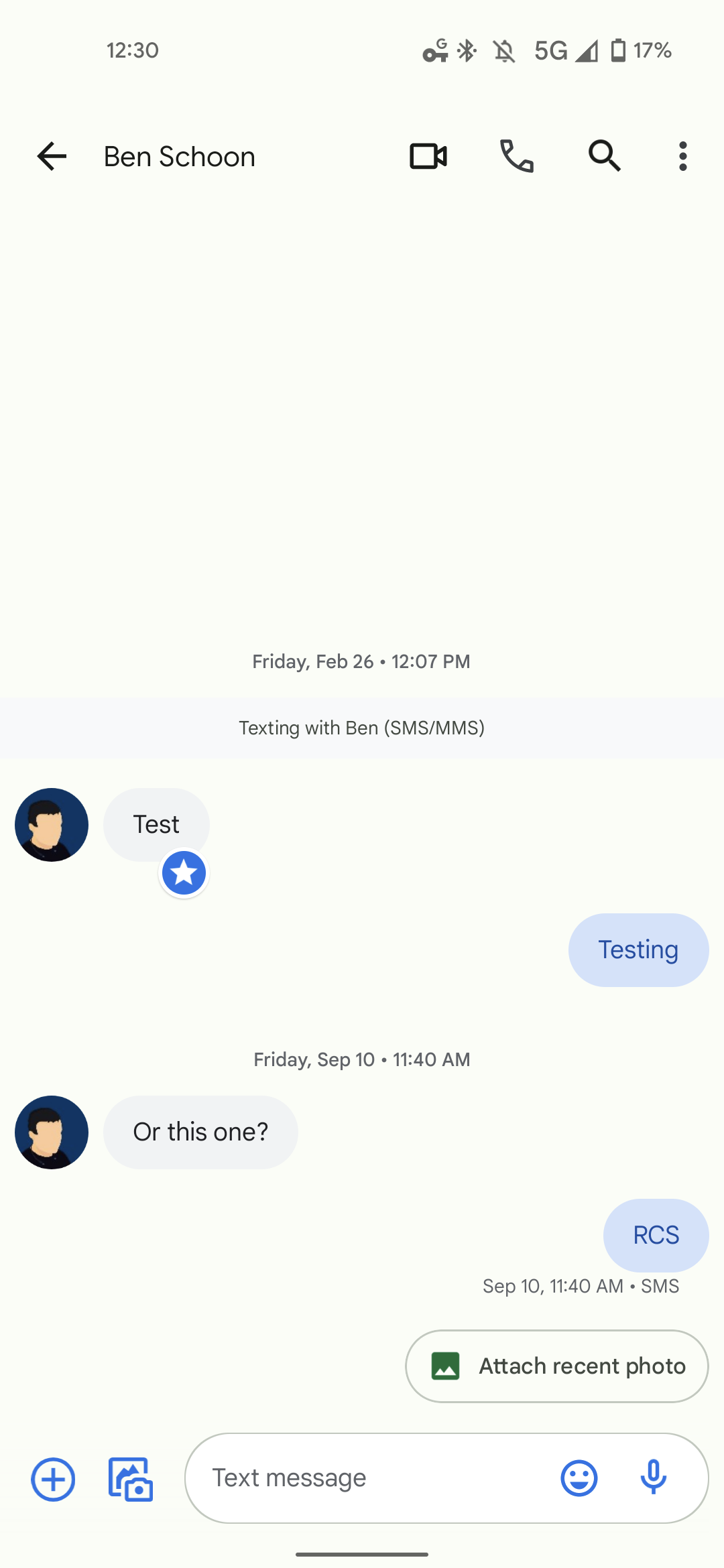
The conversation screen is mostly unchanged from before. Messages/replies and the compose field are still pill-shaped, and adopt the standard blue accent color. We’re expecting Dynamic Color to hue individual threads, but that has yet to occur today for all users. Meanwhile, it’s unclear if any shapes will change.
Material You in Google Messages is currently rolling out with version 9.7.032 in the beta channel. When we first installed, wallpaper theming did not appear on the homescreen or conversation view, and we had to force stop before it appeared. The shape changes, however, also show up on devices not running Android 12. Similar to the Google Phone app, the full Dynamic Color implementation should roll out with a future update.


This redesign follows Messages getting an updated attachments picker and unified emoji, GIF, and sticker UI. Those two changes were somewhat more substantial than the state of Material You today.


Full Dynamic Color theming
More Material You:
- Google Podcasts gets Material You tweaks, Dynamic Color
- Upcoming Google Keep redesign brings the best Material You widget to date [Gallery]
- Duo gets its Material You redesign in latest update w/ Dynamic Color support
- Google Drive’s Material You redesign adds that quirky, bulbous X-shaped widget
Author: Abner Li
Source: 9TO5Google


