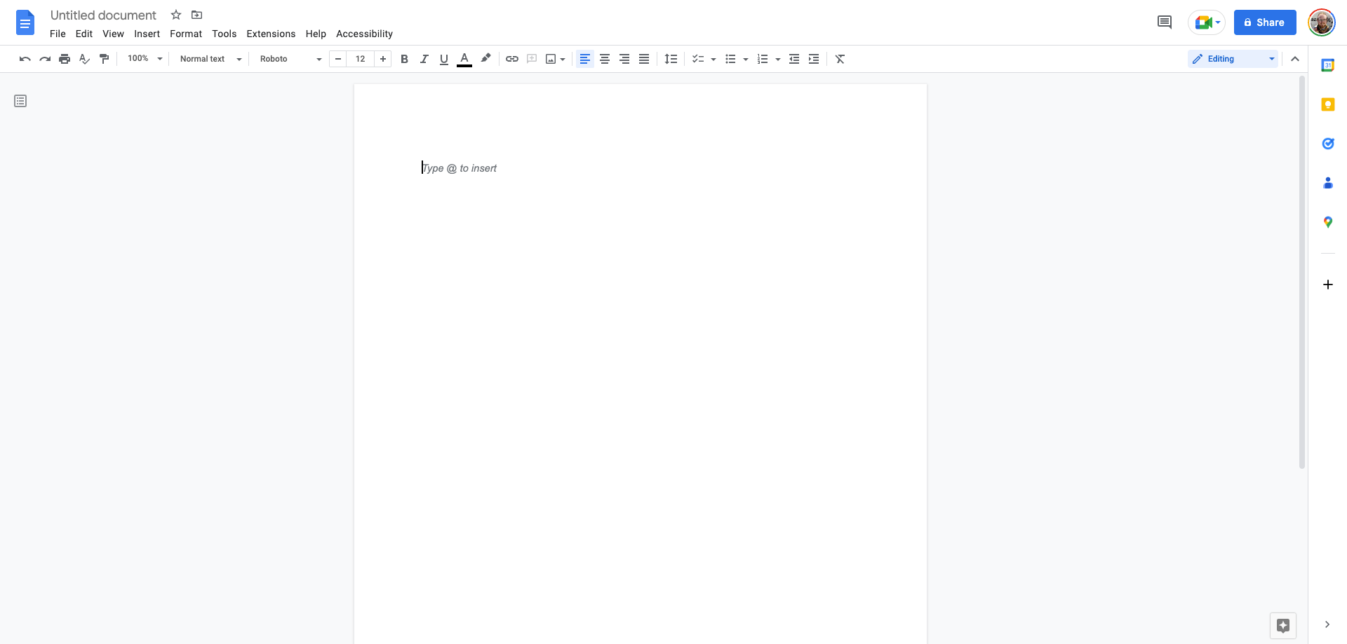
Formally announced last month, the Material You inspired redesigns of Google Docs, Sheets, and Slides on the web are beginning to appear for some Workspace customers.
9to5Google has a rebooted newsletter that highlights the biggest Google stories with added commentary and other tidbits. Sign up here!
The most noticeable change in for long-time users of Google Docs is the thoroughly redesigned toolbar. Ditching its previously rectangular design, the Material You styled toolbar is now a long pill shape across the width of your web browser. There’s a new bit of padding on either side, and the bar and all of its buttons are now thicker than before. Changing font size is also a bit easier, with new plus and minus buttons to quickly tick up or down by one point.
Each app makes up for the change in toolbar density in its own way while also taking the chance to, in Google’s words, “reduce clutter.” For instance, Google Docs previously offered four individual buttons in the toolbar for paragraph alignment. These have now been condensed down to a dropdown menu. Meanwhile, the toolbar for Sheets comes through relatively unchanged.
In other notable tweaks, all of the buttons now use an outlined icon style, rather than filled. The previously multi-color Google Meet button in the top-right corner is now a simple outline. Also where Google Docs previously displayed the last edit time of your current document — which you could also click to view the edit history — the Material You redesign switches this to a new textless button in the top-right corner.


As was shown in the original preview, in-document comments have been given a facelift, using the same blue shade as the updated toolbar.
As usual, since the web doesn’t have support for Material You’s signature dynamic color schemes, the new looks for Docs, Sheets, and Slides make heavy use of Google’s default shade of light blue. For better or worse, this choice brings the apps visually in line with Gmail’s own Material You redesign.
Notably, while the editor views of each app have been updated, we’re still seeing the previous design for the file selection tool. Additionally, the redesign appears to currently only be live for those who are using a Google Workspace account on a domain opted in for “Rapid Release.” The new look may not reach normal Gmail/Google accounts until around March 22, when most other Workspace accounts (set for “Scheduled Release”) are set to get updated.
More on Google Workspace:
- Gmail and Google Calendar client-side encryption now generally available
- Google Docs adding stopwatch, Calendar template, and other Smart Chips
- You can now edit Google Contacts directly from the Gmail sidebar
Add 9to5Google to your Google News feed.
google-news
Author: Kyle Bradshaw
Source: 9TO5Google


