![]()
Leica has finally officially revealed the M11 Rangefinder, letting us finally put all the rumors of what we may or may not expect to rest. Now that it’s here, what has five years of development given us?
Leica’s newest edition to its legendary M line of cameras, which began with the Leica M3 sixty-eight years ago in 1954, has been announced: the Leica M11. It is the successor to the Leica M10, which was introduced almost exactly five years ago at a price of $6,495.
The Leica M11 has been hotly anticipated, with rumors swirling about its specs: will it have a hybrid OVF/EVF? Will it only use a touchscreen and no buttons? Will Leica get rid of the baseplate? Let’s dig into it.
Editor’s note: The following is an extended hands-on preview of the Leica M11, but should not be considered a full review. The camera PetaPixel was provided for evaluation was pre-production and firmware was not final.
Special thanks to Lensrentals for providing some of the lenses used during the M11 evaluation. A full list of available gear both for rental and for sale can be perused Lensrentals.com.
What’s New with the Leica M11?
![]()
Let’s get the headline specs out of the way. The Leica M11 features a full-frame AA-less 60.3-megapixel BSI CMOS sensor with a base 64 ISO and dual gain, a newly developed UV/IR cut filter and RGGB color filter array, MAESTRO III processing engine, a much larger 1800mAh battery behind which rests a UHS-II SD card slot, 64GB of internal flash storage, pixel-binned 36.5MP and 18.4MP output options, a USB 3.1 Type-C port for charging and data transfer, and a new 3.68 megapixel* tilting Visoflex 2 EVF, which will be compatible with the Leica M10 (and presumably M10-P, M10-R, and M10 Monochrom) in a firmware update. The 2.95” Active Matrix TFT LCD panel — with Gorilla Glass cover and 2.33 million dots — is now touchscreen capable like the M10-P.
*I suspect this should be 3.68 million dots and not megapixels, but I am going off the press documentation.
The integration of 64GB of internal flash storage is a very smart move and one that makes a lot of sense. I suspect in terms of the internals and its limited space, it’s easier to integrate flash storage — which can be located anywhere within the body — rather than squeezing a second card slot next to the first slot. It also has additional advantages, primarily that you are never without the ability to take photos because you forgot, lost, or damaged your SD card(s). I suspect that transfer speeds from the internal storage are also faster and possibly the buffer dumping, though I have no numbers on this.
Finally, the price: a whopping $8,995. This represents a 38% increase over the M10’s introductory price of $6,495 — or $7,365 with inflation. That’s a steep price bump, especially for the base model, even considering Leica’s history of price increases that outpace inflation (the opposite behavior of every other camera manufacturer).
The Leica M11 Body and Menu
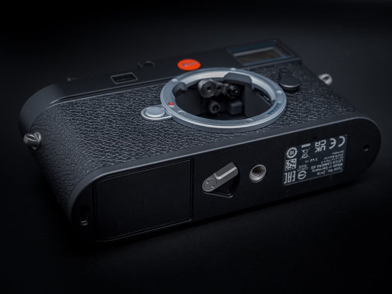
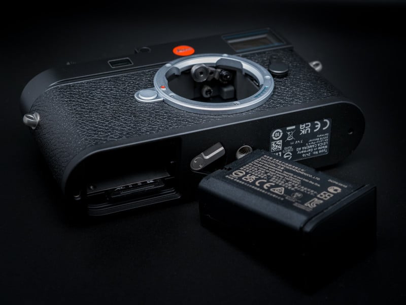
The biggest external change in the M11 is on the bottom — gone (finally) is the antiquated base plate as the camera inherits the same battery design from the SL, Q, and S2/S3 bodies. It’s easily one of my favorite points of design on any camera and incredibly fluid in use: flip the lever to partially eject the battery then push a second time to fully unlock and remove it.
Because of this we now 1) have a significantly higher-capacity battery, 2) have easy and quick access to the SD card slot, 3) no longer need to remove the camera from a tripod to change batteries or card, 4) have much-improved weather-sealing, and 5) don’t have a base plate to worry about damaging or losing.
Two body options are now available: an anodized black aluminum top plate version with a scratch-resistant coating (455 grams wihout the battery) and a classic chrome brass top plate version (565 grams without the battery) — both use a magnesium housing.
The 110-gram weight difference makes the black aluminum option about 20% lighter than the chrome brass. I was given the black aluminum version, but I was able to compare it against the silver brass as well and the difference is certainly noticeable. It’s an interesting choice to make the black variant aluminum and the silver chrome brass rather than the other way around since I feel like people tend to like brassed black more — perhaps it’s because silver chrome bonds better to brass. Nonetheless, I think the two options are a good move — I would certainly get the lighter weight black — though it is sure to anger some Leica purists.
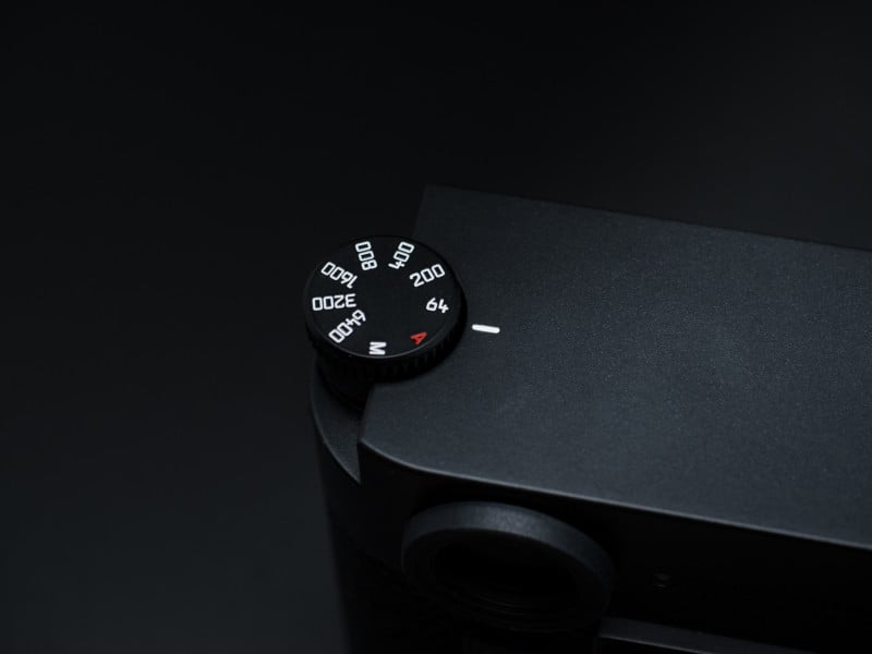
Like the M10, the M11 retains the same ISO dial on the left top side. It’s a cool design on paper — it nicely mimics the old rewind knob of the original M3 and successor M2 — but not quite as fluid in practice: it’s just a bit too stiff and recessed enough that you can’t get an ideal grip to easily and quickly pop it up. I think if it had less resistance, enough that you could pop it up with your thumb, it would work far more fluidly. For me, it isn’t a huge deal. I’m either at ISO 64 or in “A” mode 99% of the time, but fully manual shooters may not love it. But, if you didn’t find it an issue on the M10, you won’t find it to be one here either.
The viewfinder remains the same: 0.73x magnification with framelines for 28/90mm, 35/135mm, and 50/75mm lenses. It’s on par with the best Leica viewfinders since the M3, so it stands to reason that if it ain’t broke, why fix it?
The rear of the camera remains largely in line with the M10, with three buttons (Play, Fn, Menu) to the left of the screen, a four-way directional pad to the right, and a clickable command dial that defaults to exposure compensation (after a press, which I disabled) above that. By default, the Fn button cycles the rear LCD on and off — basically, in and out of live-view depending on how you look at it, though either way the sensor is always active in order to meter.
Live view is electronically stabilized, which does make a noticeable difference for smoother framing and focusing — the latter is incredibly simple with the camera’s focus peaking and/or automatic magnification. Note that it is only the live view feed that is stabilized, not the actual images; you can’t electronically stabilize a single photo like you can video, after all.
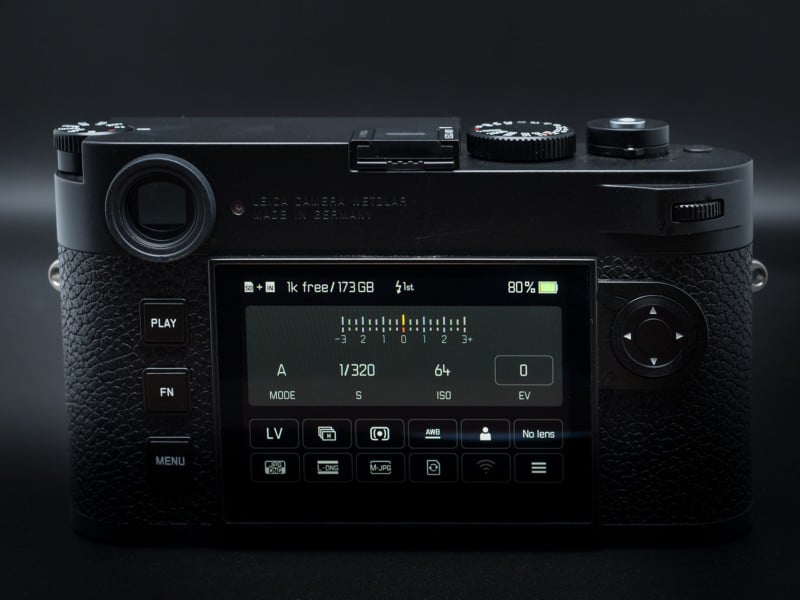
Pressing the Menu button once will first bring you to a customizable Quick Access* menu at bottom of the screen and the area above it shows your basic shooting settings — above that is a status bar with your storage, flash, and battery info (which drops in 5% increments). The Quick Access menu allows you to adjust the most commonly accessed settings without extensive menu diving and is touch-capable, though unfortunately, the primary menu — accessed by pressing the Menu button a second time — is not. I found the easiest way to use the Quick Access menu is to tap the function you need, then use the rear command dial to adjust the setting — but you can do it all on the touchscreen if you so choose.
*Leica has not yet provided me with a manual, so some terms may differ from the names Leica officially refers to them.
The primary menu layout is now in line with the SL2 and Q2, but it’s not altogether incredibly different from the M10. Like most Leica menus, it’s quite intuitive and easy to use. Once you set the camera up to taste you will rarely find yourself needing to access the full menu options.
![]()
The touchscreen is most handy in playback: double-tapping a captured image will zoom into that point (you can also use a pinch gesture) and dragging your finger will scan across the image. Another double-tap will zoom back out and you can quickly swipe left or right to flip through images. The double-tap-to-magnify function also works in live-view to set the magnification point for focusing.
The top of the camera remains almost the same with one exception: a new unlabeled button in the far right corner near the shutter release that acts as a customizable function button; I set mine to toggle the metering mode. Unfortunately, the M11 has lost the M10’s custom button on the front of the camera, so we haven’t really gained anything. I will say though, if we can only have one button, the new positioning is definitely superior and simpler to access in practice.
I would have liked that front button to cycle through the 1.3x and 1.8x crop modes (39.2MP and 18.2MP), though. Speaking of the crop modes, I did not get a chance to test them out in my brief time with the camera, so I do not know if the M11 permanently crops the image (like Nikon) or simply tags the crop and allows it to be adjusted in post (like Canon and Sony).
There is also a newly designed handgrip that doubles as a tripod bracket with its integrated Arca Swiss plate. The new grip is also designed to allow instant access to the battery and therefore the SD card slot, as well as the USB-C port, without removal of the handgrip.
Bigger Battery
The new 1800 mAh battery — up from M10’s 1100 mAh and the same capacity as the M240 battery — provides about 63.6% more capacity compared to its predecessor. Given the 210 shot CIPA battery rating of the M10, I expected a decent, but not huge, increase in battery life.
Instead, I was shocked. Whatever Leica has done here in terms of power efficiency, much of it likely owing to the new MAESTRO III processor, is nothing short of incredible.
The M11 is CIPA rated for about 700 shots (in live-view) and rated for about 1,700 in “Leica Adapted Shooting Style” (using the rangefinder). I firmly trust both figures at a minimum. In the time I had the camera, I only charged the battery once, and it’s quite possible I may not have needed to do that. Given that I was using a new camera, I did far more chimping and menu diving than normal and used live-view quite a lot. It’s even more impressive given that the sensor is always active, unlike the M10 and prior models.
As we’ve said before on PetaPixel, most recently in our Nikon Z9 review, looking at CIPA battery performance numbers on modern mirrorless cameras is basically as useful as not being given any information at all. However CIPA is evaluating battery performance is badly in need of updating, and any numbers it provides tend to be woefully below actual performance.
A New EVF
![]()
The release of the Leica M11 is complemented by the release of the Visoflex 2 — a hot shoe mountable EVF. The Visoflex 2 features a 3.68-megapixel (again, I think this should be 3.68 million dots but I’m just telling you what Leica is saying) OLED display, an anodized black aluminum build, diopter adjustment from -4 to +3, and three positioning steps of 0, 45, and 90 degrees.
I suspect the EVF shares the same or similar technology found in the Sony Alpha 7R III and Nikon Z5/Z6/Z7 series. I am not sure what the refresh rate is, I have asked, and I will update this review should Leica tell me.
I was not given the opportunity to use the Visoflex 2 during my time with the pre-production camera, so I cannot comment on its quality. It looks to be of high magnification and high eyepoint and while the design looks boxy and large compared to the Typ 020, this is likely a very fair and necessary tradeoff for high-quality optics.
The Visoflex 2 will be compatible with M10 models via a firmware update at a yet to be determined future date in 2022. The Visoflex Typ 020 is not compatible with the M11.
The New Sensor
![]()
The first thing I noticed after being shown the camera were the matte black shutter curtains — metering is now off the sensor, rather than center-weighted off the grey shutter blades of former models. We have the standard options of matrix, center-weighted, and spot. While these have been available since the Leica M240 in live-view mode, they were not the default and battery life took a considerable hit. There’s also now a fully electronic shutter option up to 1/16,000th of a second — Leica has not verified the readout speed yet, but I suspect it’s somewhere around 1/15th of a second. In other words, it is insufficient for most moving objects without rolling shutter artifacts but acceptable for many other subjects when used with care.
Leica cut no corners with the heart of the M11: a 60.3MP (9528×6328) BSI sensor with an updated RGGB color filter array, 3.76 µm pixel pitch, and a new, thinner UVIR cut filter. Now that Leica has fleshed out its masterpiece series of APO lenses — Leica 50/2 APO-Summicron-M, Leica 75/2 APO-Summicron-M, Leica 90/2 APO-Summicron-M, Leica 135/3.4 APO-Telyt-M, and the new Leica 35/2 APO-Summicron-M — they clearly wanted to make a camera that really makes the most of those optics.
Leica won’t reveal the manufacturer of the sensor; however, the company tells me it was developed exclusively for this camera. I suspect, at the very least, it shares some very similar architecture to the Sony sensor found in the Sony Alpha 7R IV and Sigma fp L. Ultimately, I don’t care where it came from. The imaging pipeline, which would be exclusive to Leica, will ultimately make more raw difference than which factory fabricated the sensor.
Leica states the ISO 64 is truly native and without any pull and so far, there is nothing to make me think that isn’t true. I see none of the compromised highlights or abrupt roll off that come with pulled settings outside the native analog range. This is good and presents the potential for some excellent dynamic range and tonality. The sensor is also dual gain, like most these days (particularly Sony sensors), but I have not heard back from Leica yet as to what the second gain is. I suspect it’s ISO 320 or 400.
![]()
Leica claims 14 stops of dynamic range at full-resolution and 15 stops with the pixel-binned 36.5MP and 18.4MP modes. I think this is not far off from real world expectations. Based on my use of the camera so far, I’d estimate 14 to 14.5 stops of useable dynamic range, depending on your threshold for noise. Its dynamic range is definitely shadow-biased like the Sony Alpha 7R IV, but not quite as much. It strikes a great balance, and highlights still have great latitude, if not on the same level as the Nikon D810/D850/Z7.
Leica says it uses an advanced algorithm via the new Maestro III processor to produce the pixel-binned results. More investigation is required when I get a production unit as to whether the in-camera binning results in cleaner images than downsizing in post. However, shooting at 36/18 megapixels does give you greater buffer capacity and smaller file sizes. One thing I’m not sure of is why Leica didn’t choose 30/15 megapixels binning modes instead, for a perfect 2:1 oversample — I have reached out for comment but have not yet heard back from Germany.
Strangely, the Leica M11 only uses the sRGB color space — based on the spec sheet and RawDigger inspection of my DNG files — and even stranger, I seem to remember a menu option to set it to Adobe RGB (which is one of the first things I do when setting up a new camera). I could be misremembering this, however. More investigation and discussion with Leica are required once I get a production unit, but this seems odd given that the Leica SL2 and others use both sRGB and Adobe RGB.
Image Quality
Given that this was a pre-production unit that was not operating with final firmware, Leica has asked us to reserve in-depth testing and detailed comments regarding image quality for now, so this will be brief and will be explored in more detail in our full review down the line. So, that out of the way…
Images from the M11 are outstanding. They have excellent dynamic range that I’d (tentatively) put up there with the best of Sony and Nikon, great color particularly after profiling, and fantastic noise performance.
In my brief comparison against the Sony Alpha 7R IV — using the Leica 50/2 APO-Summicron-M (one of the best lenses I have ever used) on both cameras — I would even give the Leica M11 a slight edge over the Sony. There isn’t a lot in it, maybe half a stop, but the Leica seems to produce less color shift and chroma noise. Again, more testing is required.
While there is obviously no Adobe profile for the camera yet, there is an embedded profile within the DNG files. I make my own profiles for every camera I own and I did the same here; colors are excellent, especially after profiling.

I did encounter two issues in use. First, the auto white balance was all over the place to the tune of +/- 2,000K. Even a series of photos, on a tripod with the same framing and exposure, seconds apart, may result in values with as much as a 1,500K difference. The correct white balance always seemed to lie somewhere in between. This was reported to Leica and its team in Germany was already aware of it, so we can expect this to be ironed out in final firmware.
Secondly, I had issues with exposure in Aperture Priority and Manual modes with auto ISO: the camera would massively overexpose, sometimes to the tune of four or five stops. This only happened during either: 1) shots where I very quickly raised the camera to my eye and snapped a photo, or 2) during bursts in a similarly quick environment.
In the case of the latter, it would always “jump” to the correct exposure somewhere in the middle of the burst. It never occurred during more deliberate shooting. Essentially, it’s like the metering system couldn’t keep pace with fast-paced shooting and would take a few seconds to catch up. Like the white balance issue, Leica was already aware of this issue when I reported it. I don’t consider either of these to be anything to worry about — such issues are not uncommon in pre-production units.
The 60.3MP sensor will really test photographers’ shooting techniques, as well as their lenses. The greater the number of pixels per degree of FOV — regardless of sensor size or pixel pitch — will magnify the detrimental effects of both sloppy technique and uncorrected lens aberrations. What may have looked great on the 24MP Leica M10 may now be full of aberrations and blurred pixels if your shutter speeds aren’t sufficient. Keep in mind, other than some Hasselblad and Phase One cameras, this sensor is more taxing than any other on the market, alongside the Sigma fp L — the IBIS in the Fujifilm GFX 100 and 100S mitigate the issue.
I found 1/2x focal length to be the absolute minimum for pixel-level sharp results, with 1/3x being optimal. This means even with a 35mm lens, you’re ideally at 1/100 to 1/125. Thankfully, Leica has excellent minimum auto-shutter speed options in the menu — just be sure to set your lens info if you’re using an older, non-coded lens.

Lastly, a quick comment on out-of-camera JPEGs: I did not thoroughly test this because it seemed like one of the least important things to spend time on (especially with a pre-production camera without final firmware), but I did do some quick, initial adjustments and testing with several of the JPEG modes until I got something I was reasonably happy with. And the results are excellent — fantastic color, superb detail, and compression are minimal, which helps avoid posterization and other artifacts. While there is obviously noise reduction in the JPEGs, as with any other camera, Leica has done a wonderful job ensuring it doesn’t compromise fine details or yield waxy, smeary results. More thorough investigation on this will be in the final review.
Below are a set of sample images that I captued as part of my time with the M11.
![]()
![]()
![]()
![]()
![]()
![]()
![]()
![]()
![]()
Leica FOTOS 3.0
I did not get much time to use the new Leica FOTOS app, which was a beta version and still had many features to be added (the company estimates that will come in the second half of 2022) and kinks to work out, but I can say the time I did spend with it was easily the most pleasant and smooth wireless tethering experience I have ever encountered. I only used the app on my iPhone 13 Pro, but I will also test it with my iPad Air 4 once I receive the production unit.
Shooting with the FOTOS app — currently available for iOS only, as Leica said most of its user base are iPhone users — and changing settings could not be simpler. There is very little lag with both the live-view image and making adjustments to settings, the connection never dropped and, unlike every other app I have used aside from Hasselblad, the initial connection setup is very quick, simple, and intuitive.
Update 1/13/21: While Leica informed PetaPixel that it was only targeting iOS, that doesn’t appear to be the case. We’ve reached out to Leica for clarity, but the app is available on Google Play with noted support for the M11.
The upshot here is you not only get great features like embedded location data, image access via Bluetooth, and increased transfer rates, but more importantly, it makes the camera much more usable for tripod-based work outdoors or in a studio, especially as it lacks a tilting LCD. In fact, the FOTOS app is so good and simple that I’d probably use it over a tilting screen in tripod-based situations.
The Leica M11 Could Actually Be a Primary Camera

Leica has thrown everything but the kitchen sink into the M11. In-body image stabilization (IBIS) is the only major feature I wish had been included, but I suspect there are significant limits to what can be stuffed into a body of this size (maybe this is why Leica only has a single SD card slot and internal storage and not two card slots). Perhaps there are also limitations of the M mount throat, which is even narrower than the Sony E mount. Leica went to significant effort to decrease the thickness of the M10 to match the film M bodies and IBIS would no doubt require them to backtrack in this regard. Still, if Ricoh can stuff three-axis IBIS in the Ricoh GR III and GR IIIx, I think Leica is up to the challenge, even if it isn’t full five-axis.
The combination of all the elements here — the high-resolution sensor with excellent dynamic range and low-light ability, lower resolution pixel-binning options, a silent electronic shutter, the incredibly impressive battery life, 64GB of internal storage as an effective second card slot (but with other benefits too), off-the-sensor metering, a new high-resolution tilting OLED EVF, the effortless wireless tethering — makes the Leica M11 the most complete and versatile M digital to date by a massive margin. It almost feels like the jump from the M9 to the M240, as though a generation has been skipped.

Perhaps the highest praise I can give the camera, based on my experience so far, is it’s the first time I feel like an M camera could serve as my primary system. No, it isn’t suitable for some of my work, nor could it be my only system, but the M11 is filled with all the capabilities I need for a good deal of my work, all without any significant shortcomings.
I have never considered a Leica M digital camera because they are far out of reach financially for me, but also because there have always been enough significant limitations to the cameras that would prevent them from ever being more than a fun personal camera, rather than also a tool for work. I no longer feel that’s the case with the M11.
Boy, do I wish I had a spare $9,000. Maybe a new M-E based on the M11, Leica?
Author: Matt Williams
Source: Petapixel


