![]()
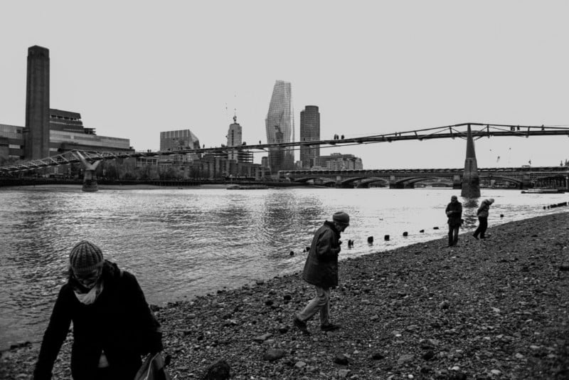
One of the most effective ways to fill a frame with information is to layer elements of your composition, either in two dimensions along the X and Y axis or in three with the Z axis.
When it comes to conveying narrative or communicating visual data, this layering is a great way to incorporate multiple elements into a photograph, allowing or introducing a dialogue between those aspects.
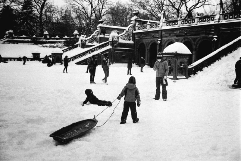
Simple photographs with only one important piece of information, like a portrait or product shot, don’t necessarily need information to exist in more than one plane, and often great effort is put into making the background as simple and uncluttered as possible, either via depth of field or composition.
The most extreme example of this simplicity would be a passport photo, which requires the absence of even the implication of a background in order for the only essential information contained to be communicated.
Photographs with complexity and interest throughout the frame in all three dimensions can be immensely rewarding, and this often forms the backbone of my projects. In my opinion, when it comes to documentary photography, the most effective layered frames are the ones that incorporate relevant information in each plane to the idea being communicated, rather than just an arrangement of things for the sake of visual flair.
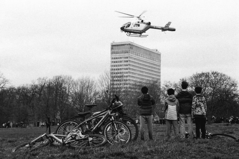
The “classic” lenses for layering a composition tend to be the standard wides, 35mm and 28mm. With these I’d say you’re working on situations occurring within maybe ten meters of you, with a clear foreground (usually the point of interest), something they are interacting with or juxtaposed against in the mid-ground (or interchangeable with the foreground), and a background that situates the context of the situation.
I’d say some of the best contemporary examples of this kind of photography can be found in the work of Josh Edgoose, Vineet Vohra, Sagar Kharecha, and Lauren Welles, who are all worth studying and learning from if working with wider lenses in this way is something you want to improve on.
My own wide-angle work leaves a lot to be desired, and I do my best work at 50mm+. Longer lenses tend to lend themselves to tighter compositions, highlighting only a few essential elements per frame. The easiest way to layer with this kind of lens is in two dimensions rather than three, stacking elements vertically or horizontal, but with little of that essential depth in the Z axis.
Read also: What a Longer Focal Length Can Offer Your Street Photography
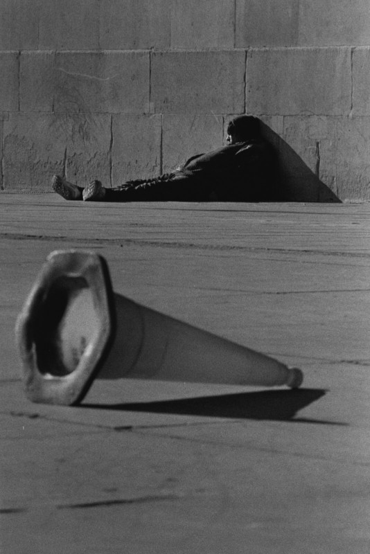
A lot of my work, especially my early efforts, reflects this and is based around those vertical or horizontal layers with clearly segmented sections. However, I have been working towards applying those wide-angle techniques involving depth in the Z axis to my work with longer lenses.
I really like how work built in three-dimensional layers can draw the eye through from the background to the foreground, and vice versa. Even slight progress in these attempts has brought my work noticeably closer towards what I am trying to achieve.
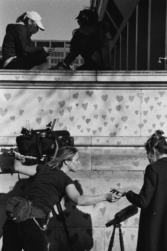
Working with my favorite focal length at 90mm, I usually need to be stopped down all the way to f/16 to achieve enough depth of field to incorporate layers on those planes. The simplest use of background, mid-ground, and foreground, clearly demarked and with interest on each layer offers me the best results.
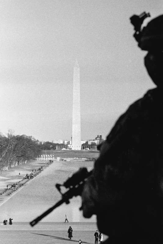
This photograph made in Washington DC contains one of my favorite recent layered compositions. It has a clear juxtaposition of the Monument and Guardsman, with figures below providing mid-ground interest which keeps the eye moving around the frame.
I aligned the soldier’s eye-line with the tip of the monument and made sure there was clear figure-to-ground for all of the important elements. I stopped all of the way down and focused on the monument, allowing the guardsman to fall out of focus but still maintain definition in my frame.
Thematically and compositionally, I like how things are connected in this image, and this would not be possible without incorporating the full height, breadth, and depth of what this scene had to offer.
With slightly shorter lenses, like 50mm, you can maintain much more definition of the out-of-focus foreground elements when focusing on further parts of the scene, like this shot at 50mm f/16.
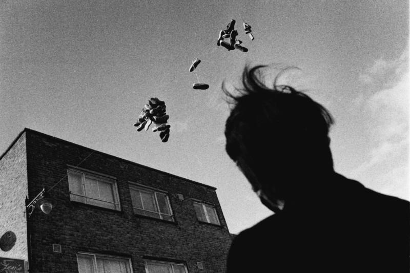
With something like a 28mm lens, you can expect more clarity throughout when stopped all the way down. Longer lenses offer a slightly more atmospheric result in this way.
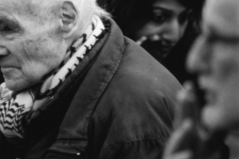
Unlike the wider lenses where proximity to your subjects brings the audience right into the action, the approach with longer lenses allows you to piece together elements that are slightly further away from one another.
This photograph was taken at about 600mm, and you can see that even stopped down to f/16 it is not ideal for capturing a wide field of focus. Instead, allowing some aspects to be out of focus gives you that combination of atmosphere combined with enough clarity that details are not entirely lost and remain essential to the overall story.
Even with longer lenses, I’d say the best results come from working close, within a few meters from your subject. Images with a strong graphic foreground seem to work best when they occupy a large proportion of the frame, as above with the image from DC, where I was about a meter away from the National Guardsman.
A characteristic of longer lenses is that they can “flatten” things out, so introducing depth in combination with that flatness can give you some interesting ways to think about capturing a scene.
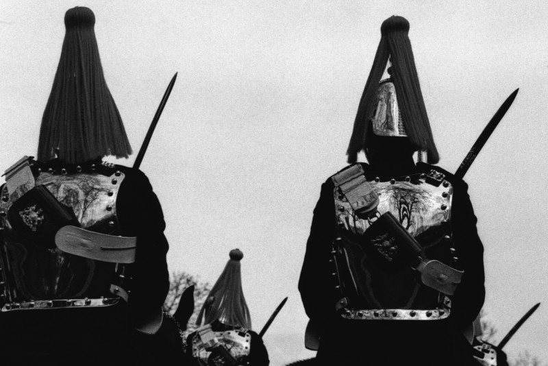
I’ve really enjoyed playing with these ideas and incorporating them into my work. Being able to involve so many more aspects in a single frame than I usually have done has been immensely rewarding, though I recognize that I still need to push my work a lot further in my upcoming projects. It’s been a way to set myself new challenges even when working in familiar environments.
Thanks so much for taking the time to read my thoughts on working with longer lenses to create layered photographs. I’ve recently put out a short digest of images made on the East Coast of North America over the last few years, many of which showcase some of the ideas I’ve mentioned here.
About the author: Simon King is a London-based photographer and photojournalist, currently working on a number of long-term documentary and street photography projects. The opinions expressed in this article are solely those of the author. You can follow his work through his documentary collective, The New Exit Photography Group, and on Instagram.
Author: Simon King
Source: Petapixel


