The iPhone 14 Pro reviews are out, giving us an early look at the new features and changes introduced by Apple this year. The first reviews praise the iPhone 14 Pro models for their new Dynamic Island, photography capabilities, premium finish, and more.
The new Always-On display, however, is proving to be somewhat controversial as reviewers say it’s actually too always-on. I fear that these early reviews might be correct…
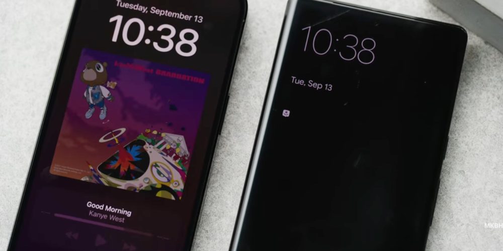
The Verge‘s Nilay Patel was the first to say that the iPhone 14 Pro’s Always-On display “is a little too… on.” If you compare Apple’s implementation to ones from Samsung, Google, and other Android manufacturers, there’s a notable difference.
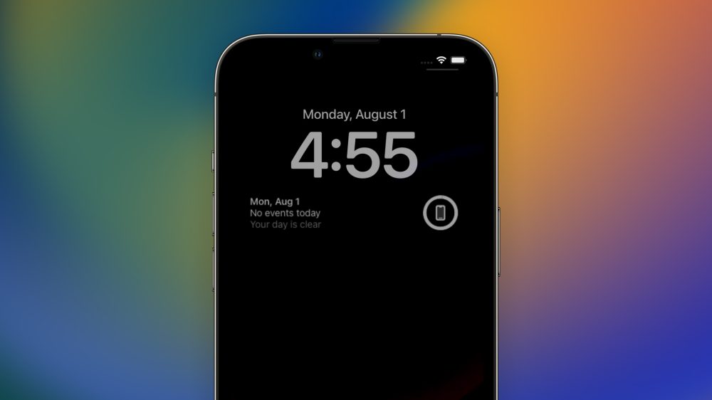
These Android manufacturers choose to dim everything on the display and only highlight the clock and some notifications in black and white. Apple, however, shows the time, widgets, a dimmed version of your wallpaper, and even artwork if you’re currently listening to something.
Different from Android makers, Apple took the Apple Watch approach, which is: what’s on the screen, stays on the screen. This is made possible thanks to a new version of Apple’s ProMotion display, which ranges from 1Hz to 120Hz.
Since the panel is only refreshing once per second when it’s turned off, Apple says it can save battery while displaying important information.

Despite the new display technology, YouTuber Marques Brownlee noted that his review that battery life seems to be impacted by the Always-On feature, which makes sense since no light is better than some light.
While Apple showed a few interesting backgrounds with Always-On display usage, reviewers showed us a different perspective.
Imagine if you’re listening to The Beatles’ White Album. The AOD will keep displaying a dimmed white album, which, as Patel said, is “too on.” If you have a family picture on the beach sand or any other white background, you’ll see that the Always-On display might actually make the experience worse.
Here’s a workaround and a wish for the iPhone 14 Pro Always-On display feature

If you’re like me and already think this technology is better turned off, don’t worry. In the iPhone’s settings, you can disable Always-On. It’s a very simple toggle.
For the future, rather than just needing to switch my background, I wish Apple would only highlight the clock and my widgets, instead of notifications and the background. It would help save battery and would reduce any privacy concerns.
It’s also interesting to note that Apple has a few tweaks for the AOD tech. If you’re wearing an Apple Watch and go far from your iPhone, the display is automatically turned off. In addition, you can also switch how notifications are displayed to show just how many notifications you have, and not from who they are.
Wrap-up
With this first look on the iPhone 14 Pro, I do think the Always-On display looks too on. I hope this is something Apple can adjust in future updates to iOS.
What do you think? Do you like the new AOD tech, or do you prefer Samsung’s approach? Share your thoughts in the comment section below.
Read more:
- Comment: A new 12-inch MacBook couldn’t fit Apple’s current Mac lineup – and I’m glad it doesn’t
- AirPods Pro 2 have everything you need – but there’s one feature Apple hid
- Comment: The problem with the iOS 16 battery percentage icon
Add 9to5Mac to your Google News feed.
google-news
Author: José Adorno
Source: 9TO5Google


