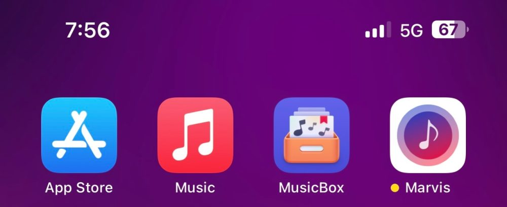
With today’s release of iOS 16.1 beta 2 for developers, Apple has changed the design for the coveted battery percentage in the status bar. The battery icon itself will no longer show as full, even when the percentage is less than 100%. Instead, the icon will dynamically change based on your battery charge.
The battery icon has been controversial since it was added late in the iOS 16 beta testing process. Many users criticized the design because it would show a full battery icon with the percentage inside. What I’m saying is this: José was right yet again, and I apologize for ever doubting him.
With iOS 16.1 beta 2, the battery icon no longer appears as full if it’s not actually at 100%. Instead, the design dynamically adjusts based on your current charge level. The percentage number appears inside that battery icon just as it did before.
This new design also comes with a bolder font than before. When your iPhone is charging, the lightning bolt icon no longer appears once you hit 100% charge.

iOS 16.1 beta 2 is currently available to developers, and we expect a release to public beta testers as soon as later today.
Spot any other changes in today’s release of iOS 16.1 beta 2? Let us know in the comments below or on Twitter @9to5Mac. Stay tuned for our full hands-on coverage with the new releases right here at 9to5Mac today and throughout the rest of the week.
What do you think of this new design for the battery percentage icon in iOS 16.1? Is it better than what Apple shipped with iOS 16?
Add 9to5Mac to your Google News feed.
google-news
Author: Chance Miller
Source: 9TO5Google


