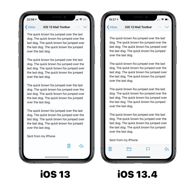
iOS 13.4 has reverted a bad design choice made with the iOS 13 Mail app, namely the actions toolbar the bottom of the screen.
The delete and reply buttons now sit at opposite ends of the toolbar, and Apple has added back the quick actions for flagging and moving folders.
The new design will look similar to iPhone and iPad customers who stuck with iOS 12. With earlier versions of iOS 13, Apple inexplicably removed the helpful buttons and collected the delete and reply buttons on the right hand side, leaving a lot of blank empty space in the rest of the toolbar’s width.
The design meant that common actions were buried, and users reported they were accidentally pressing the delete button when they wanted to reply, as the icons were simply too close together.
You can see a side-by-side of the change here:
The iOS 13.4 toolbar consists of four buttons; Send to Trash, Move Message, Flag, and a catchall Reply button. The Reply button opens a sheet that includes options for reply, forward, and a load of other miscellaneous actions relating to the current email message.
The first beta of iOS 13.4 was released to developers today, and should be released for all customers within the next few months.
Author: Benjamin Mayo.
Source: 9TO5Mac


