Android 12 brings a lot of key features to Google’s Pixel devices. From Material You to helpful privacy settings that block out your precise location, there are plenty of options to play with. One aspect you’ll likely see the most, though, is the homescreen. Fortunately, you can customize every aspect of it to fit your needs.
Table of contents
Breakdown of the Google Pixel’s homescreen
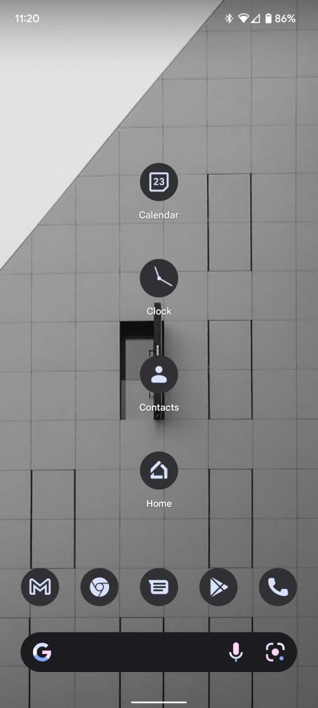
There are a few different parts to the homescreen on a . Depending on how you put these parts together, you can end up with a very different homescreen than the next person. For instance, utilizing widgets, you can customize the Pixel’s homescreen to display tons of information at your fingertips, so you don’t miss a thing. On the other hand, you can make it as simple and clean as you want with only a few icons and one widget.
No matter how you want to do it, there are plenty of customizable parts to set the Pixel’s homescreen up however you want to. Here are the main components:
- Wallpaper
- Themed icons
- App grid layout
Customizing the Pixel’s wallpaper and utilizing Material You
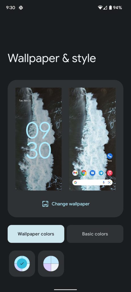
The foundation of Android 12’s Material You is the wallpaper. The wallpaper determines the overall color palette present throughout the whole of a Google Pixel. Material You will take colors from the wallpaper and sprinkle those colors in different aspects of Android 12. For instance, the Quick Settings button colors are changed depending on the wallpaper chosen, giving a uniform feel throughout the device. These colors are also found in the main settings menu for the same effect.
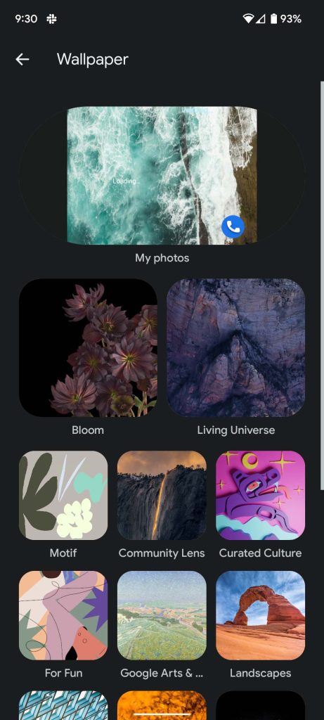
Google has an abundant wallpaper selection in Android 12, ranging anywhere from cityscapes to fun, vibrant drawings to photos taken by community members. There are even animated wallpapers such as in the “Living Universe” collection. While absolutely gorgeous, these tend to drain the battery a little more.
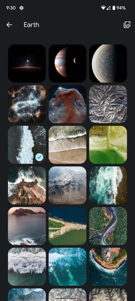
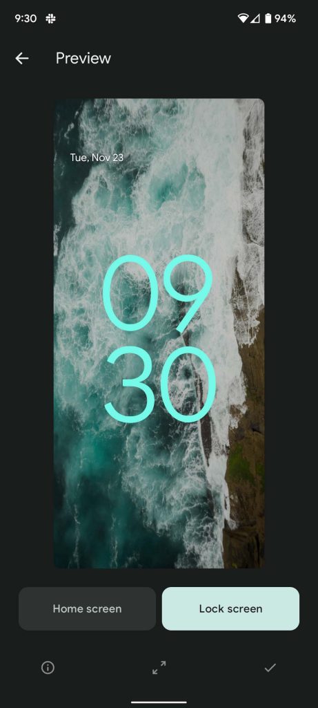
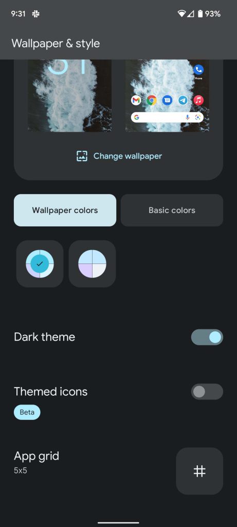
In order to select or change your wallpaper, long press on any blank space in the homescreen. A small menu will pop up with three options. Select Wallpaper & style which will take you to the style page. Under a preview of your current wallpaper, go ahead and tap Change wallpaper. Here’s where you can sort of go crazy. There are hundreds of photos between the many categories Google has to offer. Just select a photo from one of the categories, and once you like the look, hit the checkmark in the bottom right-hand corner of the preview. Choose between the homescreen, lockscreen, or both and you’re all set!
How to set themed icons and customize grid layout on Pixel
In true Material You fashion, themed icons are simply icons that will take on a simple art style and color depending on the accent palette derived from the wallpaper. You can easily enable these by going to the same page you would to change the wallpaper (long press>Wallpaper & style). Once you’re there, scroll down the bottom portion of that page. You’ll see the Themed icons settings. Slide or tap the slider to turn it on and that’s it.
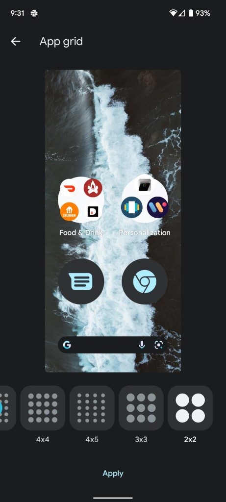
Another setting you’ll see right under themed icons is the App grid option. In essence, this setting changes the number of icons that can sit on your homescreen. The most is a 5×5 grid, and the least is a 2×2 grid that only allows four total icons on the homescreen. Personally, I prefer the 5×5 on the Pixel 6, since the device is on the larger side. This sizes the icons just right for me.
Customizing Widgets and At A Glance on the Pixel’s Home screen
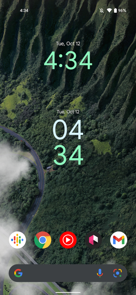
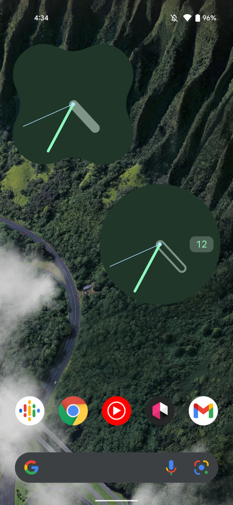
We’ve gone over setting up widgets before here at 9to5Google, since Android 12 adds a lot to the table in that respect. Some widgets are also based on the wallpaper colors, giving the appearance of a well-put-together homescreen.
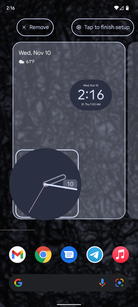
To add a widget, long press on the homescreen and tap Widgets. How many widgets are available in the menu will depend on how many apps you have installed on your Pixel. Most Google apps that are preinstalled on the Pixel take advantage of Material You, while third-party applications usually do not. After dragging one onto the home screen, you can edit its size and other features by long pressing on the widget and either repositioning it or letting go to change its size. Some Google-made widgets like the clock widgets will have a pencil in the bottom right-hand corner after letting go. Tapping that pencil will allow you to change even more aspects of it, truly adjusting it to your liking. It’s also worth mentioning that the scale of adjustments you can make to widgets depends on the app grid size. A bigger grid allows for more minute adjustments, while a small grid only allows for extreme adjustments.
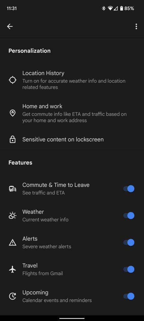
Additionally, while At a Glance can not be turned off – we have a few thoughts on that – it can be adjusted. You can get to At a Glance settings by once again long pressing on the homescreen and then tapping Home settings. This feature will normally show details like planned events in your Google Calendar, upcoming flight information, and weather. All of those individual aspects can be disabled, so some information doesn’t appear at the top of your homescreen. Leaving these options on can come in handy when you have a flight coming up and need the details quickly or your day is packed, and you need to know what’s next immediately. Under normal circumstances where nothing is planned and no flights are upcoming, At a Glance shows only the date and weather, which can easily be accomplished with a couple of great-looking widgets.
Additional homescreen settings
You can get to these settings with a long press on the homescreen once again. This time, though, go ahead and select Home settings in the menu that comes up. Here you can find a few more small options that’ll let you tweak the finer details. For instance, notification dots can be turned off for a cleaner look, as well as turning off “Swipe to access Google app” to disable the Google news feed on the left-most part of the homescreen.
That being said, there is a lot to change and adjust to your liking. Anything from your wallpaper, to the color palette Material You uses can be customized, making your Android 12 experience purely you. After all, that’s what makes the stock Android experience on a appealing.
Author: Andrew Romero
Source: 9TO5Google


